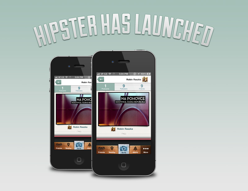
During this tutorial we’ll be using Adobe Photoshop to create a unique and clean email, announcing the launch of a new mobile app. We’ll look at using smart objects, clipping masks, warping text, and even examine the psychology of our users.
Step 1: Document Setup
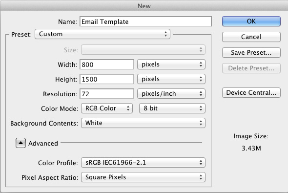
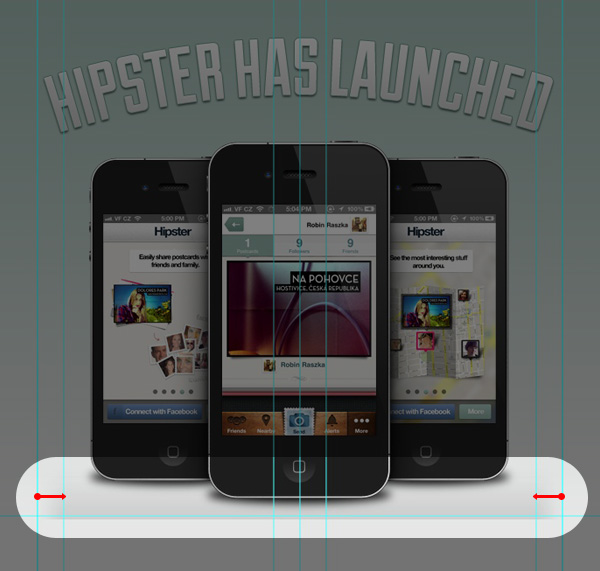
The first thing we need to do is create a new document ready for our design. The standard for email design is 600px wide – we’re going to make our document 800px wide, but design within the centre 600px so we can get a better feel of how the whole design will look to the majority of viewers. It will also give us extra space to work within.
So, make a new document, we need to set the width to 800px and the height to 1500px.
Step 2: Placing our Guides
Now that the document is ready we need to place our guides. These will be used to dictate where we place our content and give the overall design a more cohesive feel.
Firstly, make sure you’ve got Rulers (cmd/ctrl + R) and Guides (cmd/ctrl + ; ) turned on.
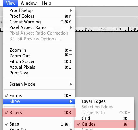
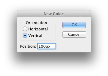
Next go to View > New Guide… this will open the prompt box shown below. Set the Orientation to Vertical and Position to 100px this makes our first guide. Repeat this step with the following values; 130px, 370px, 400px, 430px, 670px, 700px.
Then create a single Horizontal guide at 590px.
You should now have seven vertical guides set up in total, the two outer guides will act as our boundary creating the 600 pixels for us to work within, the next guide in on each side provides a guide for our text to allow good breathing space improving legibility. The guide at 400px shows the center of the document and the guide either side of this is again for our text.
Step 3: Background
Great. We’ve got our document setup, however all we actually have at the moment is a big slab of white and some lines. It’s time to start adding some color!
First, fill the “Background” layer with the color #e5e5e5, this can be done in one of two ways, either grab the paint bucket tool with your foreground color set as #e5e5e5 and simply click the canvas. If however you want to be a little quicker and use keyboard shortcuts set your background color to #e5e5e5 and with the “Background” layer selected hit cmd/ctrl and backspace to fill the layer.
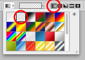
Next up is to add a gradient to our background, set your foreground color to #a5c0b8 then select the gradient tool and choose the second gradient in the presets, this will give us a gradient which is completely opaque on the side we begin the gradient on and transparent on the other. Make sure the gradient is set to linear too. Both these selections are shown below:
Now draw a straight vertical gradient from the top of the page to our guide 590 pixels down the document.
TIP: holding shift while dragging the gradient out will ensure you get a straight line.
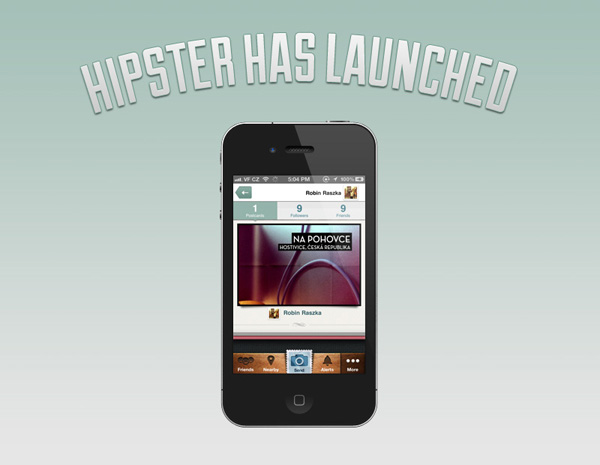
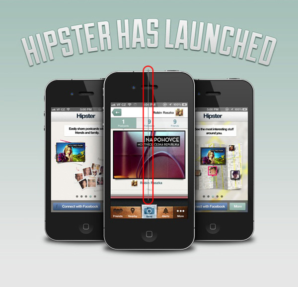
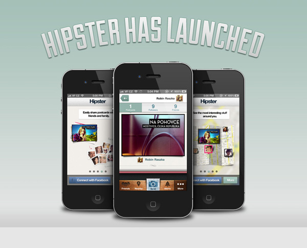
Step 4: The Headline
Now our background is sorted, it’s time for the headline. For the headline I’ve used the lovely Duke font by James T. Edmondson, it’s available for free from The Lost Type co-op.
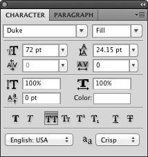
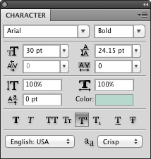
The first step is to get the basic text into our design, using the type tool type out your headline. If you are using the Duke font as well set the style to “Fill” and use the “All Caps” button to ensure al the characters are in capitals. This will make for a very impacting headline. (Some of these settings are only available through the “Character” panel, to activate it just go to Window > Character). The settings I used are shown below:
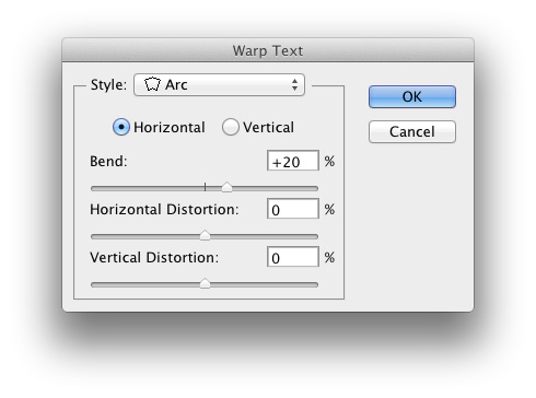
Now let’s create the arc in our text, with the our text layer still selected make sure you’re still using the text tool, click the “Create Warped Text” button.

Choose “Arc” for the style, Horizontal, and a +20% bend as shown below:
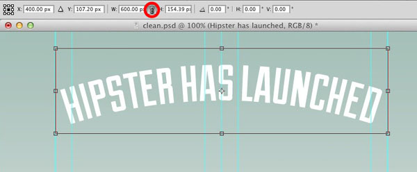
We now need to make the text fill the full width of our document, with the text selected press cmd/ctrl + T to activate free transform. You should now see a box around the text with draggable anchor points on all four corners and on the centre of each side.
Using the upper menu ensure “Maintain aspect ratio” is turned on by pressing the icon between the width and height attributes. This will mean that if we change either of these two values the other will scale in proportion to make sure our text doesn’t become squashed or stretched.
Now enter a value of 600px in the width field and press return, center this text with the center guide we created earlier and ensure it is 30 pixels from the top of our document.
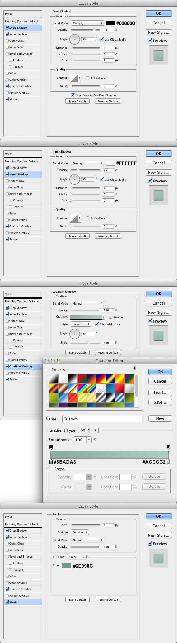
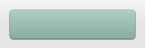
The headline now needs some styling applied to really make it punchy. Apply the following styles to your text:
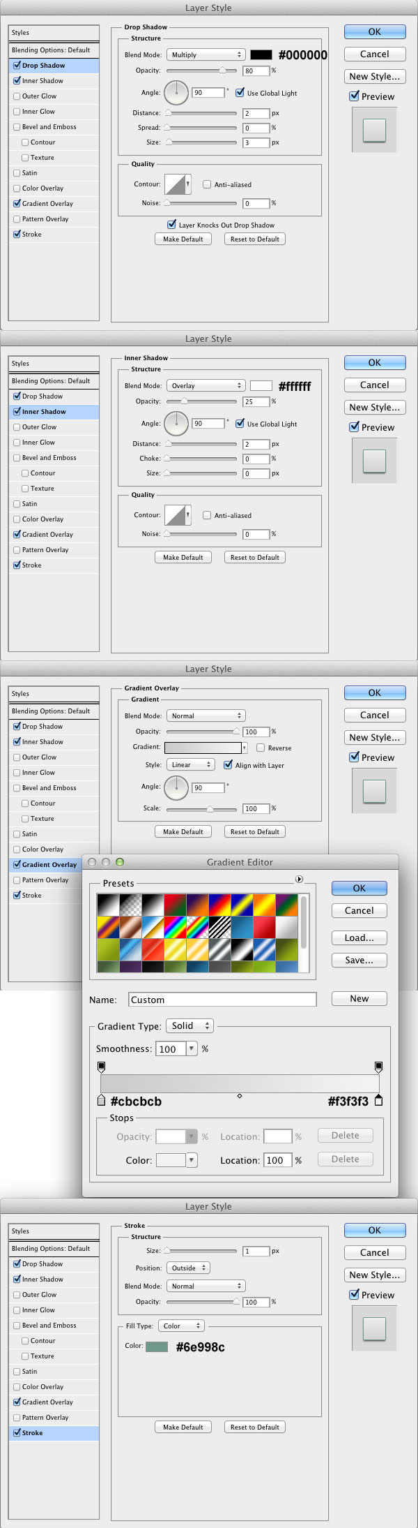
A few notes about the layer styles we’ve just applied: the Drop shadow lifts the text from the background a little and allows us to use light text on a light background due to the darker border it applies. Also, if we look at the Inner shadow, we have used it to create a highlight rather than shadow, by setting the “Size” to 0 we are creating a solid line rather than the diffused shadow normally seen, this highlight on the top also re-enforces the lighting given by the gradient (the light source coming from above).
And that’s the headline done!
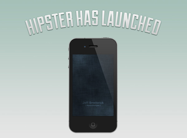
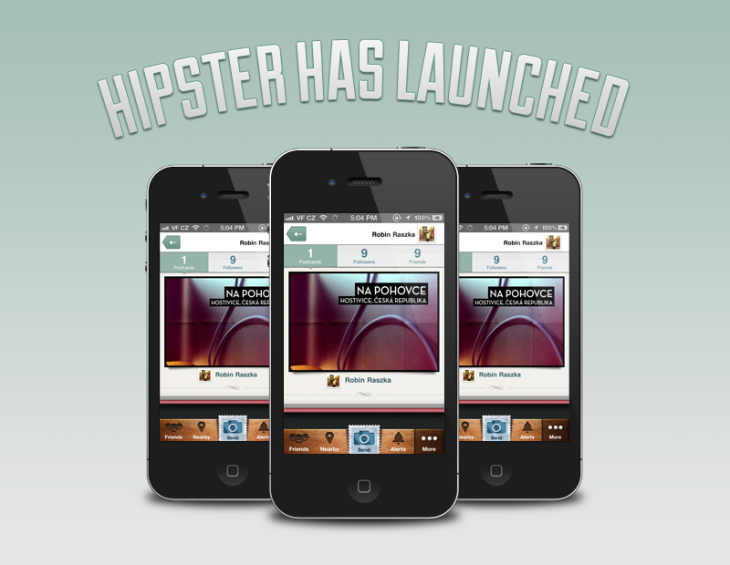
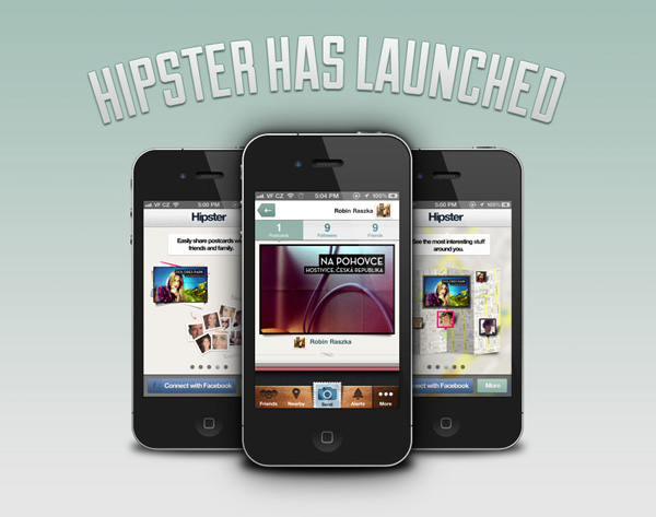
Step 5: iPhones
We will now be adding the iPhone into our design. Download Jeff Broderick’s great iPhone 4 from Dribbble.
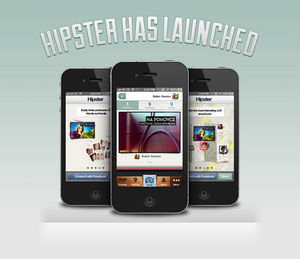
Now open up the PSD and drag the whole iPhone group over to the document you’re creating the email in. Next we need to resize the iPhone to 210px wide, use the same method we used when resizing our headline text to ensure the aspect ratio stays the same. Center the iPhone and place it just below the headline text, like the image below:
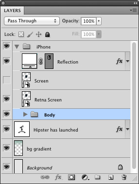
Next up, let’s optimize our document a little. Although our file won’t be huge at this point, by reducing the number of layers in the document we are not only making the final file size smaller, but also reducing the clutter in the document (All great news if you’re passing your document onto a developer.)
Expand the iPhone group so you can see the contents, it should look like this:
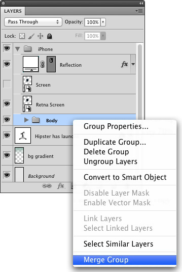
Now right-click on the “Body” group and click “Merge Group”.
TIP: you can also press cmd/ctrl + E with the group selected to achieve the same result.
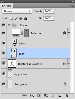
Now delete the “Retina Screen” smart object and turn on the visibility of the “Screen” smart object. Your layer panel should now look like this:
Next up, we need to get a screenshot of an app onto the screen. You can open up the smart object in one of two ways, either right-click and click “Edit Contents” or double-click the layer thumbnail.
This will open up a new document with just the screen. Now paste in either your app screenshot or grab one from Pttrns, a great website showing design patterns in iOS apps.
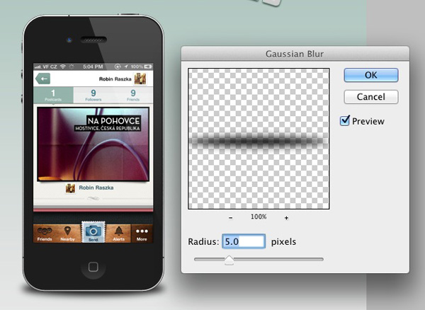
Next we’re going to create a shadow for the iPhone. In order to create more depth in our design we’re not going to use a drop shadow, which would give the impression we are looking at the iPhone from above, instead we will be placing a shadow at the base of the iPhone, which will give the impression of the iPhone being stood upright.
First thing to do is draw an ellipse using the Ellipse Tool, this should be 210px by 20px and positioned with the center roughly inline with the base of our iPhone as below:
It’s time to make this look more like a shadow, first off right-click on our shape layer, convert it to a smart object, and rename the layer to “Shadow”. Now we’re going to go to Filter > Blur > Gaussian Blur and set the radius to 5.0px.
Step 6: More iPhones
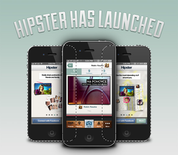
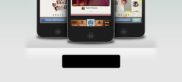
Our design is looking good but a little empty, time to add more iPhones. First step is to duplicate our “iPhone” group (so we can navigate our document a little more easily name this new group “iPhone 2″). With our new group selected transform this group to 210px wide using the same method we used on the first iPhone group and our headline text.
Position the bottom of our “iPhone 2″ group 20px higher than the base of our first iPhone and 20px to the right of our 130px ruler. Make sure the “iPhone 2″ group is now below the “iPhone” group. It should look similar to this:
Duplicate the “iPhone 2″ group, rename this new group to “iPhone 3″ and place it 20px to the left of our 670px ruler.
So we have all three of our iPhones placed, but they all have the same screenshot. However we have a little issue, if we go into the smart object used for the screen it will update all three of our screenshots.
To get round this right-click on the “Screen” smart object and click “New Smart Object via Copy” then delete the first “Screen” layer. Now go through the same steps we used to update our first screenshot with this one. Then repeat this for the other iPhone, your document should now look like this:
By placing these smaller iPhones behind our first and higher up (in 2d space) we are creating the illusion that the design has depth to it. In the next step we’ll be re-enforcing this effect by taking note of how light and shadow would fall if this were a photo.
Step 7: Adding Depth
We have our iPhones in and some depth added to the overall composition, now we’re going to take a few extra steps to emphasize this even more.
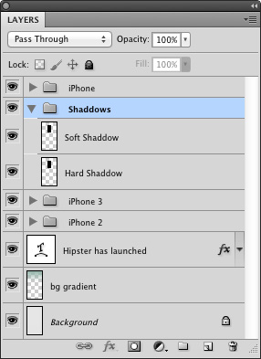
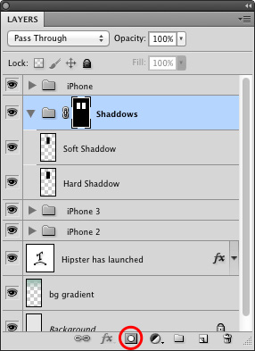
The first thing we’re going to do is create a shadow of the front iPhone falling on the two rear iPhones. Duplicate the “iPhone” group and name it “Hard Shadow”. Now merge the group either by pressing cmd/ctrl + E or by right-clicking then “Merge Group”, this flattens the group into a single raster layer, which we can then edit to create our shadow.
With the “Hard Shadow” layer selected bring up the Hue/Saturation menu – this can be done by either going to Image > Adjustments > Hue/Saturation or by pressing cmd/ctrl + U. Then simply slide the Lightness value to -100 to turn our selected layer completely black.
Duplicate the “Hard Shadow” layer and name this new layer “Soft Shadow”, then create a new group with both of these layers in called “Shadows” and place it behind our “iPhone” group but in front of “iPhone 2″ and “iPhone 3″.
Our shadows are in the right place, so we need to get them blurred. We have two shadow layers, our “Hard Shadow” will be a stronger harsher shadow, a lot less blurred than “Soft Shadow” which will be blurred much more. This will create a more realistic shadow than a single layer. Place any object on your desk, you should see a tight strong shadow and a wider softer shadow.
Select the “Hard Shadow” layer and apply a 5px Gaussian blur, then select the “Soft Shadow” layer and apply a 20px Gaussian blur. Your shadows should look similar to what is shown below:
Our shadow is now in, however if we look above the iPhones and below the main iPhone we can see it’s spread much more than we wanted, and is distorting the 3D look we’ve achieved so far. To solve this we are going to create a layer mask on our shadows group constraining the shadow to just the two rear iPhones.
Expand both the “iPhone 2″ and “iPhone 3″ groups so you can see the “base” layer. cmd/ctrl click on the layer thumbnail of the base layer in “iPhone 2″ to create a selection, now cmd/ctrl + shift click on the base layer in “iPhone 3″, this will add to the selection. You should now have a selection around both of the rear iPhones.
Now click the layer mask button with the shadows group selected.
There’s just one more step to get our shadow looking even more realistic. If we look at the light source on our iPhones we can see it comes from above, therefore our shadow should be weaker at the top getting gradually stronger as it gets lower and therefore further away from the light source.
With the layer mask selected, grab the gradient tool with a black to transparent gradient, set the opacity to 30%. Now draw a gradient from the top of the main iPhone down about two thirds.
TIP: remember, holding shift will ensure your gradient is drawn straight!
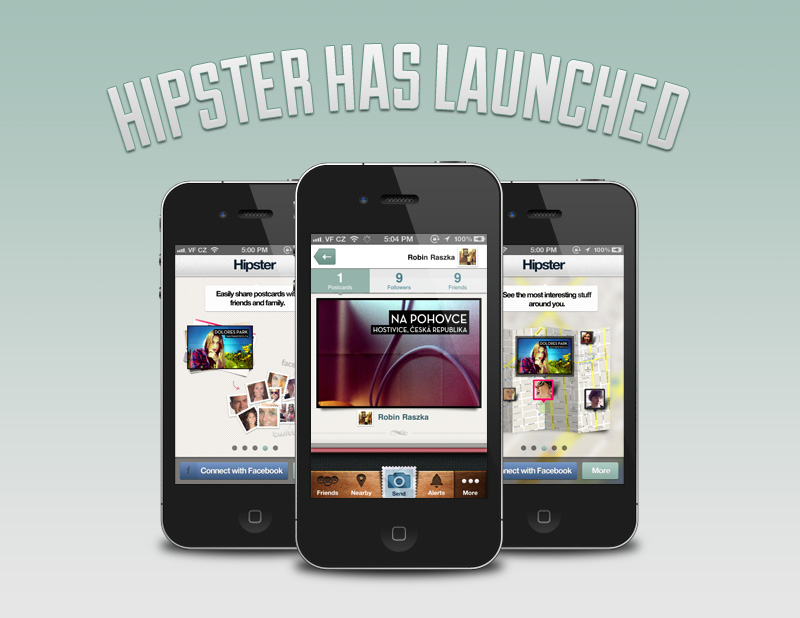
Step 8: The Floor
Next we’re going to create a faux floor on which the iPhones will sit, this will again further enforce the 3D effect we are aiming for. However in this case it will also provide a visual break in the composition allowing us to transition into our grid much more seamlessly. (This is a great technique to employ if you ever find yourself needing to swap from three columns to four columns.)
Firstly create new layer called “dark”, place it below the iPhone groups and make a selection about 100px tall and the full width of the document.
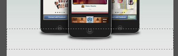
Now draw a black to transparent gradient from the bottom of this selection to about half way up. (Make sure you’ve put the opacity back to 100% after making it 30% when we were editing our layer mask!)
Then deselect the selection, this can either be done by going to Select > Deselect or by pressing cmd/ctrl + D.
Move the base of this gradient about 20px below the base of the main iPhone and set the opacity of the layer to 10%. It should look similar to this:
Add a layer mask to this layer (using the same method we used to add one to our “Shadows” group earlier). With the layer mask selected draw a black to transparent gradient from the first guide to the second and from the last to penultimate guide as shown below.
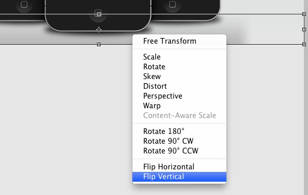
Duplicate this layer, name it “light”, then press cmd/ctrl + T to activate free transform, right-click and Flip Vertical.
After confirming this transform by hitting return, open the Hue/Saturation menu as we did when creating our shadows. Set the Lightness to +100 hit “OK” set the layer opacity from 10% to 60% and position the top of this “light” layer touching the bottom of the “dark” layer.
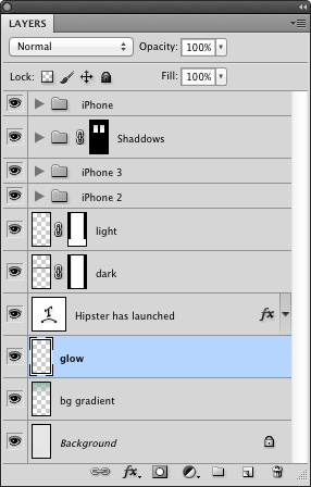
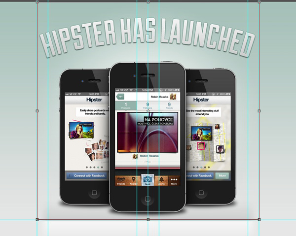
As a final touch we’re going to create a glow in our background. Create a new layer above the “Background” layer and “bg gradient” layer, name this new layer “glow”.
Select the gradient tool, using a white to transparent gradient set to “Radial Gradient” draw a gradient smaller than the canvas size.

Then using the free transform tool make the sides meet the outer guides, the top meet the top of our document and the bottom meet our guide at 590px down the page.
To keep things tidy group all the layers so far into a single group called “Header”.
Step 9: Call to Action
So we’ve now told our audience that we’ve launched our product, shown them some screenshots of it and hopefully got them ready to download the app! This is where a Call to Action comes in; a device (in most cases a button) we use to allow the user to take action, in this case download our app.
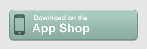
Using the Rounded Rectangle tool with a corner radius of 7px draw a new shape of 255px by 58px and call this layer “base”. Place it above all the other layers in our document. Position it in the horizontal center of the document and 30px below the base of the “dark” layer we created in the previous step.
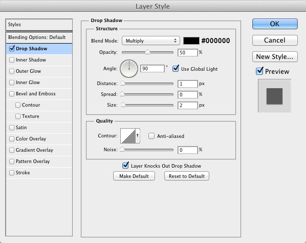
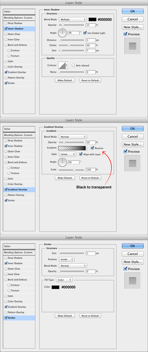
Now apply the following layer styles:
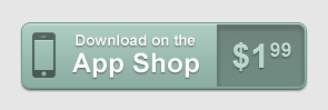
Your button should now look like this:
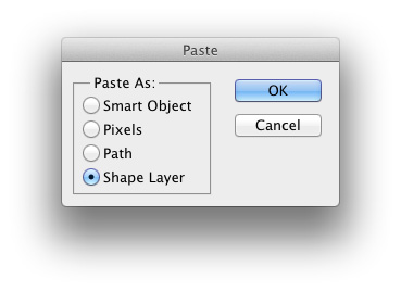
Time to add some content to this button. First download an iPhone icon from thenounproject.com then open the file up in Illustrator. Using the selection tool drag a selection over the whole icon and copy either by pressing cmd/ctrl + C or by going to Edit > Copy.
You can now close Illustrator, go back to photoshop and paste the icon, either press cmd/ctrl + V or Edit > Paste. You will be presented with the following window, choose “Shape Layer” and then click “OK”.
Now that the shape is in our document make sure it’s filled with the color #000000 and resize it to 41px tall (ensuring the aspect ratio is locked) then place it in the vertical center 10px from the left side.
We are now going to give the icon an inset look, as if it has been pressed into the button. To do this set the fill to 50% and apply the layer styles shown below:
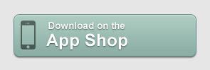
Giving the following appearance:
We’re now going to add some text to the button to tell our audience what clicking the button will do – I’ve decided on the phrase “Download on the App Shop”. This achieves two objectives, it firstly informs them the button will either begin a download or take them somewhere to initiate the download, and also where it is available.
Place one line on top of the other as shown below. I’ve used Arial Bold in white #ffffff for both lines of text, the top is set at 13.5pt and the lower line is at 24pt. Again, center this vertically and place it 15px to the right of the right edge of the icon.
To give the text a little extra pop and make it more readable we are now going to apply a simple drop shadow, use the settings below for both lines:
This app is a paid for app, it’s a good idea to show our audience the price at this stage so they don’t get a nasty surprise when they go to download it. Not only are we allowing them to make a more informed decision now, we’re also preventing a bad experience with our product, leading to a happy customer.
The first thing we need to do is duplicate our “base” layer call this new shape “inset”, now grab the rectangle tool and set it to “Subtract from shape area” as shown below.

With the vector mask of our new “inset” shape selected draw a rectangle which covers the whole button up to 15px to the right of our text.
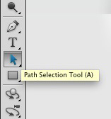
Now select the “Path selection tool” and hit “combine” on the top bar.

Next set the fill of this layer to 20% and apply the following layer styles to it, these will give the impression that our price section is dropped into the button and help differentiate the two sections.
Create a new text layer with the price of your app, I have used the “Superscript” option in the character panel to generate the smaller numbers, the color used was #b6d9ce, and the rest of my settings for the text are shown below:
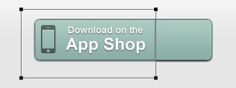
Center this price both horizontally and vertically, add these layers to a new group named “CTA” and your button should look like this:.
Step 10: Adding Content
Up to this point our email is looking pretty, but we haven’t been able to tell our audience anything. We need to add some text.
Draw a new rounded rectangle with a border radius of 7px with the dimensions of 600px by 168px in white (#ffffff) and placed 30px below our call to action. Call this new layer “base”.
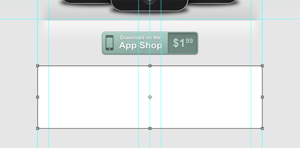
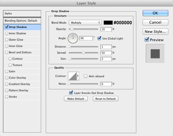
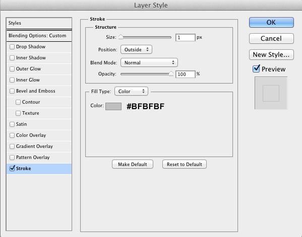
We have the main container for our text in, however it is very close in color to our background, we need to make it stand out a little. Apply the following layer styles to give it that little extra punch:
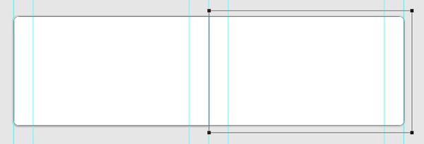
Now duplicate the “base” layer and name the new layer “mask”. Grab the rectangle tool and drag a subtracting rectangle over the right half of the mask layer, this uses the same method we used to create the inset section to our call to action. (Use the guides we created at the beginning to show where the center is).
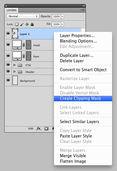
We’re going to use this “mask” layer to create a clipping mask for screenshots of the app. First right-click on the “mask” layer and click “Clear Layer Style” then paste in a screenshot of your app above the “mask” layer. Right-click on the screenshot layer and click “Create Clipping Mask” this will make sure the only areas of the screenshot that are visible are those areas over our “mask” layer.
Now reposition your screenshot so that the feature you want to show is clear and will grab the attention of your audience.
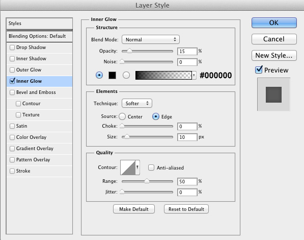
To ensure lighter screenshots don’t appear to bleed into the white are we are going to use for our text we will apply a small inner glow to the “mask” layer. That’s one of the great things about clipping masks, all the layers above inherit the layer styles of the mask layer. Just use the settings shown below:
Group the “mask” layer and your screenshot layer into a new group called “screenshot”. Then duplicate the “base” layer. Position it at the top of the layers panel and with the fill set to 0% apply the following layer style:
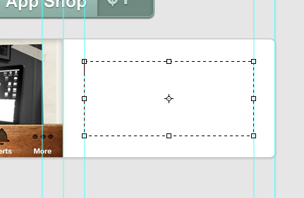
Now we have an image placed, we need to add our text. Turn on the guides again and draw a text box (by dragging a box out with the text tool rather than clicking) which goes between the guide to the right of our center guide and the penultimate guide, then ensure a 30px gap at both the top and bottom of the box.
Enter a headline for this first feature, I set my title in Arial Bold, at 24pt and in the color #15ae7e.
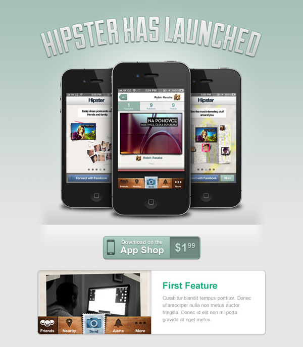
For the body text I set it again in Arial but this time regular. This text was at 13pt and the color #999999. Your email design should now be looking something like this:
Now we need to add two more of these feature blocks. The easiest and fastest way to do this is to group all the layers that make up this first feature box, name this group “Feature 1″.
Now right-click on the “Feature 1″ group and click “Duplicate Group”. Name the new group “Feature 2″ and place it 30px below the first feature. Repeat this step to create a third feature box.
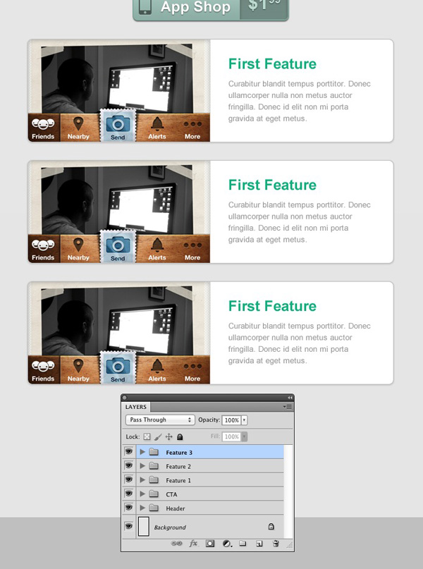
Using the same methods we used to create the first screenshot, swap the screenshots in both “Feature 2″ and “Feature 3″, then update the text in each of these too.
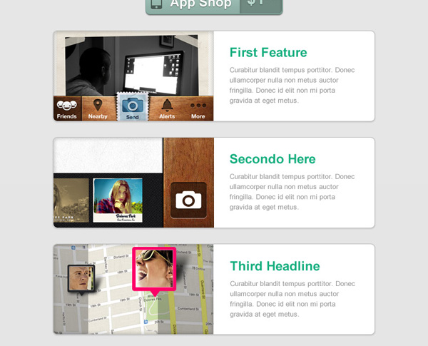
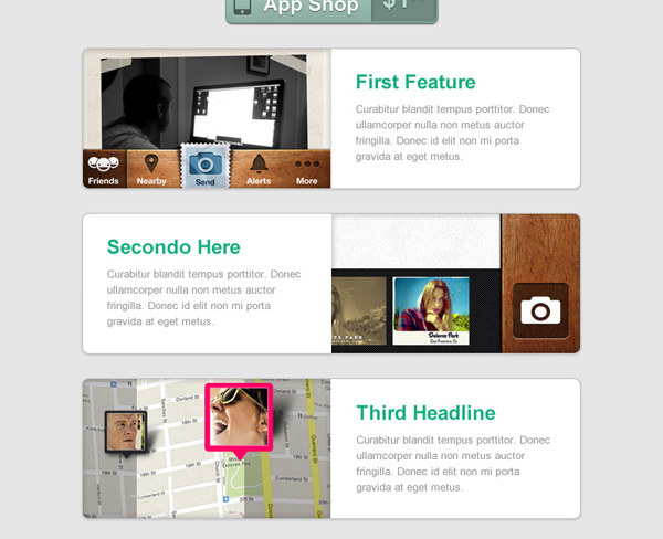
The feature area looks finished, however we can employ a useful psychological trick to improve the chances of our audience reading the content we’ve written and also balance out the composition of your email a bit more too.
We’re going to flip the center feature, move the screenshot to the right and the text to the left. This will prevent the viewer of the email from scanning down the headlines and will instead make them move across the email, in turn reading a lot more of the text.
First move the text in “Feature 2″ over to the left, align it with the second guide and the guide just before the center guide. Then select the “mask” layer, go into Free Transform, right-click and “Flip Horizontal” then grab the “screenshot” group and move it over to the right.
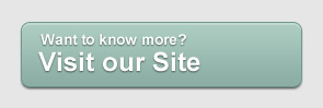
Step 11: A Final Call to Action
We’re going to add another call to action below our features, this should improve the effectiveness of our email campaign – assuming we have our audiences attention through showing them features they will likely want to know more. By placing a button allowing them to do just that straight after the features, we are streamlining the experience.
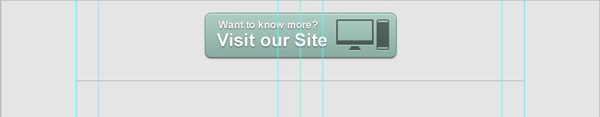
Duplicate the “CTA” group we made earlier and place it 30px below the features and at the top of the layer palette. Then delete all the layers except the first “base” layer and the two text layers.
In this case our second call to action will push users to visit the apps website. For this reason my new text will be “Want to know more? Visit our Site”. Once you have changed the text place it 10px from the left edge of the button.
We are now going to add an icon on the right of the button, download this computer icon from the noun project, import it into photoshop using the same method we used to get the iPhone icon into our document.
Resize it to 41px tall and place it 10px from the right of the button.
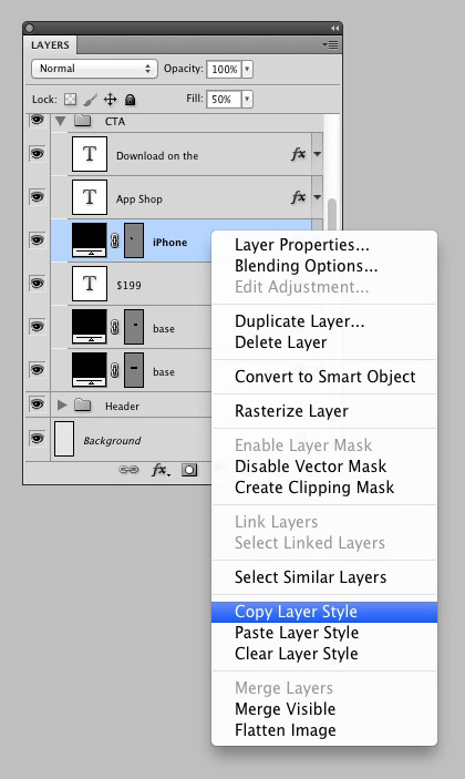
Now go back to our first “CTA” group, right-click on the iPhone icon and click “Copy Layer Style”. Go to the icon you have just imported, right-click then press “Paste Layer Style”. This will replicate the styling from our first button creating a cohesive feel to our design.

Step 12: The Footer
There are a few bits of information we still need to include, some of these are required by law, such as an unsubscribe link, others are just nice and will help keep more people signed up to the newsletter (for example, stating why they are receiving the email).
The first thing we need to do is draw a 600px wide line 30px below our button – this will serve to show a division of content. Draw this line in black (#000000) then set the opacity to 20%.
Now draw a text box from the second guide to the penultimate guide, 10px below the line we’ve just drawn. I filled this text box with the following text:
You are receiving this email because you elected to get updates regarding the launch of Hipster. If you would like to unsubscribe from future updates just click here.
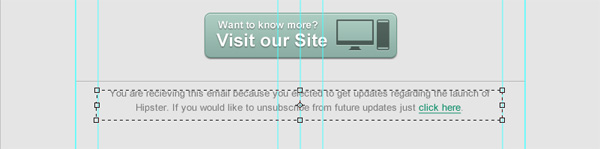
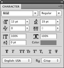
The settings I used are below, the text color being #808080.
In Conclusion
Our email template is now complete! Hopefully you’ve learnt some great techniques which you can carry through to other projects.
I would recommend getting familiar with clipping masks and smart objects if you aren’t already, they can really speed up your workflow and give some great effects which are hard to achieve using other methods. Best of all, they are non destructive, meaning you can go back and amend them later if needed.
Thanks for reading!