The Multi Column Layout Module has been introduced to help us create columns quickly and easily using CSS3 only. In this tut I’m going to be taking a look at some of its properties and demonstrate them through a series of examples.
Introduction
Anyone who has tried to create multiple columns in the past using CSS will already know that this type of layout has been achievable for a long time. However, this has often resulted in the use of hacky techniques and floats. More often that not this has been quite time consuming and definitely not the easiest of layouts to create. The truth is creating multiple columns using CSS has been an extremely awkward process up until now. The multi column layout module offers more flexibility and control over previous CSS methods.
The new approach, which is an extension to the current CSS box model, allows content to run from one column to another and makes it easily adaptable for different viewing devices and dynamic data.
Browser Support
Ok, so before you get too excited about this new module it’s important to understand which browsers support it, which prefixes to use and a few browser limitations.
Supported Browsers
- IE10+
- Firefox 5+
- Chrome 12+
- Safari 3.2+
- Opera 11.1+
Both Chrome and Safari use the ‘-webkit-’ prefix. Firefox uses the ‘-moz-’ prefix. Opera and IE support all the properties without the need for a prefix. For some reason Chrome, Safari and Firefox don’t support break-after or column-fill properties, whilst Safari and Firefox don’t support column-span. Saying that, I’m sure these properties will soon be available in future updates.
A Quick Example
Before we take a look at the properties used in the multi column layout module I’m going to show you a quick example to help you understand how it works a little easier.
Here’s a preview of how the columns will be rendered:

First, the html for this example it super simple. We simply create a div with a class of ‘columns’ and a bit of a lorem ipsum dummy text.
  <div class="columns">  <p>Dignissim tristique a, auctor massa in nascetur lundium, nascetur mid integer dis et egestas rhoncus ac aliquet turpis integer velit, est dolor porttitor auctor, elementum porta sit tristique urna ac proin odio, habitasse ridiculus, non nunc nisi ac integer ultricies vel ac, phasellus ac? Scelerisque, ac sagittis sociis vel dictumst! Ac odio, dis placerat mus platea odio a in arcu! Urna et aliquam, a! Proin. Dolor lacus dolor adipiscing eros, et tincidunt, lundium aliquet tincidunt, porta, placerat urna nec! Urna, adipiscing enim mid ut. Enim amet, a ac mauris vut porttitor risus integer elit, dis odio sed pulvinar ridiculus sit. Dignissim tristique a, auctor massa in nascetur lundium, nascetur mid integer dis et egestas rhoncus ac aliquet turpis integer velit, est dolor porttitor auctor, elementum porta sit tristique urna ac proin odio, habitasse ridiculus, non nunc nisi ac integer ultricies vel ac, phasellus ac? Scelerisque, ac sagittis sociis vel dictumst! Ac odio, dis placerat mus platea odio a in arcu! Urna et aliquam, a! Proin. Dolor lacus dolor adipiscing eros, et tincidunt, lundium aliquet tincidunt, porta, placerat urna nec! Urna, adipiscing enim mid ut. Enim amet, a ac mauris vut porttitor risus integer elit, dis odio sed pulvinar</p>
</div>
The multi column layouts module is quite easy to describe and understand in CSS. Here’s an example:
.columns{
 column-count: 4;
 column-gap: 10px;
}
First we use ‘column-count’, to dictate how many columns are needed (I’ve used 4 in this example).
We then say how big we want the gutter (the gap between the columns) to be. In this case I’ve used 10px.
By adding these properties it allows our lorem ipsum dummy text to flow between the 4 columns. It really is this simple to get started. By now you should be starting to see how simple this is to use.
CSS Properties
Let’s take a look in more detail at some of the properties which can be found in the multi column layout module.
Column Count and Width
Setting the number or the width of columns is important to the multi column layout content. Columns should be set by using either ‘column-width’ or ‘column-count’, but should never be used together. Both of these properties are by default set to ‘auto’.
Column Width

‘Column width’ does exactly what it says on the tin. It allows you to specify a fixed width for the columns. The measurement of this width can be carried out in the standard way using px, ems etc. Depending on what you enter for the column width it can vary and may be slightly wider or narrower to fit the space available. If this property is set to ‘auto’, then this means the width of the columns will be dictated by other properties, such as the one below.
Value options column-width: (length) | auto;
Column Count
Should you want the layout to be split into a number of specified columns then this is the property that you would opt for. By setting the value of this the content is divided into the required amount of columns. If this property is set to ‘auto’, then this means the number columns will be decided by other properties, such as ‘column-width’.
Value options column-count: (number of columns) | auto;
Columns
‘Columns’ is effectively a shorthand property that allows you to set the ‘column width’ and ‘column count’. Here are a view valid values that you might associate with ‘columns’:
columns: 12em;  /* column-width: 12em; column-count: auto */
columns: auto 12em; /* column-width: 12em; column-count: auto */
columns: 2;   /* column-width: auto; column-count: 2 */
columns: 2 auto;  /* column-width: auto; column-count: 2 */
columns: auto;  /* column-width: auto; column-count: auto */
columns: auto auto; /* column-width: auto; column-count: auto */
Column Gap

‘Column gap’ give us the opportunity to add a space between each of the columns and gives the content room to breathe. We specify the width of the gap using standard CSS measurements. The width of the gap that you specify cannot be negative.
Value options column-gap: (length) | normal;
Column Rule

‘Column Rule’ effectively puts a border down the middle of the ‘column-gap’. Therefore, to enable this, a ‘column-gap’ width must be specified that has the same or larger value than the column rule. The column rule also has several separate sub properties as well as a shorthand version. This shorthand version works in the same way as the shorthand ‘border’ property. You can see this below:
column-rule-width:1px;
column-rule-style: solid;
column-rule-color: #000;
column-rule: 1px solid #000; /* This is the shorthand version */
Column Span

‘Column-span’ allows us to span across all of the columns. If we take our simple example from earlier and add a h1 title to our content, we can easily get this h1 tag to span the entire 4 columns by adding column-span:all to it. Have a look at this demonstration:
h1{
 column-span: all;
}
Value options column-span: all | none;
Column Fill
The ‘column-fill’ property gives us two controls for setting how the amount of the content is balanced over the columns. If set to ‘balance’ then the variation in the column length will be minimized and all lengths will be as equal as possible. If set to ‘auto’ then the columns will be filled in order and (for instance) may result in the 4th of 4 columns having less content than the 3 previous columns. If balance was set on this then it would allow all 4 columns to be roughly of equal height. This property solves the problem of undesirable gaps being left in the content.
Overflow
‘Overflow’ should be used to control what happens if the content overflows the columns. If for instance the main ‘columns’ div had a fixed width and the content of the columns extends this then we can control whether this should be shown or clipped using the ‘overflow’ property.
In the example below we can see that the columns overflow the div. This is due to overflow not being set to ‘hidden’ on the parent element.

Example 1
The old Method for Creating Multiple Column Layouts
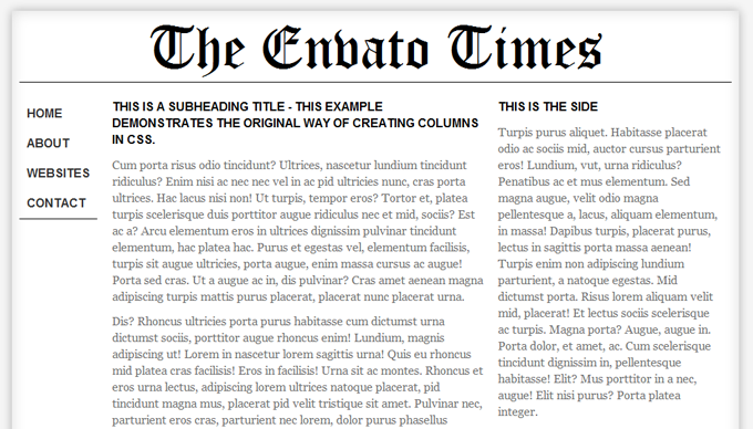
I’ve put together a few examples which you can download at the top of this page. I have done this to show how you might use this new module in different situations so that you can see how easy it is to change the layout of your code just by changing a few properties in the CSS markup.
This first example demonstrates the old method for creating multiple columns using CSS3. It has been achieved by adding a ‘float:left’ to the ‘navigation’, ‘the main content’ and the ‘sidebar’.
Sure, this works OK and you can achieve the desired effect. However, the flexibility really is quite restricted. If you were wanting to add extra columns or change the layout then you have to rely on adding extra markup, moving elements around, and it can be quite tedious. This new module changes all that.
Example 2
The New Method

This example above shows the new method for creating the columns. This time, rather than using it on the main body elements I have added the CSS3 Multiple Column module to the ‘main content’ where you can see that the content has been divided into 3 columns.
To change the number of columns, it’s as simple as changing a number.
Example 3
Other Features

In this last example I’ve kept with using it on the main content, but also added some extra divs to show how you can change the layout quite simply. I’ve also added ‘span:all’ to the lower ‘h1′ tag so that the headline stretches across ‘all’ columns. Lastly, I’ve added a rule to it by including ‘column-rule: 1px dotted #999999;’ to the CSS.
It’s all worth noting at this point that I’ve also included a javascript fallback in the examples, so that they work on browsers which don’t support the multi column layout module yet.
Fall Backs
As with any new CSS module; new toys save us time, but have an interim or crossover period that can sometimes take quite a while before competent cross browser compatibility is reached. We’re currently in the in between stage, where some browsers have caught up, some are catching up and some are left behind. It’s during this stage that we need to have a backup plan or fallback for the browsers that do not yet feature support. Luckily Cedric Savarese has come up with a script that reads our new CSS3 property values and displays the columns using javascript. You can read how to implement this and download the script on A List Apart.
Multi Column Layout Generator

If at this stage you’re dying to jump in and play around with some of the properties that we’ve discussed today, then I’ve knocked up a quick ‘multiple column generator’ that you can have a mess around with. It’s nothing fancy, but after a little fiddle with it you should be able to grasp the basic concepts of the ‘multiple column layout module’ and be able to start using it in your own projects.
You can also download the generated code so that you are able to further experiment with some of the other properties that are not included in the generator.
CSS3 Multiple Column Layout Generator
Summary
So that brings us to a close on the CSS3 multi column layout module. I hope you now have a better understanding of how to use it. It really is quite simple to use once you’ve had a little play around with it. Despite being new and having a few browser support limitations, it is starting to make its way around the Internet and I’m sure it’ll only be a matter of time before it’s a fully approved and implemented CSS module.
It gives us the ability to explore some great layouts with CSS. Experiment with it, have a mess around with it and download the source files for the examples at the top of this tut. I’d be keen to hear what you have to say and think about this new module, let me know in the comments below.
Further Links, Reading and Resources
- Official Recommendation – CSS3 Multi Column Layout
- FireFox Extension – Make any webpage utilise the multi column layout module
- CSS3 Multi Column Layout generator