Modal boxes are among the most effective “bang for your buck” design elements that a web designer can employ. Today, we’re going to define a modal box is… then we’ll look at the best ways to use them and suggest a handful of our favorite scripts to employ them in your own projects.
March of 2011
What Is a Modal Box?
Put simply, a modal box is a scripted effect that allows you to overlay a small element over a website. The primary benefit of modal boxes it that they avoid the need to use of conventional window pop-ups or page reloads. In short, modal dialog windows are a means to swiftly show information to users on the same page they are working on, thus improving the usability of your site and decreasing unnecessary page reloads.
So, it’s a Lightbox, right? Well, not exactly. A lightbox is a type of modal box that has been designed to display images (and sometimes other forms of content), but the word modal box refers to a much wider set of user interface devices, which we’ll discuss.
Modal boxes find their origin in interface applications such as Microsoft Windows, Mac OS and UNIX, but lately they have spread throughout all kinds of situations – from websites to mobile applications.
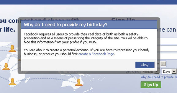
A common modal box might use Javascript to create a modal “dialog” or “wizard”, which amount to forms where users are usually asked for information that’s relevant to what they are browsing. For instance, if you are on Facebook, a modal dialogue box might pop up to ask for permission to use an app. Or your bank website might launch a modal box to inform you when you session is about to time out.
There are five situational categories where modal boxes are commonly used:
- Error: To alert users of an error.
- Warning: To warn users of potentially harmful situations.
- Data: To collect data from users.
- Confirm or Prompt: To remind users to do something before moving on.
- Helper: To inform users of important information.
Now that we know what a modal box is, let’s discuss the difference between a modal box and it’s cousin, the modeless box.
The Difference Between Modal and Modeless
Before we move on, let’s clear up a potentially confusing bit of terminology in the world of user interface design: the difference between modal and modeless (aka non-modal) design elements.
Modal dialog boxes will not permit users to work with the parent window once they are invoked; While modeless dialog boxes will permit users to access the parent window, even after they are invoked.
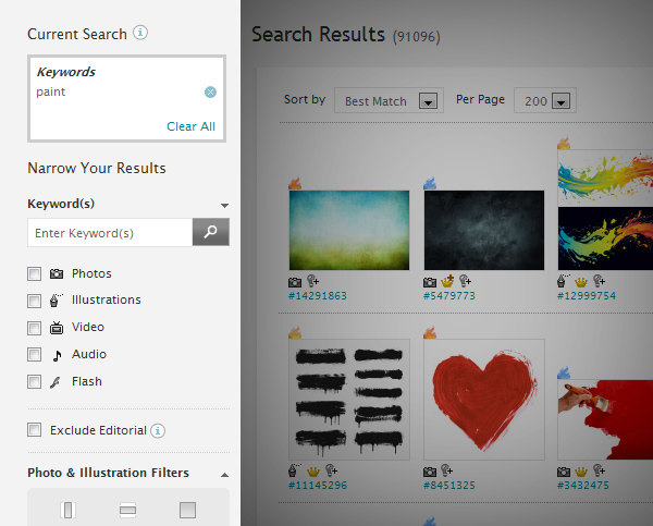
An example of a modeless element – iStockPhoto uses an elaborate sorting system on the left side of their search results page.
A user must close the modal dialog within the application in order to access menu options or other dialog boxes; But the modeless dialog box can be left open while the user continues to work. In graphical user interface design, the modal window is called child window, and it is meant to draw the user’s awareness to emergency situations.
Common modeless design elements might include:
- Toolbars
- Accordion Menus
- Social Media Docks
- Advanced Search Menus
A good analogy would be to compare a modeless box to a good friend who is always available to help out in a tough situation, but isn’t high maintenance or demanding… where a modal box is that annoying friend that demands your attention immediately and forces you to drop everything to listen to them on the spot.
Likewise, modal boxes, when launched, should only be used in situations where they are really necessary.
For instance: Informing users that they must change their password immediately for security reasons is important – use a modal box in this scenario. Informing users that you just launched a new e-book probably isn’t important enough to warrant a modal box – so you could probably announce this in another creative way on the page.
When to Use Modal vs. Modeless and Potential Problems
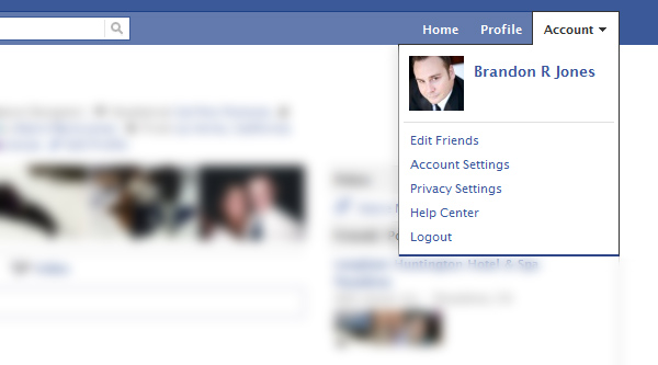
An example of a modeless element – Facebook allows you to open up mini menus.
Modeless boxes are used if the requested information is not mandatory to proceed, so the window may be left open while the work is continued. For instance, a toolbar is a modeless dialog box,
and its items can be used to choose particular features of the application. Normally, an ideal software design would invoke these types of dialog boxes as much as possible. They do not compel the user to any
specific mode of operation… meaning that they can work at their own pace, in the order that suits them.
However, a modal dialog box temporarily halts the interaction with the software, which initiated it. The program may demand some additional information or it may intend to confirm that the user has
decided to continue with some action which may be dangerous.
Usability experts opine that modal dialogs are not good design solutions, as errors are more likely. Users might have developed the habit of
dismissing them when unexpected modal dialog boxes pop-up. Thus, dangerous actions are actually not avoided.
Here’s another potential problem to be aware of: Modal boxes interfere with ordinary workflow. A modal dialog box interrupts the main workflow as the underlying parent window is frozen. Most of the time it can be moved or resized, but it cannot be minimized. Further, the user cannot refer to other windows, while responding to the dialog box.
Additional problems can arise: A modal error dialog box may appear unexpectedly while typing, discarding the input; When used in applications that use keyboard commands, modal windows might misinterpret keystrokes. This is known as focus stealing… modal windows are designed to steal a users focus… but overusing them can become frustrating becuase it throws too many roadblocks in from of a user.
The bottom line: Always start a design by trying to use modeless boxes whenever you can… they are unintrusive and allow a user to work in their own way. Reserve modal boxes for times when it’s absolutely necessary to gather information or alert a user to something urgent (and there will be plenty of these times!) Think of the modal box as your secret weapon… you don’t want to use it until you’ve exhausted your other design options, but when you do use it, it’ll get you out of a bind quickly.
Practical Uses of Modal Boxes
Modal boxes help in drawing the user’s attention to crucial information. Let me give you some examples of cases where a modal box is necessary:
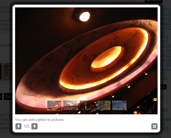
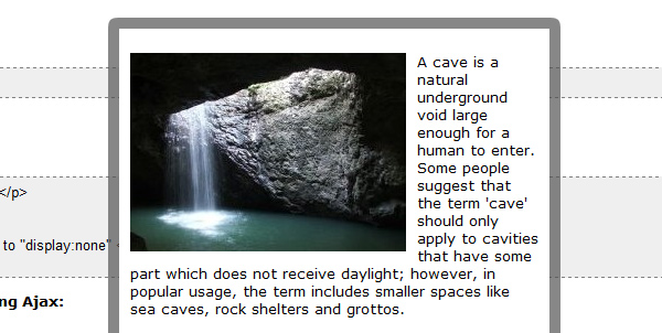
Image / Video Lightboxes
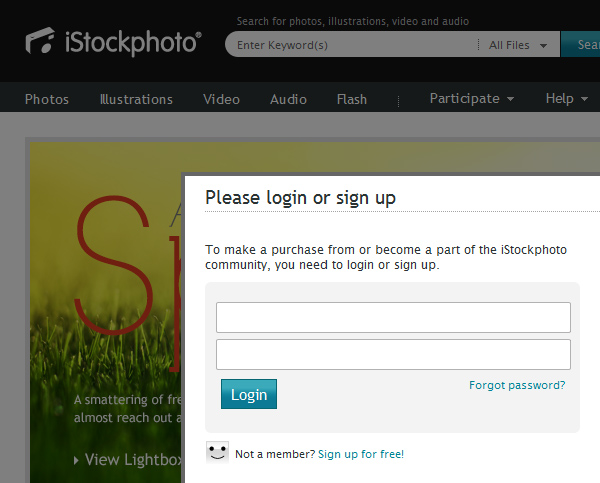
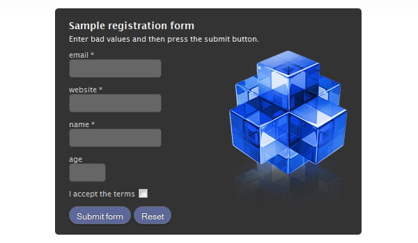
Login / Signup Forms
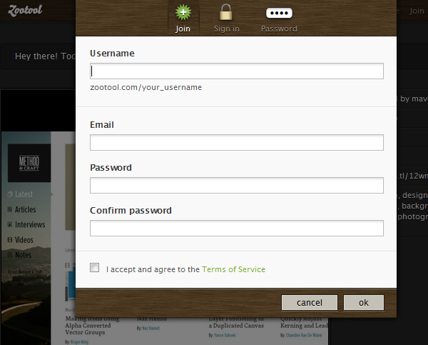
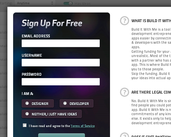
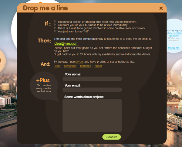
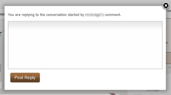
Contact / Comment Forms
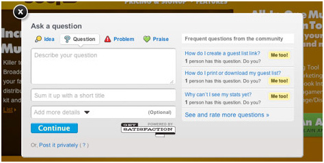
Alerts
9 Modal Box Scripts (That You Can Use in Your Own Projects)
Talking about the design aspects of modal boxes is great… but getting down to business and actually using them is another matter entirely. Assuming you aren’t a Javascript guru who can whip out lines of custom code from scratch, you’re going to have to start with a pre-built script package and customize from there. The good news is that there are a ton of free ones available – you just have to do a bit of extra research to determine which one fits your needs best. Here are some of our favorites:
jQuery UI
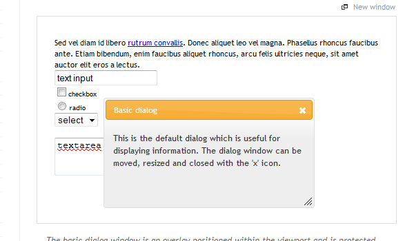
JQuery UI Dialog is part of the main jQuery UI library – which essentially is a library of effects and plugins built on jQuery. It is customizable via css and can be implemented in any project without restrictions. It’s probably the most direct of all of the modal box scripts in the sense that you’re working directly with the jQuery script library, not through a third party. You can use this dialog box in five different forms: basic dialog, modal dialog, modal message, modal confirmation, modal form.
prettyPhoto
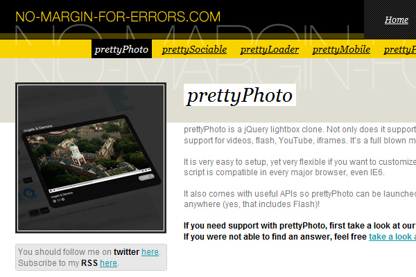
“prettyPhoto is a jQuery lightbox clone. Not only does it support images, it also support for videos, flash, YouTube, iframes. It’s a full blown media lightbox.
It is very easy to setup, yet very flexible if you want to customize it a bit. Plus the script is compatible in every major browser, even IE6.”
ModalBox
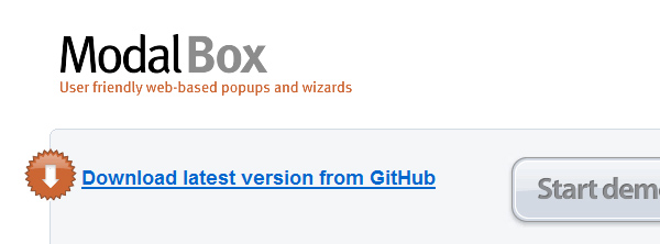
ModalBox is a JavaScript technique for creating modern (Web 2.0-style) modal dialogs or even wizards (sequences of dialogs) without using conventional popups and page reloads. It’s inspired by Mac OS X modal dialogs. And yes, it may also be useful for showing bigger versions of images.
NyroModal 2
One of the most comprehensive of the bunch, Nyro focuses on ease of customization and allowing a wide variety of content types.
SimpleModal
ModalBox is a JavaScript technique for creating modern (Web 2.0-style) modal dialogs or even wizards (sequences of dialogs) without using conventional popups and page reloads. It’s inspired by Mac OS X modal dialogs. And yes, it may also be useful for showing bigger versions of images.
FancyBox
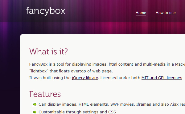
This is another lightbox driven modal. FancyBox is a tool for displaying images, html content and multi-media in a Mac-style “lightbox” that floats overtop of web page.
Facebook Modal
Facebox is a lightweight Facebook-style lightbox which can display images, divs, or entire remote pages (via Ajax) inline on the page and on demand. It uses the compact jQuery library as its engine, unlike Lightbox v2.0, which uses Prototype.
jQuery Tools
This is actually a complete set of jQuery drive tools… from a script that allows you to expose specific HTML elements to a full form builder.
Lightbox2

Lightbox is a simple, unobtrusive script used to overlay images on the current page. It’s a snap to setup and works on all modern browsers.
.
A Note on Browser Support
Several browsers do not allow pop-up windows to be modal, though others enable the creation of modal windows via different methods. Internet Explorer uses window-showModalDialog() to open a
modal window. Such a window will open when Internet Explorer is running, while other browsers will show a JavaScript error. Mozilla based browsers such as Firefox and Netscape 6 use a different method
to indicate that the dialog box should remain in front. They use the window.open with an additional attribute for modal, though it is not actually modal, but allows the window to remain in front.
The reality is that most designers don’t really need to worry too much about the intricacies of browser adoption until it’s time to do the coding… most modern browsers do in fact support modal boxes though. When in doubt, check with the documentation for the script that you want to use to verify that it’s going to work on the particular list of browsers that you need it to work for.
Alright, that’s it for now – feel free to post your own favorite modal solutions in the comments!