In any CSS Grid each line has an index number which we can reference to place grid items. However, we can also name each of these grid lines, making it easier to work with and maintain our grid layouts. Let’s take a look!
Grid is Coming
The most common response to any Grid tutorial is “but when can I use this?” and it’s a fair question. The fact is: Grid is coming, and it will be here soon.
“CSS Grid is going to become supported-by-default in Chrome and Firefox in March of 2017.” – Eric Meyer
If you haven’t taken a look at it yet, now’s the time!

Grid Line Numbers
When we declare a grid, each line is given an index number:

Note: Unless the layout is set with direction: rtl;, these numbers begin at the top left of the grid, working their way to the bottom right.
We can reference these numbers to place grid items:
.item {
  grid-column: 2;
  grid-row: 3;
}
In this example our .item element is positioned starting on column line 2, and row line 3:

Explicit Grid Line Names
With more complex grids, you can imagine that referencing everything by numbers might get a bit confusing. For this reason, the Grid module allows us to explicitly name our lines when we declare our grid columns and rows.
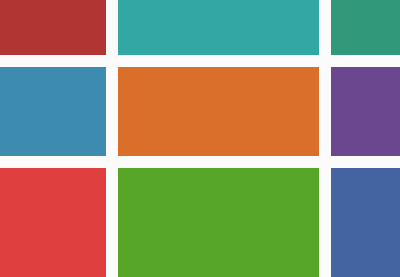
Let’s use an example like the ones we’ve used throughout this series. Here’s our basic 3×3 grid declaration:
.grid-1 {
  display: grid;
  grid-template-columns: 100px auto 100px;
  grid-template-rows: 60px 130px 50px;
  grid-gap: 20px;
}
Now we can wrap our column and row values with line names (whatever the heck we want), using square brackets:
.grid-1 {
  display: grid;
  grid-template-columns: [start] 100px [centre-start] auto [last-column-start] 100px [finish];
  grid-template-rows: [header-start] 60px [main-start] 130px [main-end] 50px [row-end];
  grid-gap: 20px;
}
We can now position items with names, instead of numbers:
.item {
  grid-column: centre-start;
  grid-row: header-start;
}
Some pointers:
- These names can be tailored to your own descriptive needs, so think logically about what will help you recognize and remember areas of the grid.
- The original line numbers remain in operation, so you can still use them.
- You can declare multiple names for one line, for example:
[main-end footer-start row-5]etc. - Even if you name your grid lines, you’re not obliged to use them, so it’s a good “just in case” habit to get into.
Implicit Grid Line Names
When we deliberately do things, like naming grid lines, that’s said to be explicit. When something is implied, but not directly stated, that’s referred to as being implicit. We’ve covered explicitly naming grid lines, but there are also circumstances where lines are given names implicitly.
You may recall from a previous tutorial that it’s possible to define grid areas.
We might define four grid areas like this:
.grid-1 {
    /* ..existing styles */

    grid-template-areas:    "header header header"
                            "main main sidebar"
                            "footer footer footer";
}
This gives us the following:

Naming a grid area header automatically assigns names to its four boundary lines too. The row lines around it become header-start and header-end, and likewise the two column lines also become header-start and header-end. The same applies to the other areas, which are given line names main-start, main-end, sidebar-start and so on.
Note: Looking at things in reverse, explicitly adding named lines in the same format (header-start and header-end) will create a named grid area of header.
We can use these line names just like we have previously, to position items. And again, they exist in addition to any names you define yourself, and the original line index numbers.
End of the Line
That’s it for this quick tip! Remember: get into the habit of naming your lines and areas for easier grid management and maintenance.
