This tutorial will teach you how to create a responsive web page with buttons which take on different states depending on the user’s interaction. This type of interaction is especially useful on links such as “purchase” or “delete” where it’s wise to confirm that the user indeed wants to take a specific action.
This interaction is one that many are familiar with; you can see a similar effect in Apple’s app store when purchasing apps.
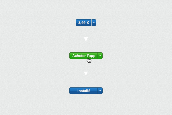
Apologies for the French, you get the idea..
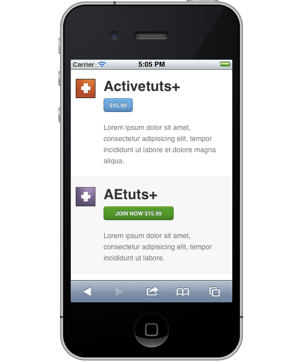
The page we create in this tutorial will also work on mobile devices, as it’s a responsive design.
Introduction
We’ll be creating a sample page based on the Tuts+ network, this page will contain confirmation feedback buttons. Although the example uses “join now” confirmation buttons, you could conceivably use this style of interaction anywhere where you need a user to confirm the action they are about to take.
When and why to choose this interaction
Good UI design gives users a comprehensible sense of power that consistently helps them feel in control.
An important aspect of human computer interaction is conveying to the user a sense of control. When users are in control they feel comfortable. When they aren’t in control they get frustrated. But when you think about it, humans are always in control. Computers never do anything without you first instructing them.
This is where the importance of good software and UI design enters the picture. Good UI design gives users a comprehensible sense of power that consistently helps them feel in control. They’ll never ask “wait why did that happen?” or “wait how did I get here?”
You can convey a sense of control to the user by communicating insights to them with each interaction. Help them understand cause and effect in the system. To use a basic example, if you save something, the system will give you a positive message saying “your settings have been saved”. Thus, users will never question “I wonder if that was saved?”
What does this have to do with the tutorial?
The interaction we’ll create in this tutorial helps give the user a sense of control. By changing the button state and having the user confirm their decision to purchase, we make sure that the user never does anything unintentionally. This is especially useful when you’re asking users to part with their hard earned money; the last thing anyone wants is to accidentally pay for something!
The beauty of this interaction is that, rather than receiving a pop-up prompt saying “are you sure you want to purchase?”, users are notified via the button state change they are about to do something important. If they don’t want to do it, they can simply continue to browse the site; whereas an alert prompt would explicitly require the user to make a yes/no decision.
Before you start
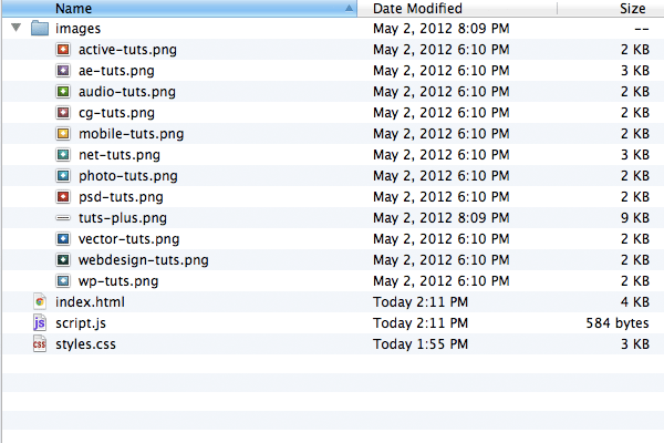
Make sure you grab the image file dependencies for this tutorial. Put them in a folder named “images”. All your other files (HTML, CSS, JavaScript) will go in the main directory. At the end of the tutorial, your file structure will look like this:
Step 1: Getting Started with HTML
Let’s get started by creating some basic HTML that will define our page structure.
<!DOCTYPE html>
<html>
	<head>
		<title>Confirmation Feedback Button Styles</title>
	</head>
<body>
<section id="container">
</section>
</body>
</html>
So here we have our basic HTML5 page structure. We included our DOCTYPE, our page title, and a main <section> element with an ID of #container
Step 2: Linking to Dependencies
Now, let’s add the links to the markup’s dependencies.
First we will add a link to our CSS stylesheet (which we will soon create). This goes in the <head> element.
<link href="styles.css" rel="stylesheet" />
Next we’ll include a link to Google’s hosted version of jQuery, as well as a link to “script.js” which will hold the javascript code we create later on. Let’s put these right before the closing </body> tag.
<script src="https://ajax.googleapis.com/ajax/libs/jquery/1.7.1/jquery.min.js"></script>
<script src="script.js" type="text/javascript"></script>

</body>
Because we’ll be using HTML5 elements like <header> and <section> we’ll need to add the HTML5 shiv so our markup works in IE8. Include this in your header:
<!--[if lt IE 9]>
<script src="//html5shiv.googlecode.com/svn/trunk/html5.js"></script>
<![endif]-->
Step 3: Designing Flexibly
We’ll design this page to be responsive and flexible down to mobile. To ensure mobile browsers render our page correctly we’ll have to set the meta viewport property. To learn more about this, check out Ian Yates’ article on the viewport meta tag. Otherwise, simply add this snippet of code in your <head> element.
<meta name="viewport" content="width=device-width, initial-scale=1, maximum-scale=1">
Step 4: Creating the Header Markup
Let’s start by adding a page header to our document.
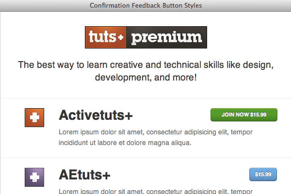
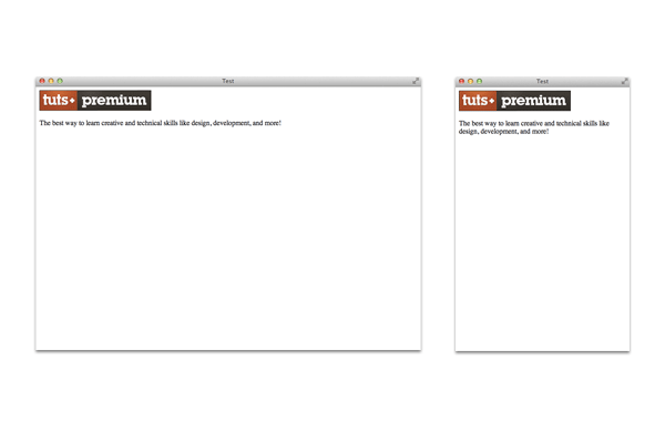
<header>
	<h1><img src="images/tuts-plus.png" /></h1>
	<p>The best way to learn creative and technical skills like design, development, and more!</p>
</header>
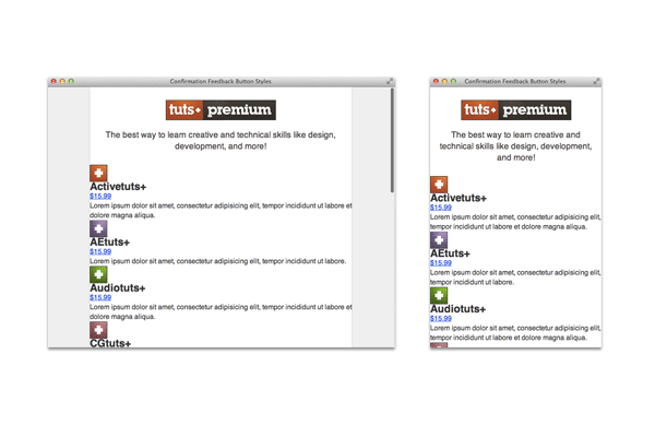
Our header (at different sizes) is pretty basic and looks like this:
Step 5: Creating the List Markup
Now we’re going to create an unordered list under our <header> element. We’ll use this to wrap our listed items in.
The unordered list
<ul class="list">
</ul>
As you can see, we gave our unordered list a class of ‘list’ which we’ll use to target its styles with CSS.
The list item structure:
<li>
	<figure class="icon">
		<!-- icon here -->
	</figure>
	<div class="info">
		<!-- info here -->
	</div>
</li>
As you can see, inside of each <li>, we have two main elements; a <div> and a <figure>. The figure element is ideally suited to house our list item’s icon. The div with a class of ‘info’ is where we put the information associated with the icon. Again, this is all contained inside an <li> element.
The icon
Inside of <figure class="icon"> we are going to put the item’s icon using the <img /> tag. The figure element’s width will be controlled. Then, by stating that the image should have a maximum width equal to the figure, it will resize according to the parent element!
<figure class="icon">
	<img src="images/active-tuts.png"/>
</figure>
The info
Inside of <div class="info"> we are going to have three elements:
- The item’s header (using the
<h2>element) - The action button (using the
<a>element) - The item’s description (using the
<p>element)
We’re going to give our button (the <a> element) a class of “join” for CSS styling later on.
<div class="info">
	<h2>Activetuts+</h2>
	<a href="http://tutsplus.com" class="join">$15.99</a>
	<p>Lorem ipsum dolor sit amet, consectetur adipisicing elit, tempor incididunt ut labore et dolore magna aliqua.</p>
</div>
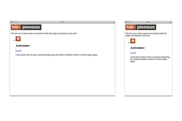
Final code for each <li> element
<li>
	<figure class="icon">
		<img src="images/active-tuts.png"/>
	</figure>
	<div class="info">
		<h2>Activetuts+</h2>
		<a href="http://active.tutsplus.com/" class="join">$15.99</a>
		<p>Lorem ipsum dolor sit amet, consectetur adipisicing elit, tempor incididunt ut labore et dolore magna aliqua.</p>
	</div>
</li>
Here’s what we have so far:
Step 6: Duplicating and Modifying Each <li> Element
Now that we have the basic structure for each <li> element, all we have to do is duplicate it for each Tuts+ entry. We have to change the following for each list item:
- The
<h2>text - The
<a href>link - The
<img src />file name
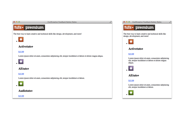
You can go ahead and copy/paste the list item code for each Tuts+ site.
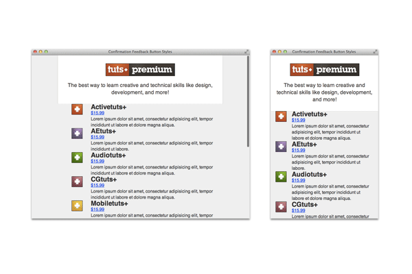
This is what we have now:
Step 7: Basic CSS
Now that we have all our markup complete, let’s start styling the page. We’ll begin by setting a few basic resets:
/* quick reset */
body, h1, h2, p, ul, li {
	margin:0;
	padding:0;
}
ul {list-style-type:none;}
Now let’s style the main body element.
body {
	background: #eee;
	font: 16px/1.4em Helvetica, Arial, sans-serif;
	color:#333;
}
Here we set the background color and some defaults for our typography such as the type size, color, and line height.
Step 7: Going Responsive (Liquid)
We want our page to be flexible all the way down to mobile. So, the two key components we’ll use to achieve this are percentages and the max-width rule.
By looking at our HTML, you’ll see <section id="container"> is the main container for our page’s content. We’ll use percentage values for the width and we’ll add some basic styling to separate it visually from the page background.
#container {
	width:100%;
	margin:0 auto 40px;
	max-width:600px;
	background:#fff;
	border-radius:0 0 3px 3px;
	border:1px solid #d0d0d0;
	border-top:0;
	box-shadow:0 1px 0px #fff;
}
Here we set our container’s width to be 100% of the browser’s viewport. Our margins center the content on the page. We also added max-width:600px because we don’t want our list items to ever be larger than that.
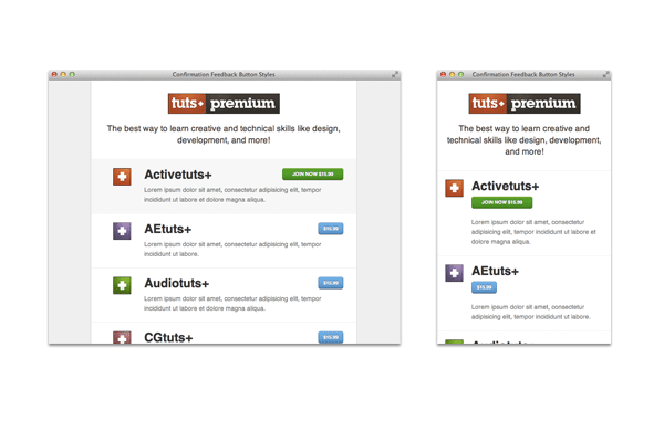
As you can see, at larger sizes our container has some extra space on the sides with a light background. But at smaller sizes, that extra space disappears and we just have a white background for our content.
Let’s not forget to make our images responsive:
img {
	max-width:100%;
}
Step 8: Header Styles
Now let’s style our main <header> element and the content inside of it.
header {
	text-align:center;
	padding:30px 20px;
}
header h1 {
	margin-bottom:20px;
}
header p {
	color:#413c38;
	font-size:1.2em;
	line-height:1.4em;
}
Our header element and its content are now nicely centered and sized.
Step 9: Structural List Item Styles
Now we’re going to start styling our list items and their siblings. First, let’s create some basic structural styles:
.icon,
.info {
	box-sizing:border-box;
}
.icon {
	float:left;
	width:15%;
	text-align:right;
	padding-left:3%;
}
.info {
	width: 85%;
	float:left;
	padding:0 5%;
}
If you remember correctly, inside each list item we have two main div elements: ‘icon’ and ‘info’. The icon figure will be floated left and given a small width. The ‘info’ div will be floated right and given the majority of the parent width.
As you can see, we used the box-sizing:border-box; rule on these two divs. This allows us to have our total width add up to 100% and still be able to add padding without going over a total width of 100% (To learn more about this property, read Encourage Responsive Form Elements to Play Nice).
Step 10: List Item Styles
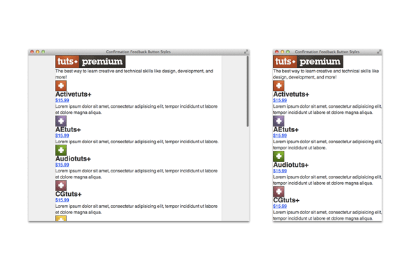
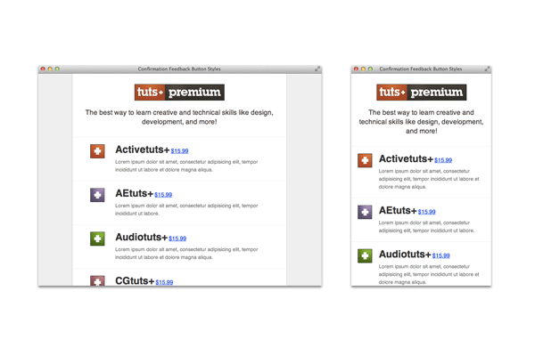
After our structural CSS additions, we now have something that looks like this:
As you can see, this needs to be cleaned up a little bit. First because we are floating our elements ‘info’ and ‘icon’, we need to add a clear to each of the list elements. We’ll also add a little styling to each list item.
.list li {
	padding: 20px 0;
	border-top:1px solid #eee;
	overflow:auto;
	clear:both;
}
.list li:hover {
	background:#f7f7f7;
}
Lastly, we’re going to style the information inside each list item:
.info h2 {
	margin-bottom:10px;
	font-size:1.75em;
	line-height:1em;
	display:inline-block;
}

.info p {
	font-size:14px;
	color:#777;
}
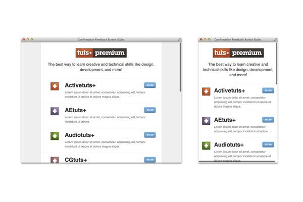
Now we have something that’s starting to look pretty solid.
Step 11: Button Styles
Now let’s apply some styling to our buttons. We’ll make them visually prominent:
a {
	text-decoration:none;
	color:#fff;
}
.join {
	background: #57a9eb; /* Old browsers */
	background: -moz-linear-gradient(top,  rgba(87,169,235,1) 0%, rgba(53,156,234,1) 100%); /* FF3.6+ */
	background: -webkit-gradient(linear, left top, left bottom, color-stop(0%,rgba(87,169,235,1)), color-stop(100%,rgba(53,156,234,1))); /* Chrome,Safari4+ */
	background: -webkit-linear-gradient(top,  rgba(87,169,235,1) 0%,rgba(53,156,234,1) 100%); /* Chrome10+,Safari5.1+ */
	background: -o-linear-gradient(top,  rgba(87,169,235,1) 0%,rgba(53,156,234,1) 100%); /* Opera 11.10+ */
	background: -ms-linear-gradient(top,  rgba(87,169,235,1) 0%,rgba(53,156,234,1) 100%); /* IE10+ */
	background: linear-gradient(top,  rgba(87,169,235,1) 0%,rgba(53,156,234,1) 100%); /* W3C */
	filter: progid:DXImageTransform.Microsoft.gradient( startColorstr='#57a9eb', endColorstr='#359cea',GradientType=0 ); /* IE6-9 */
	border:1px solid #326fa9;
	border-top-color:#3e80b1;
	border-bottom-color:#1e549d;
	color:#fff;
	font-weight:bold;
	text-transform:uppercase;
	text-shadow:0 -1px 0 #1e3c5e;
	font-size:11px;
	border-radius:5px;
	box-shadow:0 1px 0 #bbb, 0 1px 0 #9cccf3 inset;
	white-space:nowrap;
	-webkit-transition:all .25s ease;
	-moz-transition:all .25s ease;
	transition:all .25s ease;
	float:right;
	display:inline-block;
	padding:1px 1em 0; /* make appear center from 1px highlight */
	line-height:2.25em;
}
What did we do here?
- Position
- We floated our button to the right. This will make the button appear to the right of the main list header.
- Padding
- We used the line-height property to make the button the height we wanted. We also added 1px of padding on the top, this offsets the 1px highlight we added using the box-shadow property.
- Visual Styling
- We added some visual styles using borders, box-shadows, etc. We also used the CSS3 background gradient feature (you can use helpful generator tools such as ColorZilla for generating your gradients).
Step 11: Alternate Button Styles
Everything is looking pretty good. What we want to do now is add styles for a class that will be applied to the button(s) when they are clicked. For this tutorial, we are going to add the text “join now” to the existing button text when the button gets clicked. Essentially, the user has to make the decision to “join” twice.
To accomplish this, we are going to use some CSS styling, including the CSS3 pseudo class ::after
Clicked class styles
Let’s create a class called ‘clicked’ to which we can add our ‘clicked’ button styles (for development purposes, you can manually add a class of “clicked” to any <a href="" class="button">$15.99</a>).
.join.clicked {
	background: #24a501; /* Old browsers */
	background: -moz-linear-gradient(top,  rgba(30,183,0,1) 0%, rgba(36,165,1,1) 100%); /* FF3.6+ */
	background: -webkit-gradient(linear, left top, left bottom, color-stop(0%,rgba(30,183,0,1)), color-stop(100%,rgba(36,165,1,1))); /* Chrome,Safari4+ */
	background: -webkit-linear-gradient(top,  rgba(30,183,0,1) 0%,rgba(36,165,1,1) 100%); /* Chrome10+,Safari5.1+ */
	background: -o-linear-gradient(top,  rgba(30,183,0,1) 0%,rgba(36,165,1,1) 100%); /* Opera 11.10+ */
	background: -ms-linear-gradient(top,  rgba(30,183,0,1) 0%,rgba(36,165,1,1) 100%); /* IE10+ */
	background: linear-gradient(top,  rgba(30,183,0,1) 0%,rgba(36,165,1,1) 100%); /* W3C */
	filter: progid:DXImageTransform.Microsoft.gradient( startColorstr='#1eb700', endColorstr='#24a501',GradientType=0 ); /* IE6-9 */
	border:1px solid #1e8701;
	border-bottom-color:#176701;
	border-top-color:#24a501;
	box-shadow:0 1px 0 #bbb, 0 1px 0 #acc63d inset;
	padding:1px 2em 0;
	cursor:pointer;
}

.join.clicked:active {
	box-shadow:0 0 8px #777 inset;
}
As you can see, we attached the ‘clicked’ class to the ‘button’ class. That way the styles we declare for ‘clicked’ will only appear on elements that also have a class of button. As far as styling goes, we simply changed its color and borders. You may also have noticed that we added a box-shadow to the button when it gets clicked. This will added an indented button style that helps reinforce to the user that the button was clicked.
::after class styles
When the user clicks the price button, what we want to do is have the button expand and prepend the text “join now”. To do this, we’ll use the CSS3 pseudo class ::after to insert the text we want.
.join.clicked::before {
	content:'Join Now ';
}
Now we have something like this:
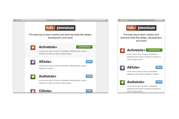
Step 12: Media Queries
As you can see, at mobile size our “join now” button is starting to get a little cramped. If our header text is really long, our button will run into our header. So, we’ll leverage the power of media queries to bump our action button to the next level when we’re on smaller screen sizes.
Let’s create a media query for moving our button:
@media screen and (max-width:450px) {

	.info h2 {
		display:block;
	}

	.join {
		float:none;
		margin-bottom:20px;
	}
}
Now our button will bump down below the header at smaller screen sizes!
Step 13: Button Interaction with jQuery
Let’s now go into our “script.js” file and write some javascript that will change our button styles when they get clicked.
First, let’s setup our script for jQuery
$(document).ready(function(){

	//code here

});
Step 14: Toggling Classes
Our script is actually pretty simple. All we need to do is toggle the class of “clicked” whenever a button gets clicked.
So let’s setup a function:
$('.join').on('click', function() {
	// code here
});
Now, what we want to do is check and see if the button that was clicked already has a class of “clicked” (perhaps it was clicked earlier). If it doesn’t have the ‘clicked’ class, we’ll add it and prevent the href attribute of the link from being followed.
// if it doesn't have a class of clicked,
// add one and prevent the link from being followed
if ( !( $(this).hasClass('clicked') ) ) {

	// Remove any 'clicked' classes if there are any
	$('.clicked').removeClass('clicked');

	// Add 'clicked' class to the button that was clicked
	$(this).addClass('clicked');

	//prevent the link from being followed
	return false;
}
If the button that was clicked already has a class of “clicked” the href value will be followed by the browser. This works well because if a user encounters this page and has javascript disabled, they simply won’t be able to confirm their decision to “join now”. Rather, the link will simply be followed without any confirmation feedback.
Step 15: Removing the Clicked Class
If a user clicks on the price button, they’ll get a changed button state. What if they want to dismiss the button and they click outside the button itself? We’re going to register that click and remove the class of “clicked”. This is a simple line of jQuery:
// if click happens outside .buy button, remove it's class
$('body').on('click', function() {
	$('.clicked').removeClass('clicked');
});
Step 16: Adding a Transition
We want to add a little bit more interactivity by making the transition between the ‘clicked’ and normal button states smoother. We’ll just use a CSS3 transition and apply it to the ‘join’ button class:
-webkit-transition:all .25s ease;
-moz-transition:all .25s ease;
-ms-transition:all .25s ease;
-o-transition:all .25s ease;
transition:all .25s ease;
That’s it!
You now have a nice confirmation feedback button. It will help users confirm their choice to make an important decision with your web page/application. Feel free to play around with this concept, make it better and learn more!