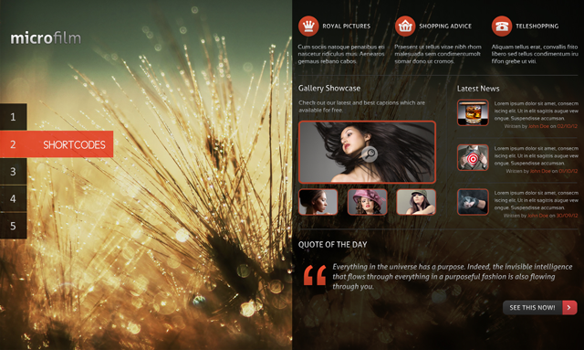
Follow me as I walk through the build process of a clean and modern photography portfolio layout. We’ll cover some basic Photoshop terchniques, including how to work with grids, transparency, icon design and some other interesting topics.
Step 1: Prepare the Working Area
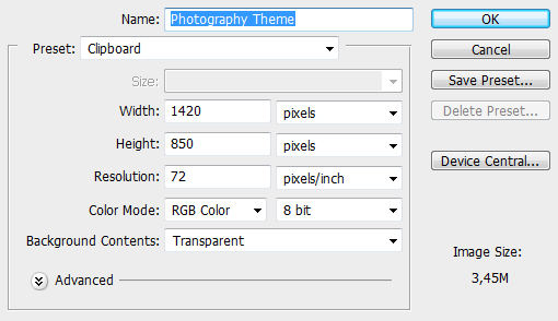
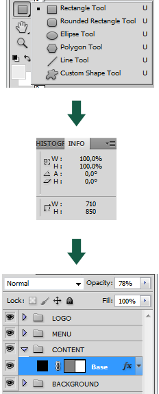
We will be designing our template as an arhitect builds a house; from the ground up. The foundation of our theme is the base so let’s prepare everything we need for it. Start by creating a new document sized 1420x850px as in the screen shown below.
You can fill the blank space with a photo of your own choice or the one you’ll find in the source download (originally found on wallon.ru).
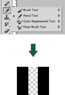
So that our background image doesn’t draw too much attention away from the rest of the interface, we’ll obscure it with a slight pattern effect. Create a new document sized 3x3px, select the pencil tool (or just press B), and draw two parallel lines:
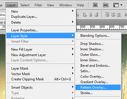
We now need to save this pattern to our archive by going Edit > Define Pattern… Having done that, return to the main document and apply the pattern over the image. You’ll find it available amongst the other patterns under Layer > Layer Style > Pattern Overlay…
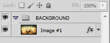
Choose the pattern that we created earlier and set the opacity to 20%. We need to keep the .psd file organized from the start so create a new folder in the “Layers” section and put our picture inside that (in case you don’t see the Layers panel, go to Window > Layers)
Step 2: Logo Creation
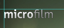
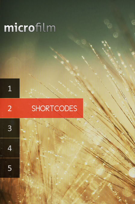
Many photography themes use minimalistic logos so as not to contrast with the atmosphere of each photo. Let’s now design a simple, yet attractive logo. I’ve decided to call the template “Microfilm” so I typed “micro” using Aller Bold and “film” using Aller Regular, both at 40px.

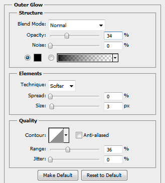
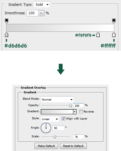
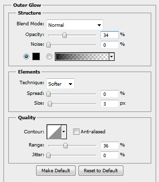
Place the text somewhere in the main document, now let’s apply some effects to the logo in order to make it more attractive. Select the “micro” layer and go to “Layer > Layer Style > Outer Glow”.
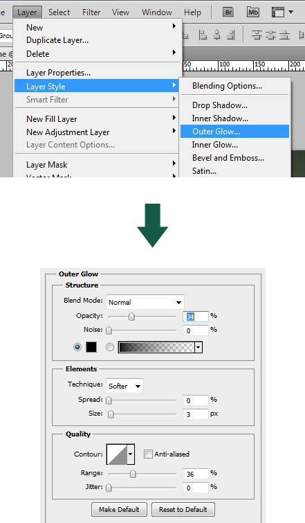
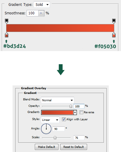
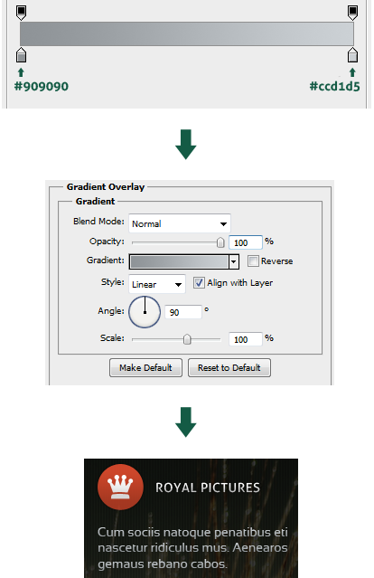
After applying an Outer Glow, switch to the Gradient Overlay section and apply the following effect.
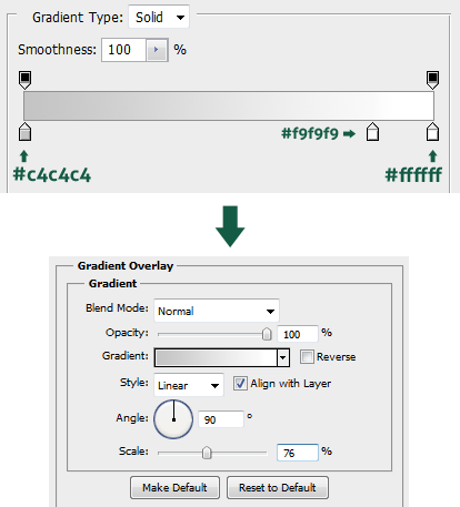
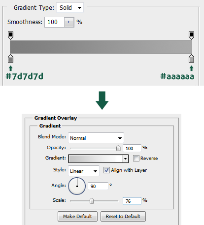
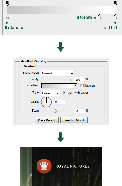
Now let’s update the “film” layer with a few effects as well. We’ll use the same Outer Glow effect as shown above, however, the gradient overlay is different. Go to Layer > Layer Style > Gradient Overlay.
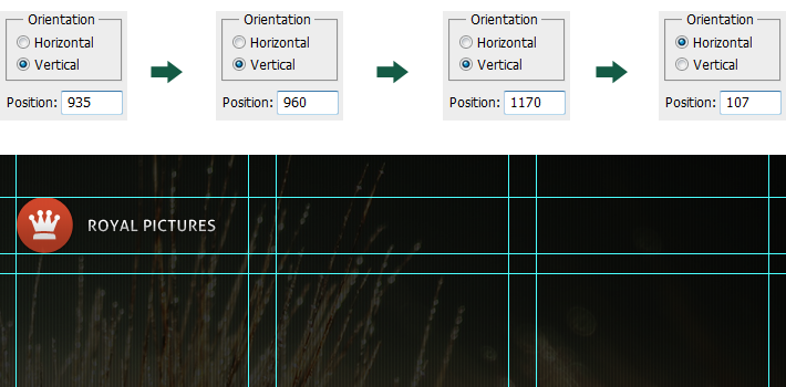
Once we’ve finished creating the logo, we can finally put it in it’s place. One of the best spots for a logo is the top left corner of the screen (users are accustomed to finding it there, particularly in left-to-right, top-to-bottom reading countries). I played with it for a while until I liked the placement: create two new guides using View > New Guide…
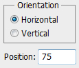
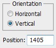
Create a new horizontal guide using new settings.
Use the guides to orientate and position your logo.
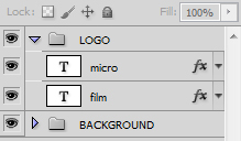
Don’t forget to create a new folder and place your logo inside it to keep everything clean.
Step 3: Designing the Navigation
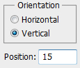
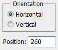
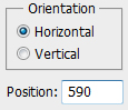
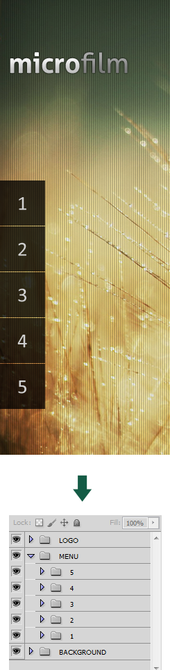
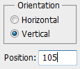
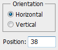
Our menu is a set of squares labeled with numbers which roll out when they get hovered over. The menu will be placed vertically centered, so we will leave 260px at the top and 260px at the bottom of our canvas, which gives us a working area of 330px in height. Let’s create the required guides in order to keep our designing proccess easier View > New Guide…
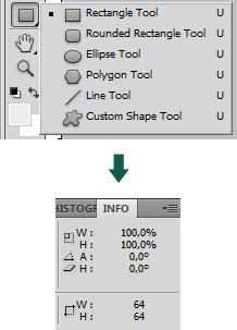
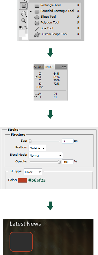
I’d like to give you an extra tip, in case you don’t know how to temporarily hide the guides just press CTRL + H. So let’s create our first menu tab, select the Rectangle Tool (or press U) and while holding the shift button create a square of 64x64px. In order to see the current size of your shape, check the info panel (Window > Info). After creating the first square, place it in the corner of the guide that we created earlier.
Select your square box and reduce the opacity to 78%.
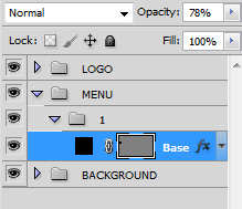
Using Calibri font (or something silmilar) type “1″ and set the size to 29px. Change the color to #d0d0d0 and put it in the middle of our square menu tab. Keep your template organized by creating a specific folder for the menu.
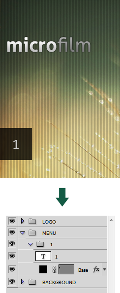
Hold ALT + SHIFT and drag your menu box down, leave a distance of 1px. Follow this step in order to create five menu tabs and change their names to their respective numbers.
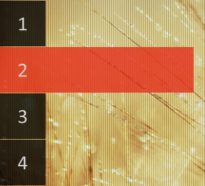
The final part of this step is the creation of a hover effect, select the base of the second (or any other tab) and press CTRL + T. Drag the box horizontally and extend the width to 270px. After enlarging the shape, change the color of the box to #e42b17.
Create a new guide in order to align your menu text correctly, use the settings given below:
Select Cicle (Gordita) font and enter your dropdown text. I wrote “shortcodes” at 27px and set the color to #f4f4f4. Put your text in the same line as the number and remember to use the guides as orientation lines.
Step 4: Build the Content Container
There’s nothing complicated in the creation of the background of this template, however, it is very important to strictly respect the size because it will represent our content area. We don’t need the photo background to distract our attention from the content area, this is why we will design it so it occupies only half of the page.
Take the rectangle tool and create a shape sized 710×850 (half of our main document), fill it with black and set the opacity to 78%.
Step 5: Creation of the Header
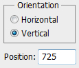
Finally, we are ready to start our trip to the content page, the structure of which depends on the way we align our content. This is why it is so important for us to create the necessary guides from the start so we can perfectly set up our content and ease our eyes with the charm of symmetry. Let’s create the guides by using View > New Guide…
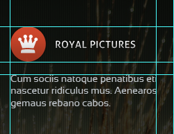
Select the Elipse Tool and create a circle sized 50x50px, position it at the corner of our content guides and let’s apply some styling effects. At first set the opacity of the layer to 85% and then go to Layer > Layer Style > Outer Glow.
Then switch to the gradient section and apply the following effect:
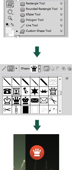
Select the Custom Shape Tool, choose an icon you like, then while holding shift apply it in the middle of the circle.
Let’s stylize our custom shape with a simple gradient.
Visually set a new guide at the bottom of the circle we created earlier. Taking the middle of circle as an orientation point, type a random title. Now update the text settings; set Aller font sized 14px and go to Layer > Layer Style > Outer Glow.
Then switch to the Gradient Overlay section and create a new effect.
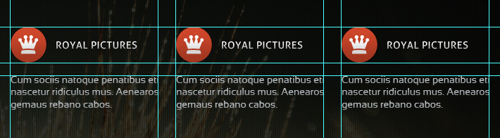
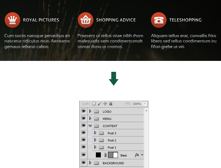
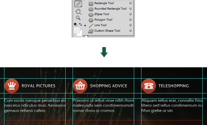
We require three columns for our header posts, and as I said earlier it is very important to pay attention to spacing and respect the symmetry. We could do with creating some new guides in order to position our header posts once we finish them – follow the same procedure like before View > New Guide…
Using Sansation Regular font with the size of 14px, type some random text. When designing a template, I usually visit some dummy text website. Type your content inside the “guide” column that we created earlier.
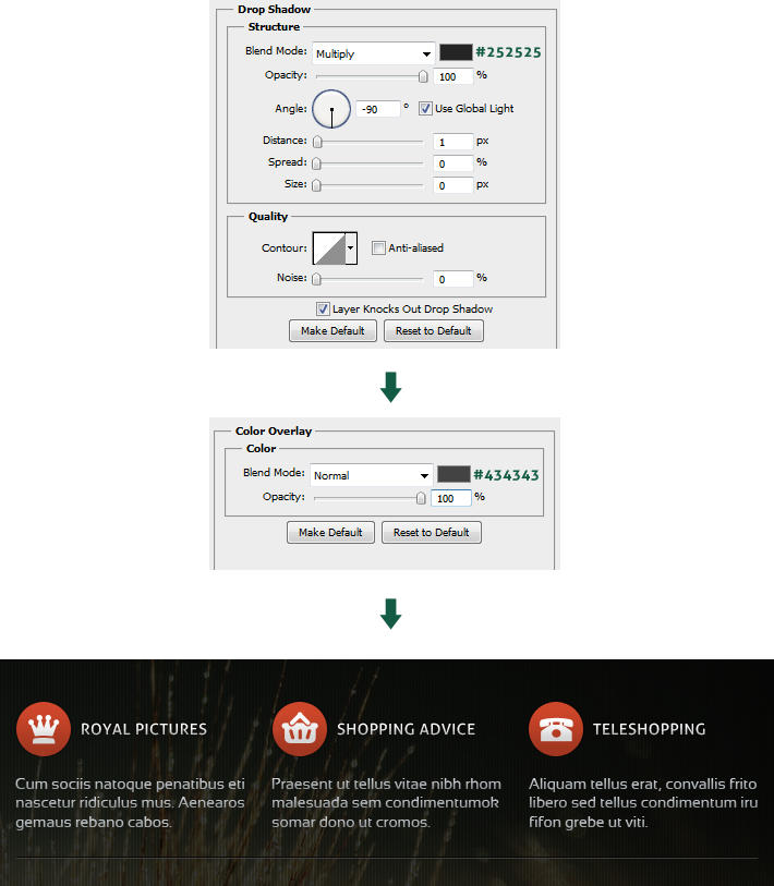
Now let’s style our text by applying a custom gradient, so go to Layer > Layer Style > Gradient Overlay.
Select the whole column and while holding ALT + SHIFT drag it to the free area that we created out of guides, then repeat the same step to create the third column.
Make some general changes to the text and icons; don’t forget to structure everything in folders to keep the document clean.
The final part of this step is the creation of a separator which serves to divide our content material. There are many ways to create it, but I’ll use one of the most simple methods. Select the line tool and draw a shape from one side of the guide margin to the other.
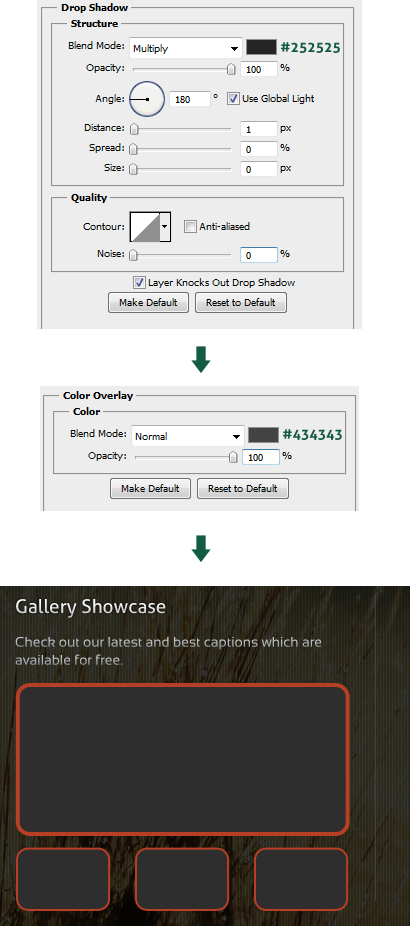
Apply some styling effects to the line in order to make it more attractive; go to Layer > Layer Style > Drop Shadow.
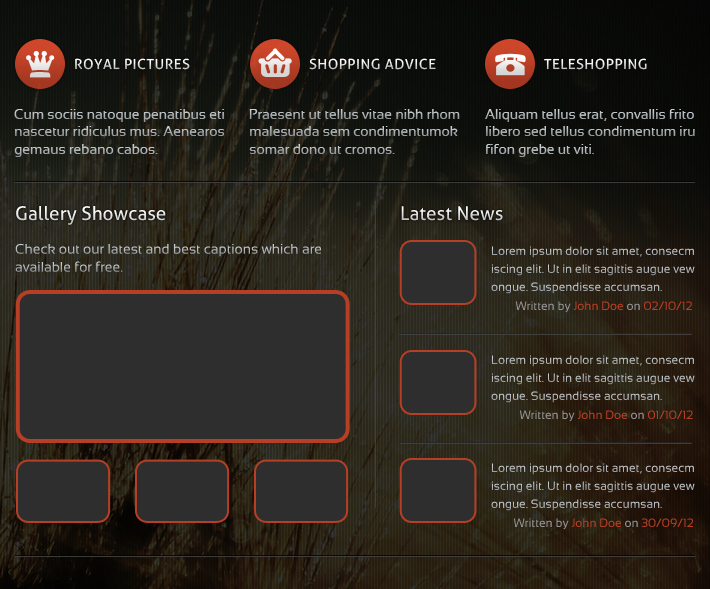
Step 6: Gallery and News Blocks
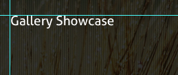
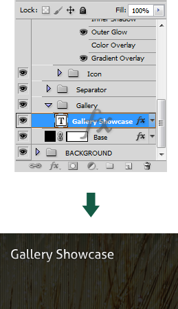
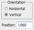
Let’s get straight to the point. We need to create the gallery section and we will start with the title. Create a new guideline the same way we did before View > New Guide…
Type “Gallery Showcase” or any other title using Aller font and set the size to 19px. Then place our text at the corner of the guide we created earlier.
We will use the same styling effects as in the title of our top content. In order to do this select the text effects from “Layers” box and drag to “Gallery Showcase”.
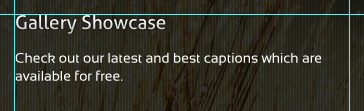
Before continuing working on the Gallery section, let’s create one more guide which will represent the border of the gallery area.
Leave a little blank space below the title and type in some random text using Sansation (14px) but remember not to cross the border line that we created a while back.
In the same way we dragged the effects of top content title to the gallery title, drag the top content text effect to the gallery one.
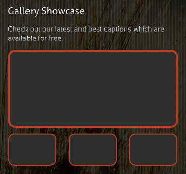
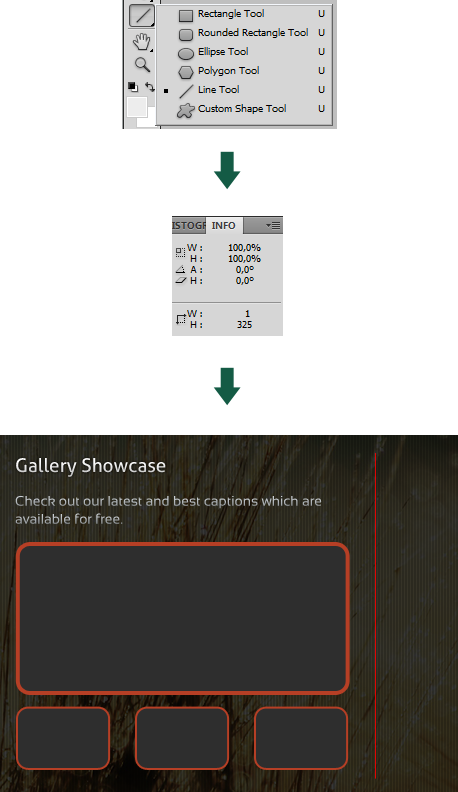
It’s time for the most important part of the gallery section; creating the picture frames. There are many efficient ways to design this, but those would be better explained in a screencast where you could see every part of the process. This is why I’ll design our gallery images in a more primitive way.
Select the Rounded Rectangle Tool, set the radius to 10px and create a shape sized 327 x 145px.
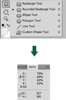
Go to Layer > Layer Style > Stroke and apply a 4px stroke colored #b63f25, then position your image between the guides.
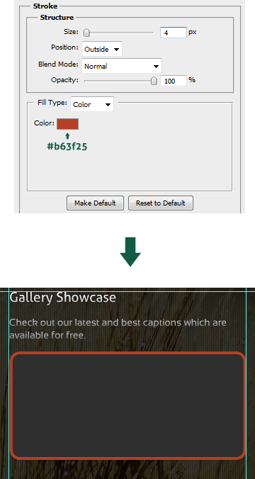
Select the Rectangle Round Tool again and create a new shape sized 91x60px (radius 10px), after that apply a 2px stroke.
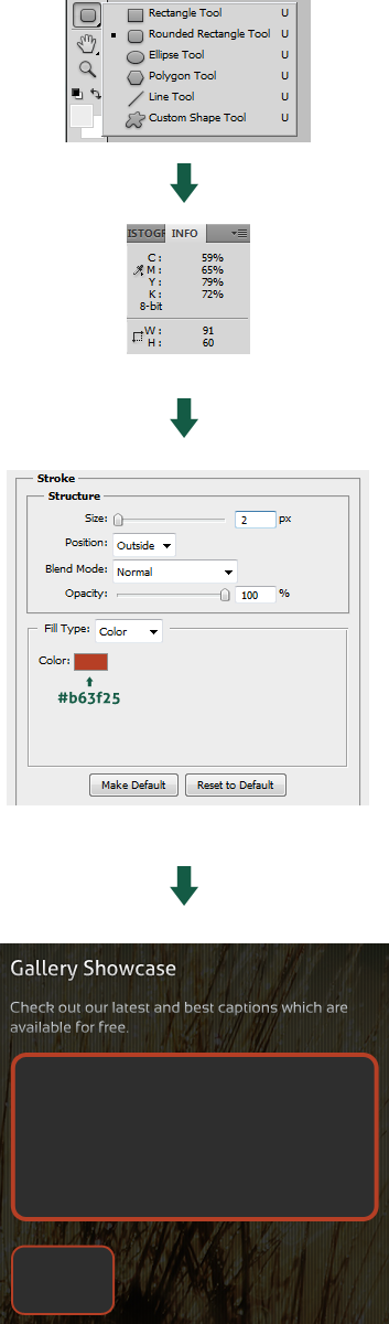
Hold ALT + SHIFT and drag the shape we created a few moments ago, leave a distance of 24px before each one. Create two more boxes this way and don’t forget to respect the border line.
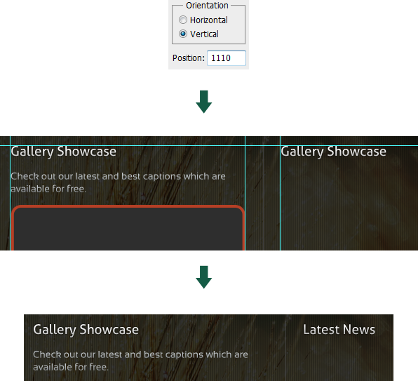
Before starting our work on the news section, let’s create a vertical separator that will divide these two sections. Let’s start by creating a guide View > New Guide…
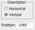
Select the Line Tool and create a shape with the height of 325px, then place it in the position of the guide we created earlier.
Now let’s stylize the separator; go to Layer > Layer Style > Drop Shadow.
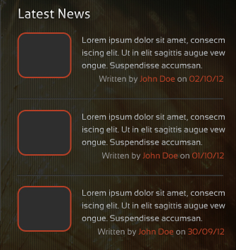
Finally, we can continue with the creation of the news section. Create a new guideline and then select the “Gallery” title. While holding ALT + SHIFT, drag it to the corner that we created out of guides, after that rename it.
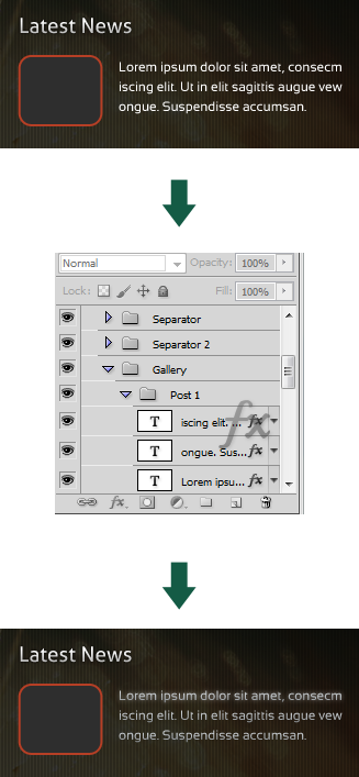
Select the Round Rectangle Tool and with the radius of 10px, create a 74x61px shape. Apply a two pixel stroke and position our rectangle a few pixels below the main title.
Type some random text which consists of three lines (don’t pass the border line limits) using Sansation font sized 12px and drag the effects from gallery text.
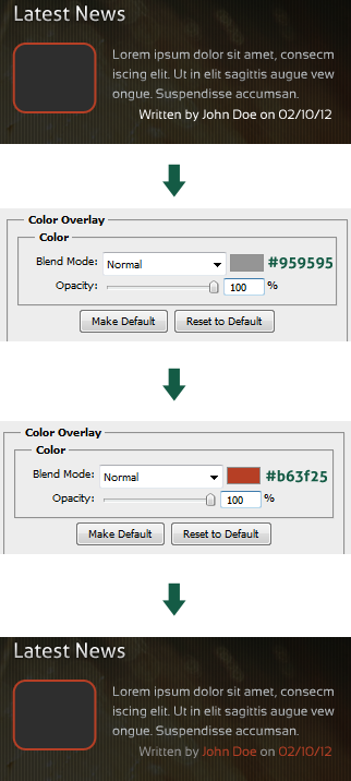
Using the same text style I typed “Written by Random Person on Random Date”, I didn’t use any original effects but applied some simple color overlays.
Select the horizontal separator layer and duplicate it, after that resize it using CTRL + T to 292px and move it below our freshly created news post.
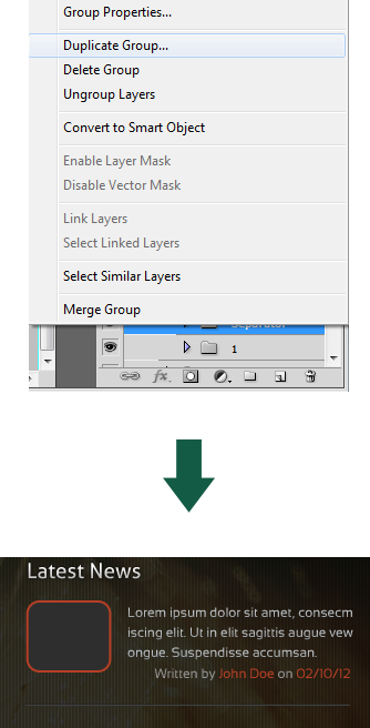
Select your post all together with a separator and while holding ALT + SHIFT drag them down in order to create two more posts. Perform the required changes to the text.
Take the top horizontal separator again and while holding ALT + SHIFT drag it down below the gallery and news section.
Step 7: Quote Area
Welcome to the final step, a little more and we’re done with our Photography template so let’s get straight to the point! Type your Quote Area title using the same text style as in the gallery and latest news titles.
Let’s create a new guideline for our quotation marks.
Using Arial, type the quotation mark symbol ("e;), set the size to 204px then apply the following effects, positioning it along the guideline we created earlier.
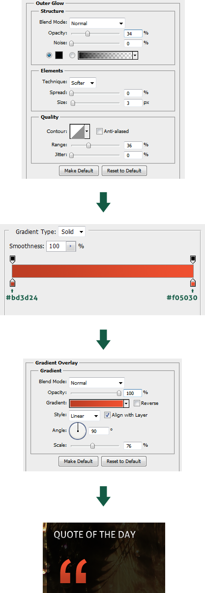
I typed a quote using Aller Italic font, sized 18px and applied the same gradient as in the general text from gallery section. Drag the effects the same way we did a few times before (don’t forget to respect the border lines).
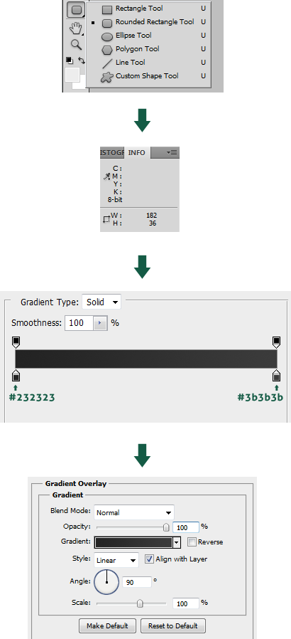
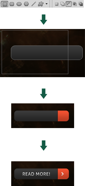
The final part of this step is the creation of a “READ MORE” button. Select the Rounded Rectangle Tool and create a shape sized 182x36px with the radius of 10px, then apply a gradient effect as shown below.
Duplicate the layer and then substract it with a rectangle and apply the same gradient we used for quotation marks, then add some little details like text and arrow.
Conclusion
We’re done! Thanks for checking out this tutorial, I hope you learned something new and will be able to use some of these techniques in your own projects. If you need any further advice, feel free to leave comments or questions and I’ll be more than willing to help.