Prototyping should be a fast and easy way to gain confidence in your designs. No longer regarded purely as a way to sprinkle motion magic or over-polish designs, prototyping is a communication tool. Whether communicating with stakeholders, design managers or users, a good prototype helps to communicate design decisions and test ideas.
Our Prototype
In this tutorial we’ll be creating a basic “boarding pass” prototype in Atomic, which you can preview here. The prototype begins with a loading state before enabling you to browse your upcoming flights and preview your boarding QR code. To create this prototype we’ll be using interactive components, data, variables and page transitions. Not to worry! I’ll be helping you through each step.
Here’s a demo of what we’ll create:
Clik here to view.
Tutorial Assets
There are a few things you’ll need in order to follow along:
- An Atomic account: Get started with a free trial (there’s also a free plan).
- Design Assets: This is the file in which you’ll find the design assets and create your prototype.
- Data Source: A Google Sheet file with the data we’ll be using in our prototype.
- Atomic iOS App: Download the app from the App Store to test your prototype on your phone.
Clik here to view.

If at any time throughout the tutorial you have a question, feel free to reach out to me (@femkesvs), or the Atomic support team (@we_are_atomic) on Twitter.
Let’s go!
1. Copy the Assets to Your Account
I’ve created a sample file with the assets you’ll be needing to create your prototype. This sample file is complete with the assets we’ll be using, as well as pre-built components.
Clik here to view.

You can access the assets here. To use the assets you’ll need to copy the prototype into your account. You can do this by clicking Copy & Edit in the bottom right and then select a project you’d like to copy it into. I suggest creating a new project for this tutorial.
2. Upload the Data to Atomic
Before we get started creating our prototype we’ll need to first add the data source to Atomic. I’ve put together a Google Sheet with some basic data that we’ll be using in our prototype.
You can access the data here. With the data source open, head to File > Add to My Drive (you’ll need a Google Account for this).
Clik here to view.
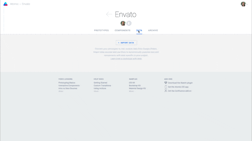
Next, with your project open in Atomic, select the Data tab. From here click Import Data, and locate the data source via search. Once located select the data source. You’ll see Atomic load the data into your project. This data source can now be accessed and used in any prototype within the project.
We’re ready!
3. Creating the Loading State
Let’s begin assembling our prototype by creating the loading state. We’ll do this by creating both a custom transition and timed-based page action.
First, select the loading component from the Assets page to copy (CMD-C and paste (CMD-V) it to the page 1. It will be large, and rather than resizing it, position it into its starting position.
Then copy the loading element you just placed on page 1, this time pasting it on on page 2. Reposition it into its final state (rotated clockwise 75° so the plane is positioned off the right side of the canvas).
Clik here to view.

To create our transition, hop back to page 1. In the right hand properties panel you’ll see a section named Page Actions. Click the plus button and then set the following:
- Make something happen: After a set time
- Wait: 0
- Go to: Page 2
- Motion: Custom transition
- Easing: Ease in-out
- Duration: 2000
Let’s preview and see our transition in action–you should see the plane glide from left to right over the course of two seconds. Neat!
To take it further you can also copy and paste the Fly logo to both page 1 and page 2 (beneath the loading component in the pages panel and placed behind). Make sure you follow the same technique of placing it in its start and ending position on each page. You probably have to adjust the order of your layers to make it appear from behind.
Lastly we’ll need to create an action that takes the user automatically to page 3 from page 2. On page 2 add another timed page action. This time we’ll use the following settings:
- Make something happen: After a set time
- Wait: 1000
- Go to: Home
- Motion: Slide up
- Easing: Ease in-out
- Duration: 300
Tip: if you’d like to stagger the timing of the two elements animating you can do this using the Advanced Motion Timeline.
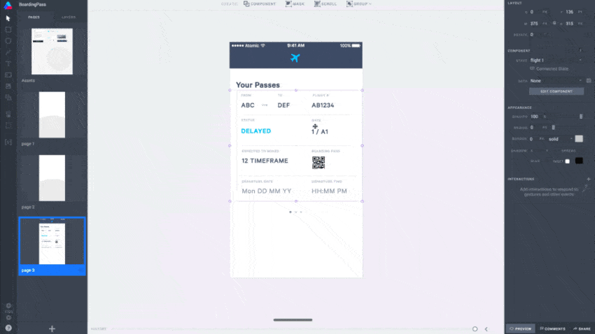
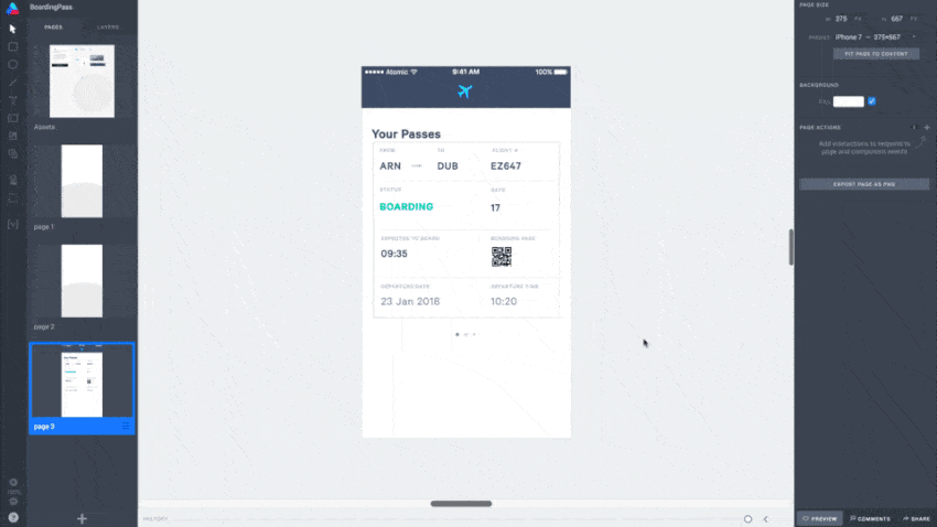
4. Understanding Components
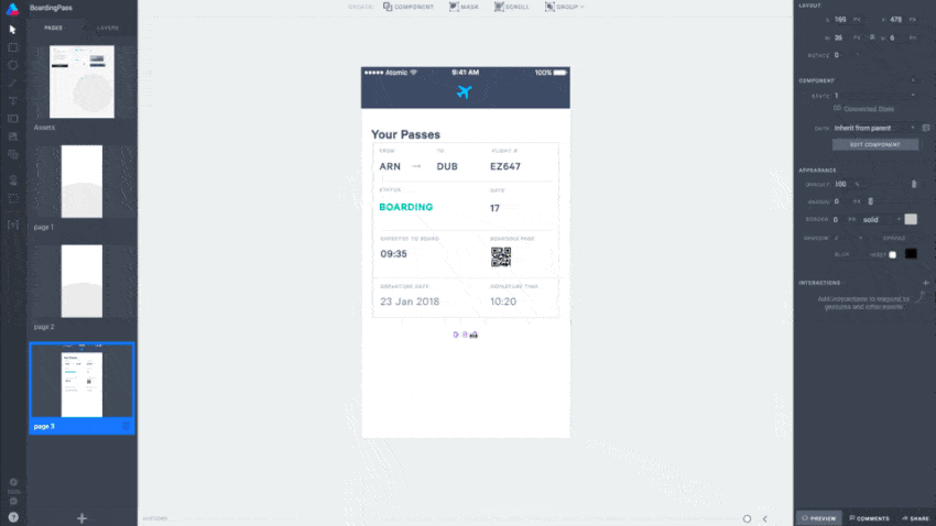
Next, copy the elements needed for page 3 and paste them onto page 3. You’ll need to do a bit of rearranging and adjustments to fit the elements on the page as needed.
Clik here to view.

Almost all of the elements needed for this page are components.
A Word About Components
Components in Atomic are like symbols. Any component can be edited and reused throughout a project. Any edits made to a component will be updated in each instance. Components can also be interactive and contain multiple states of a symbol. This makes it really easy to structure your prototype.
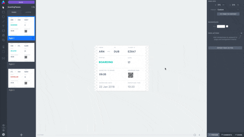
Let’s add some interactivity to the boardingPasses component. To open the component, double-click on the component icon in the layers panel next to the layer name. Once open, you’ll see three pages; one representing each flight. For now these passes are identical, soon we’ll change this.
We know that the user has three flights and we’d like them to be able to swipe through each one. There’s also a QR code icon that, when interacted with, should bring up their boarding pass code.
Clik here to view.
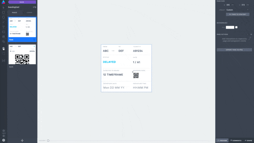
If you look in the layers panel you’ll notice each page is an instance of a component called “boardingCard”. Let’s open the boardingCard component now to see how the data has been applied.
5. Using the Data
The boardingCard component is a component embedded in a component. This allows us to create a boarding card symbol that can be reused while showing different data sets.
With the boardingCard component open you’ll see two pages; the front and back of the pass. This is where the data is being assigned to the individual text elements.
Clik here to view.

Select the ABC text and take a look at the Text properties. You’ll notice the following:
- Content: Set from data column
- Data: Inherit from parent
- Column: departure-code
Subsequently if you look at the Google Sheet where this data is being pulled from, you’ll see a column titled “departure-code”. This means that the text element ABC will display whatever data is shown in the column “departure-code”.
All dynamic text in this component has been set to Inherit from parent. This allows us to link to the data sheet at a group level, and therefore display and sort through the data row by row. We’ll get to this soon.
6. Adding a Flip Interaction
Next we’ll set up a page-based transition to flip between the pass and QR code. On the front page of the boardingCard component press H to bring up the hotspot tool. Then, draw a hotspot over the QR code icon on the front page.
Clik here to view.
Hotspots allow you to define interactive areas of your prototype. With your hotspot selected, under the interactions panel set the following:
- Gesture: Click or tap
- Go to: > Next page
- Motion: Flip
- Easing: Ease in-out
- Duration: 300MS
Then, on the back page, create another hotspot (H) that will take us back to the front page. This time draw it over the close icon and set the following:
- Gesture: Click or tap
- Go to: > Previous page
- Motion: Flip
- Easing: Ease in-out
- Duration: 300MS
Clik here to view.
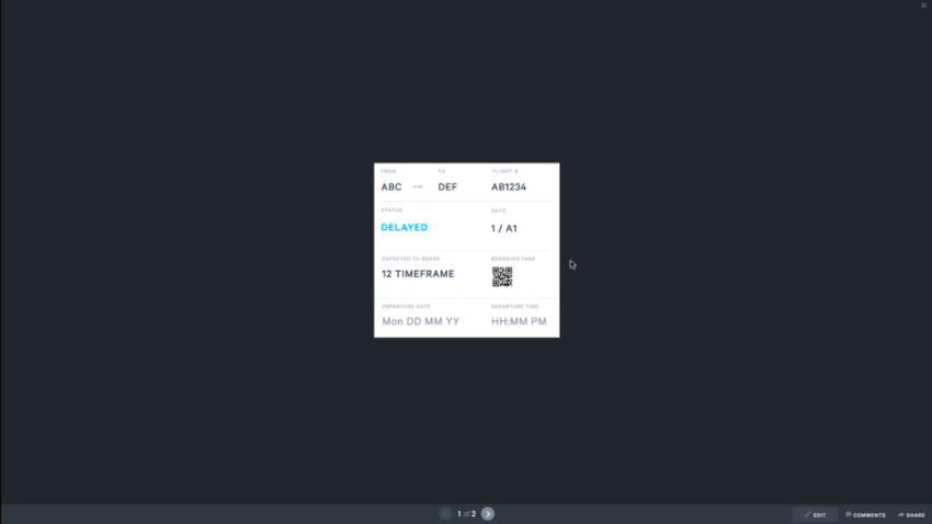
Time to test your interaction! In the bottom right corner, press the Preview button. Preview mode lets you test your transitions and interact with your prototype via hotspots. Try clicking on the QR card or close icon; the card should flip between the two states. You can close the preview by pressing X.
Having this boarding card as an interactive component allows us to select which data is shown dynamically, without having to create multiple states and interactions.
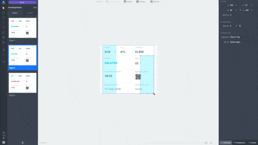
7. Connecting the Data to the Parent
To return, click the purple back button up at the top left. Now you should be back in the boardingPasses component. In this component we have three passes currently displaying the same data. Let’s update this now.
Remember how inside the boardingCard component, the data was set to Inherit from parent? In this case the parent is the component instance.
Clik here to view.

On the flight 1 page select the boardingCard instance. In the component properties leave State as it is. Under Data, select the data source and ensure the Row is set to row 1. The instance should now display data from the first row of the data sheet.
If you toggle the row you’ll notice that the data displayed updates. Let’s keep it on row 1 for now, however on flight 2 and flight 3 set this to show data from row 2 and row 3 respectively.
8. Adding Swipe Gestures
To enable users to swipe through their boarding passes we’ll need to set up some swipe interactions.
Create and draw a hotspot (H) on the right-hand side of the flight 1 page (make sure you leave some space at the top for the hotspot over the close icon on the back page of the boardingCard component, and that it doesn’t cover the QR code on the front page). To create the swipe gesture, use the following settings:
- Gesture: Swipe left
- Swipe distance: 200
- Go to: > Next page
- Motion: Push Left
- Easing: Ease in-out
- Duration: 300MS
Clik here to view.
Do the same on the the flight 2 page, and add a second hotspot on the left side of the flight 2 and flight 3 pages set to Push Right and Push Left instead. Feel free to press Preview to test and interact with the component, and adjust your swipe settings accordingly.
9. Create a Variable
To finish building the prototype we’ll need to create and use a variable. This variable will enable our components to talk to one another while influencing their state.
The variable we’ll be creating will be used to update the progress dots based on which boarding pass is shown.
Clik here to view.
To create a variable, press V to open the Variables Modal. In here click Create New Variable and type “flightDisplayed” into the Name field. Leave the default value blank.
Great, you have your variable set up! Close the variables modal by pressing the X or escape on your keyboard.
10. Using Variables
Navigate back to the prototype. If we preview now from the Home page, you should be able to swipe between the cards and also interact with the QR code.
While we can now swipe through the passes, there are a couple more things to configure to influence the progress dots to update based on the progression of boarding passes.
Clik here to view.
To do this, open up the boardingPasses component. On page 1 let’s create the following page action:
- After a set time
- Wait: 0
- Set: flightDisplay (variable)
- To: value...
- Value: 1
Repeat this on page 2 and 3, ensuring the value is set to 2 or 3 to reflect the page you’re on.
We’ve effectively told the component boardingPass to update the value of the variable flightDisplayed, depending on the flight (page) displayed. We can now use this value to influence the state of the progress dots.
Here’s how: head back to the prototype and open the progressDots component.
You’ll notice three pages (states) named 1, 2 and 3. This naming matches the values being set in the flightDisplayed variable. It’s important that these page names match the values set.
Clik here to view.
Head back to the prototype, select the progressDots component, and:
- In the Component section in the properties panel, open the State dropdown.
- Select the flightDisplayed variable.
We’ve now connected the progressDots component to the variable flightDisplayed. This means that when the value of the variable changes to a value, the progressDots component will display the page that matches the variable value.
Try previewing your prototype now, interacting with the boarding passes by swiping and seeing if the progress dots update.
Lastly, you can delete or move the Assets page to ensure your shared preview opens on the correct starting page. To delete the page, select the hamburger menu on the page thumbnail and click delete page.
Tip: See if you can figure out how to get the promoCard component to update its state based on the flight displayed. You’ll want to create a new variable called cardDisplayed.
Ta-da!
There you have it! Your very own Boarding Pass app. If you downloaded the iOS App, try opening the prototype and interacting with it on your iPhone; it should feel just like the real thing.
Well done for following this tutorial through to the very end. You should now have a thorough understanding of how to create your own prototype in Atomic. If you have existing assets in Sketch you can import them using the Atomic Plugin for Sketch, or design natively in Atomic if you wish.
Questions? Comments? Leave them below or reach out to me on Twitter (@femkesvs).
Clik here to view.
 Image may be NSFW.
Clik here to view.
Clik here to view.