In this tutorial we’re going to use CSS Grid to help us create a “broken grid layout”, something which has always been difficult with more traditional CSS layout methods.
Here’s what we’re working towards (take a look at the larger version for full effect):
This design is based on the work of Anthony Harmon, whose work is perfect for our demo. Take a look at this layout he did for Rel Acoustics:

Graphic Design on the Web
Web designers have become conditioned over the years to observe document flow and source order; creating layouts by floating blocks and letting them fill the page like building bricks. In the world of responsive design this approach seems quite natural. However, it’s a far cry from print layout where fixed dimensions mean that designers can confidently place text and images exactly where they want, leading to more experimental and visually daring layouts.
CSS Grid, beyond just allowing us to arrange things along x and y axes, can help us bridge the layout gap and get a bit more daring with our designs!
“We’ve got to start reimagining what good graphic design can be with overlapping things.” – Jen Simmons
Time to get stuck in.
1. Define the Grid
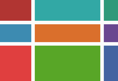
Grid columns don’t have to be uniform. Let’s take a section of the layout above and figure out how the grid might look.

Note: we’re just building one section in this tutorial. There’s no reason why each of the page sections can’t be built from independent grids.
We’ll start with some markup, a grid container:
<section class="grid1"></section>
Next, on that container, we’ll declare display: grid; then define the columns and rows.
.grid1 {
  display: grid;
  grid-template-columns: 3fr 6fr 1fr 5fr 10fr 2fr;
  grid-template-rows: 100px auto 15px auto auto;
}
The columns are laid out just as you see them in the image above. The fr unit is a fraction of the whole width, so the first column takes up three of those, the second is wider and takes up six. In total our layout comprises 27 units of width—hardly classic grid proportions!
The rows are a little different. You’ll see a mixture of fixed pixel measurements and auto. Where auto is used, the row will grow and shrink depending on the content.
2. Making the Images
Let’s begin with the images. For the markup we have a couple of options; either we use img elements, or we use other elements with an image background.
We could use object-fit: cover; on img elements, but that’s tricky–why make our lives more difficult?! So for this demo we’ll go with the latter, because that gives us greater flexibility in terms of how the proportions of the images change with fluid layouts.
Say hello to some good ol’ divs:
<div class="img1"></div><div class="img2"></div><div class="img3"></div>
With some background images to cover them:
.img1 {
  background: url(wooden.jpg);
  background-size: cover;
}

.img2 {
  background: url(speaker.jpg);
  background-size: cover;
}

.img3 {
  background: url(waves.jpg);
  background-size: cover;
}
3. Place the Images
Grid’s auto placement algorithm will have put them neatly on our grid already, but let’s get specific. We’ll use the grid lines to dictate where each element should begin and end.

Our first image starts on column line 1, and ends on 3. We can define that like this:
grid-column: 1 / 3;
or like this:
grid-column: 1 / span 2;
In terms of rows, our first image needs to start on row line 2 and end on 5, which we can state like this:
grid-row: 2 / 5;
or this:
grid-row: 2 / span 3;
Let’s now do the same for our other two images. This is what you should end up with:
Admittedly it isn’t particularly impressive, but that’s because most of the rows don’t yet have any height. They’ll get that once we start adding more content in the next step.
For more on how grid-column and grid-row work, take a look at these quick tutorials:
![]() CSS Grid LayoutCSS Grid Layout: Using Grid Areas
CSS Grid LayoutCSS Grid Layout: Using Grid Areas![]() CSS Grid LayoutQuick Tip: Name Your CSS Grid Lines, Just in Case
CSS Grid LayoutQuick Tip: Name Your CSS Grid Lines, Just in Case

4. Adding More Content
Let’s now add the textual content; a blockquote within a wrapper, and the call to action block. You can add these wherever you like as child elements of the .grid1 container, source order really doesn’t matter.
<div class="strapline"><blockquote>“Almost immediately, word spread of a Welshman who had built this incredible sounding sub bass system, and soon enough audiophiles began searching out these legendary subs that were built like no other.”</blockquote></div><div class="cta-wrapper"> <div class="cta"><h1>Gibraltar</h1><p>Introducing 212/SE, our most powerful and agile subwoofer, designed exclusively for larger systems and rooms to allow superior state of the art speakers to spring to full voice.</p><a class="button" href="">View Product Details →</a></div></div>
Next, before we style anything, we’ll position them on the grid just like we did with the images:
.strapline {
  grid-column: 3 / span 3;
  grid-row: 2 / span 1;
}

.cta-wrapper {
  grid-column: 4 / span 2;
  grid-row: 4 / span 2;
}
Looking better!
At this point it’s worth noting that you can play with z-index if you want. Stacking follows the source order by default; what’s first in the markup will be placed at the bottom, what’s declared later goes on top. But if we were to apply z-index: 1; to .img1 it would be stacked on top of .img2.
5. Inspect the Uninspected
Switching on your browser inspector will nowadays give you some help with grid layout. In Chrome’s inspector, selecting elements will pull up grid lines and measurements, like so:

The inspector within Firefox will do even more, allowing you to overlay the grid using controls under the Layout tab. You can display the line numbers, area names, and navigate the grid areas on a smaller thumbnail version:

Tip: when viewing under the Rules tab, hit the grid icon next to display to toggle the overlay:

By inspecting the grid you’ll quickly realise if you’ve misplaced any grid items, skipped a row here or there, or named something incorrectly.
6. Style the Content
Some quick font declarations and button styles will have this looking even better, without too much effort. We’ll begin by linking some Google fonts in the <head> of the document:
<link href="https://fonts.googleapis.com/css?family=Open+Sans|Playfair+Display:400,400i,700" rel="stylesheet">
We’re using Open Sans for the body, Playfair Display for the blockquote and heading. Let’s apply them:
body {
  color: #292929;
  font: 1em/1.7 'Open sans', sans-serif;
}

blockquote {
  font: italic 1.1em/2 'Playfair Display', serif;
  margin: 0 0 2em 0;
}

.cta h1 {
  font: bold 6em/1 'Playfair Display', serif;
  margin: 0 0 20px 0;
  position: relative;
}
Now some button styles:
.button {
  display: inline-block;
  color: white;
  text-decoration: none;
  background: #292929;
  padding: .8em 1.5em;
}

.button:hover {
  background: black;
}
Lastly, we’ll align the blockquote to the centre, then add some padding to the call to action, helping to fill out the row it’s been placed in. Here’s what you should have now:
Bear in mind that we’re building our layout for a wide viewport. What you see embedded in the tutorial might not look optimal.
7. Add Visual Flourishes
The design we’re working towards has a couple of visual touches which we haven’t used yet. We could add these in various ways, but as they’re not content as such we’ll add them using CSS pseudo elements. First, the squiggle above the blockquote:
.strapline {
  margin-top: 100px;
  position: relative;
}

.strapline::before {
  content: '';
  display: block;
  background: url(wavy.svg) repeat-x;
  background-size: cover;
  width: 20%;
  height: .5em;
  position: absolute;
  top: -3em;
  left: 40%;
}
These styles use a ::before pseudo element on the .strapline div, positioning it above the container itself using a negative top position. It’s perfectly centered, and you’ll remember that we allowed enough room for it by defining our first row as being 100px high.
We’ll do something similar for an SVG badge on the heading:
  .cta h1::before {
    content: '';
    display: block;
    height: 1em;
    width: 1em;
    background: url(badge.svg) no-repeat center center;
    background-size: 80%;
    position: absolute;
    left: -120px;
    top: 0;
  }
Again, we’re using a pseudo element because it’s simply a visual flourish as opposed to being valuable content. That’s not to say you couldn’t have added it as an <img> to the markup, for example. You could then have used CSS Grid or Flexbox to layout the contents within the call to action–you have many options at your
finger tips!
We’ve now built ourselves a very solid broken grid layout! Time for some next steps to take it even further.
8. Next Steps: Browser Support
CSS Grid is pretty well supported nowadays, though IE11 still requires a prefixed version, so you might want to wrap your grid styles in a @supports declaration. That would look something like this:
@supports (display: grid) {
    /* grid layout */
    .grid1 {
        display: grid;
        grid-template-columns: 3fr 6fr 1fr 5fr 10fr 2fr;
        grid-template-rows: 100px auto 15px auto auto;
    }
    ...
}
Any browser which doesn’t properly support CSS Grid will ignore whatever you’ve placed within this declaration, giving you the option to provide a fallback.
Take a look at Grid “fallbacks” and overrides for ideas on how to style fallbacks if you want.
9. Next Steps: Go Responsive
Our layout looks sharp on larger screens, but when squeezed into smaller viewports (such as when embedded into this tutorial) some cracks appear. How would you handle this in a responsive way? Adding media queries will allow you to establish the styles first, then gradually build up to lay out and make the grid more complex as viewports get wider:
.grid1 {
    display: grid;
    grid-template-columns: 1fr 1fr;
}

@media only screen and (min-width: 768px) {

  .grid1 {
    grid-template-columns: 3fr 6fr 1fr 5fr 10fr 2fr;
    grid-template-rows: 100px auto 15px auto auto;
  }

}
You might also choose to hide those flourishes we created on smaller devices, saving them until there’s more screen real estate to play around with. The choice is yours!
Here’s an example of how you could make this particular design responsive.
Conclusion
This tutorial has given you a glimpse into the world of alternative layouts achievable with CSS Grid. Forget the layouts you’ve been practicing with floats and positioning; break those old habits! Start exploring more intricate layouts and let’s see if we can make the web a little more interesting.
More CSS Grid
![]() CSS Grid LayoutCSS Grid Layout: A Quick Start Guide
CSS Grid LayoutCSS Grid Layout: A Quick Start Guide![]() CSS Grid LayoutSolving Problems With CSS Grid and Flexbox: The Card UI
CSS Grid LayoutSolving Problems With CSS Grid and Flexbox: The Card UI![]() CSS3 CSS Grid Projects for Web Designers
CSS3 CSS Grid Projects for Web Designers![]() CodePenQuick Tip: Add a @supports CSS File to Your CodePen Demos
CodePenQuick Tip: Add a @supports CSS File to Your CodePen Demos