As Ferris Bueller famously said “Life moves pretty fast; if you don’t stop and look around once in a while, you could miss it”. Let’s heed his sage advice and take a moment to look around some web design trends we witnessed in 2011.
The web is an ever-changing beast, full of flaws and imperfection and experimentation. – Dan Cederholm
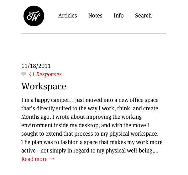
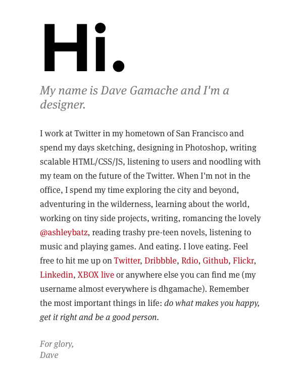
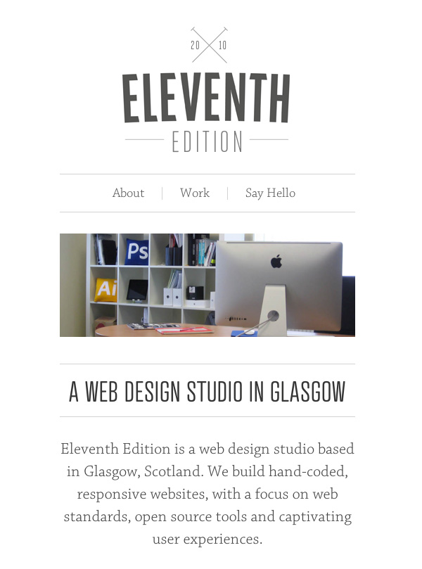
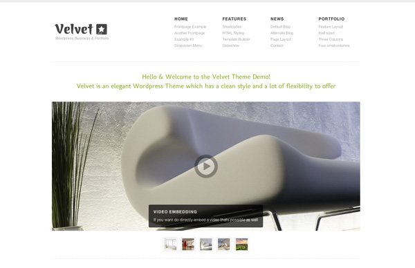
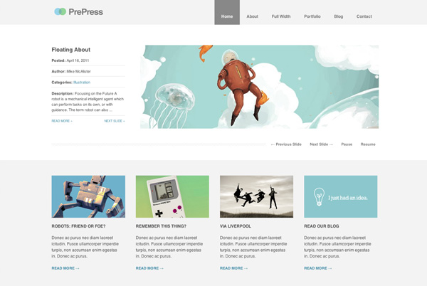
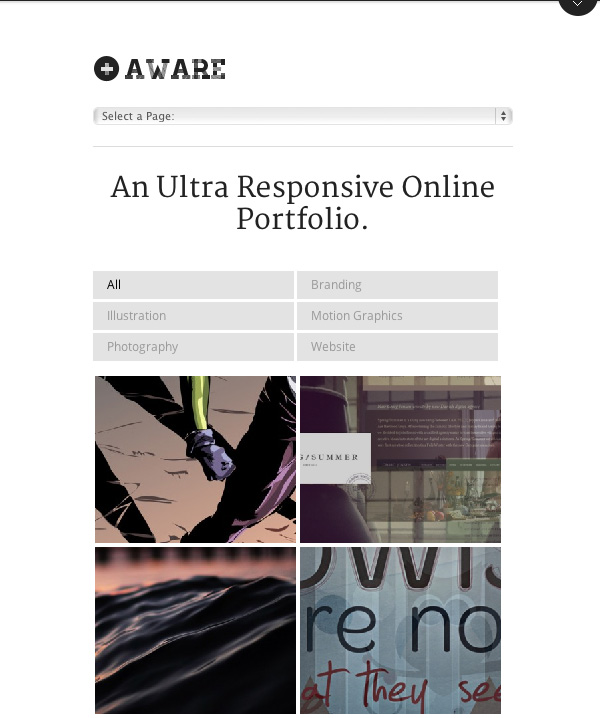
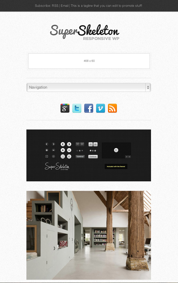
Responsive Web Design
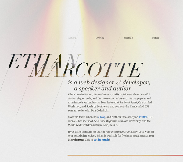
Responsive Web Design is becoming a bit like a brilliant, yet over-played song. It seems like everyone has had their say, and Ethan Marcotte’s agenda has never looked healthier. There’s good reason for this though; the concept is simple, the motives are logical, the technology is straight-forward and the results are extremely satisfying.
2011 saw an explosion in the number of websites built responsively, and the beauty of it is that we’re all involved in developing the process. It’s still in its youth, designers and developers are concocting new approaches all the time, and we’re a long way off nailing down any real best-practices. Should we first design for large screens and use media queries to gracefully degrade our designs for mobile? Or should we design for mobile first, progressively enhancing for more capable devices? Paul Irish kicked off an interesting thread over on GitHub if you’d like to dive into the discussion.
One thing RWD has shone a light on is the focus on content. Aside from all other factors, the content of any given website is what’s important; the meat-and-two-veg needs to be legible, accessible, and clear on any device. Designers are certainly taking this on board as is evident in many of 2011′s emerging websites.
When all’s said and done though, even if you’re a little tired of seeing yet more RWD tutorials and articles cropping up, stay tuned. 2012 is going to see big developments in the way we all approach it.
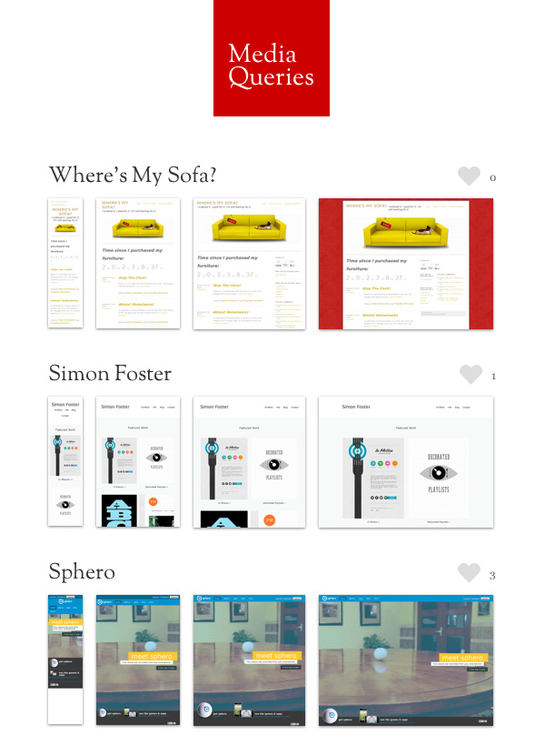
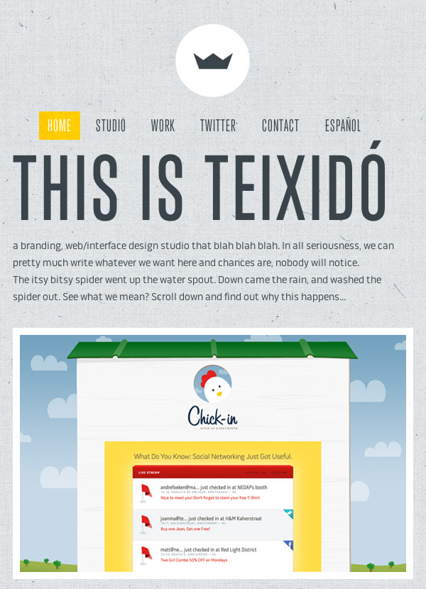
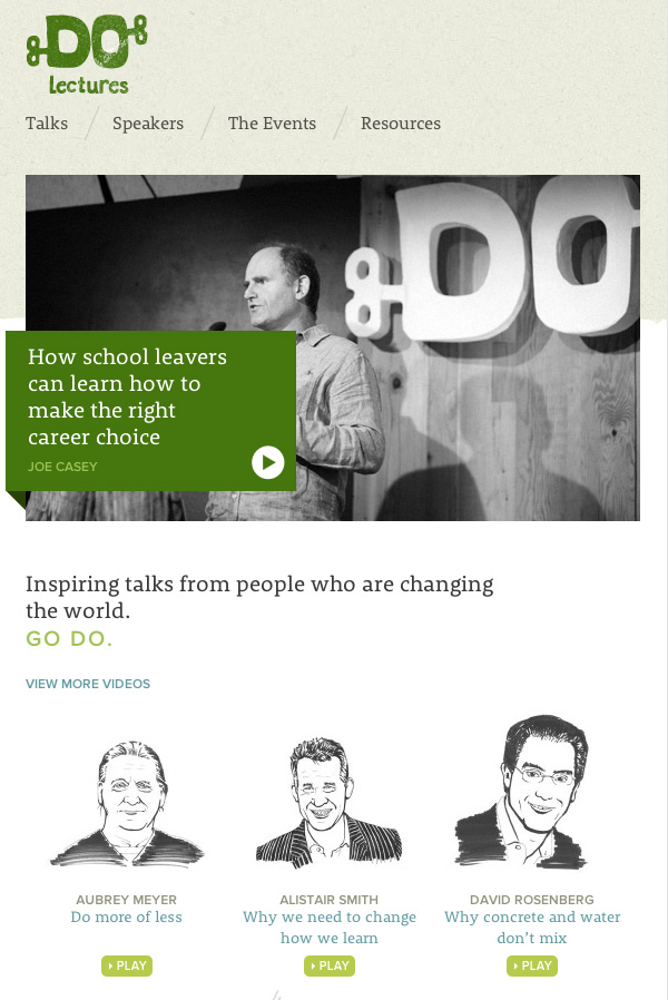
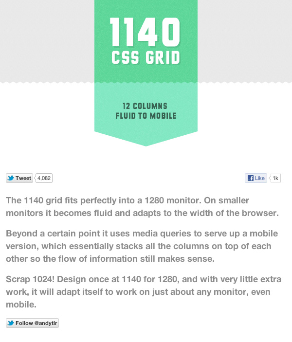
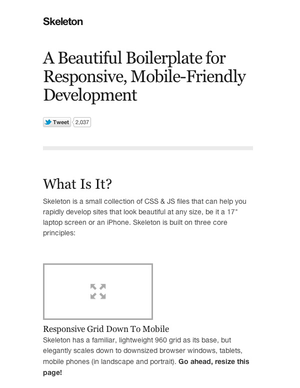
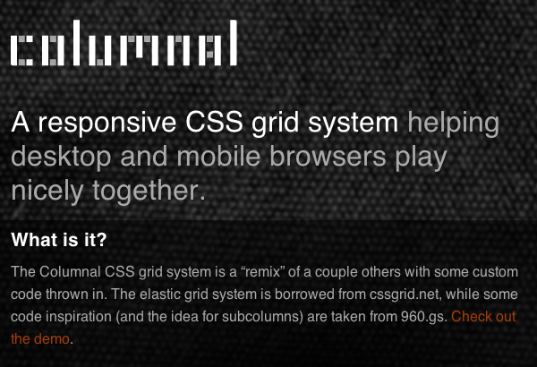
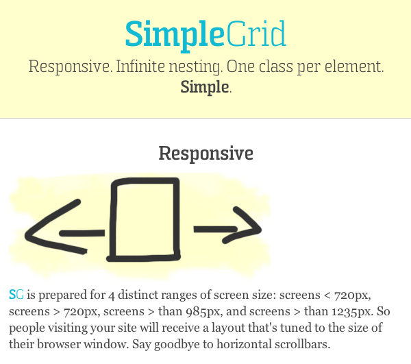
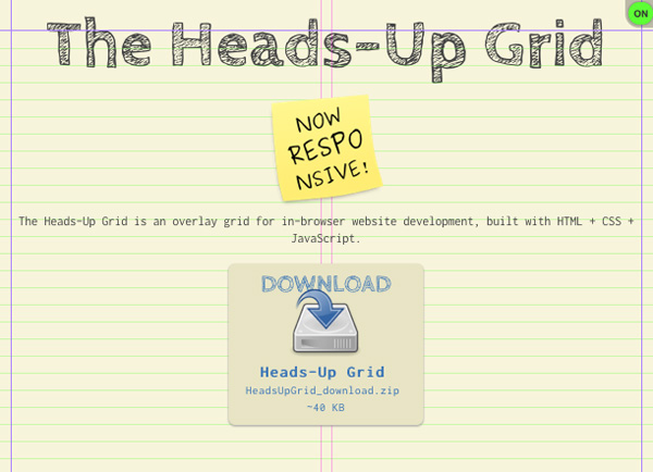
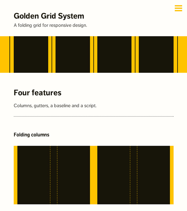
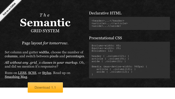
Grid Systems
Partner in crime to the responsive layout is the grid. 2011 has seen fixed grid frameworks make flexible improvements, not to mention the appearance of even more tools to help us out. All of the following frameworks, tools and guides cater for today’s needs and offer fluidity. Most of these sites also demonstrate great responsive design, as the 1:1 thumbnails below show:
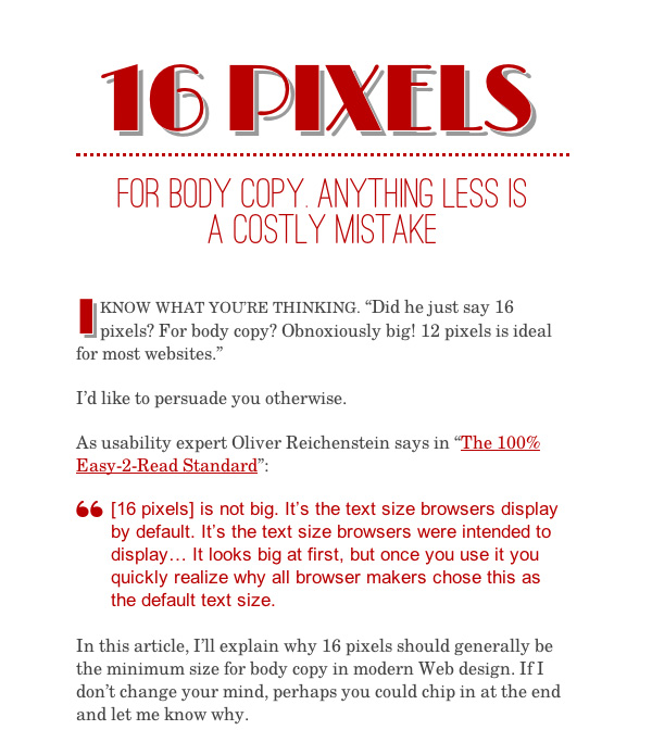
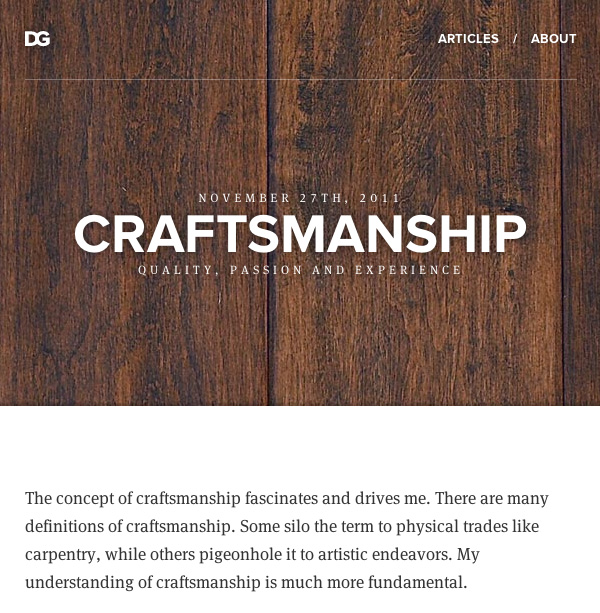
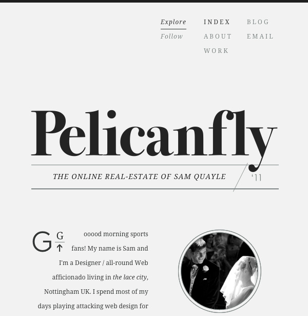
Typography
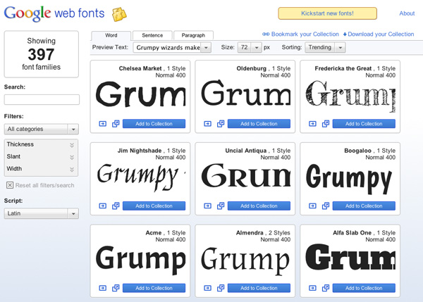
Obviously, typography isn’t a discipline which has emerged in 2011, but it’s an area of web design which continues to grow and is facilitated more than ever by web fonts and services.
Two noteworthy aspects of typography are the aesthetics (web fonts are allowing designers to indulge themselves) and the growing understanding that type exists primarily to be read. Fonts don’t have to be microscopic to appear chique, and the emphasis on content first is pushing us towards a web full of big and beautiful type.
Technology Pushing Art
2011 has seen huge leaps forward in terms of browser capabilities (and version numbers!) Even Microsoft recently conceded that automatic updates for Internet Explorer are probably a good idea. All of this means that web designers have more toys to play with in terms of HTML and CSS, which understandably leads to creativity as a result of technology. The ‘because I can’ approach, if you like.
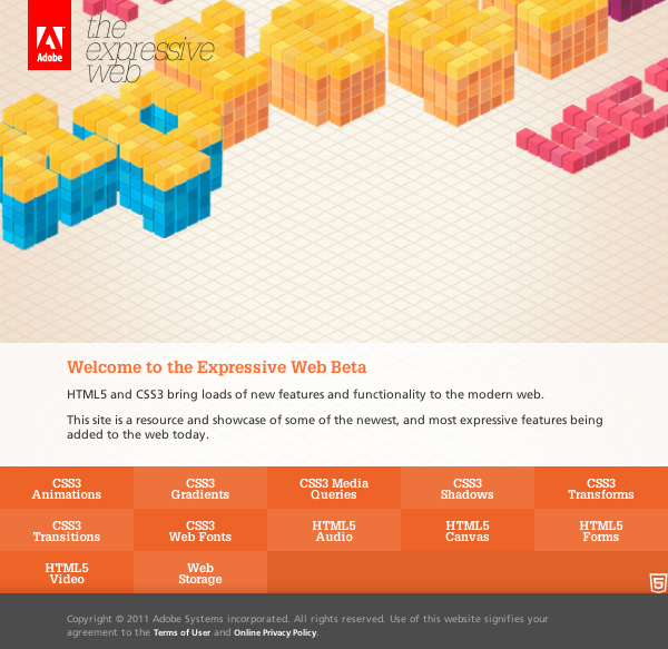
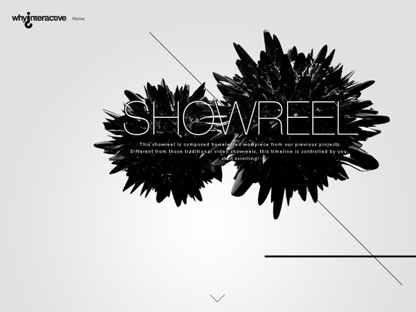
Scrolling, Vertical Narratives
I can’t think of a better title for this bit, sorry. So what am I talking about? Vertical scrolling.
It’s a daily task for web designers to play down the importance of the fold. The fold is impossible to define, what with the plethora of devices and resolutions these days, so content “being above it” shouldn’t be a client’s number one priority in a design solution.
We’re embracing vertical scrolling. The rise of mobile devices has reminded people that they can scroll and there is relevant content below the first few pixels of a web page. Some designers have taken this to the next level and made scrolling a fundamental part of the browsing experience.
One approach is in subtle parallax effects.
Note: The images below obviously don’t do the websites justice – go and check them out (and get your mouse wheel ready..)
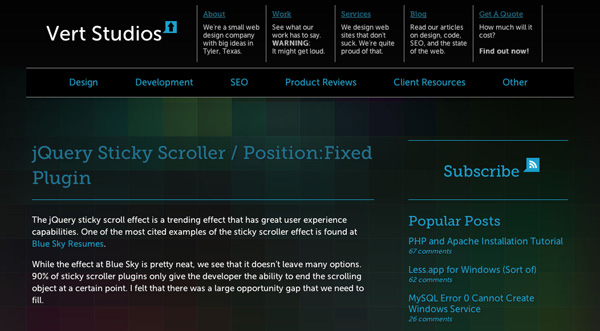
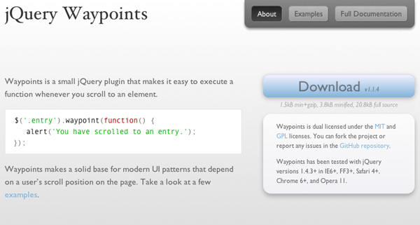
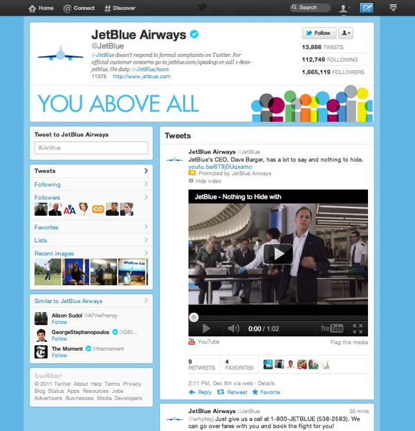
Then there’s the idea that some content can scroll up to a point. 2011 saw wide use of this effect; keeping social icons, shopping carts, menu bars, calls to action etc. persistantly in view:
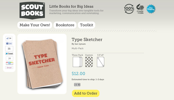
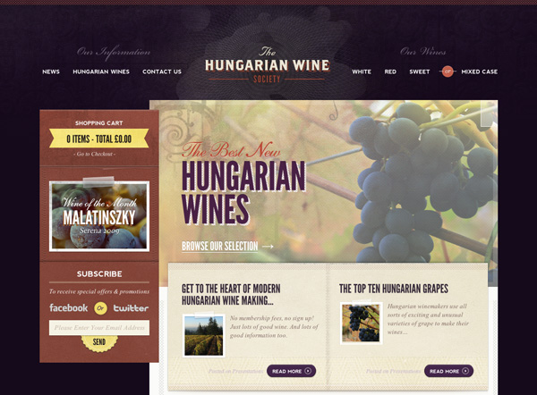
So how’s this achieved? Often, a combination of jQuery and CSS positioning. Here are just two resources to help you out:
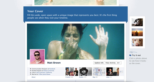
Some sites have taken the concept even further, animating elements and calling events when certain vertical points on the page are reached:
And then there are examples which take scrolling down a web page into a totally new dimension (really, check this one out)..

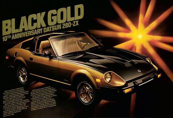
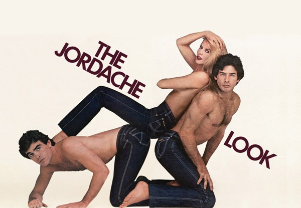
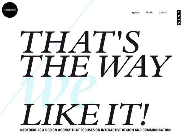
Like it’s 1983
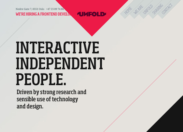
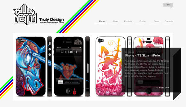
Diagonal is awkward, it doesn’t play along with today’s grid-based surroundings, but for some reason oblique lines have been popping up all over the place during 2011. It’s like a kick-back to a time even before mainstream internet, and you’ll find other visual reminders of that era too; odd color combinations, lighting effects, beige and bronze. Weird.
I can’t help but be reminded of old magazine ads with their abstract diagonal lines, display serifs, big hair, Joan Collins and pearls. It’s a look which is oddly appealing..
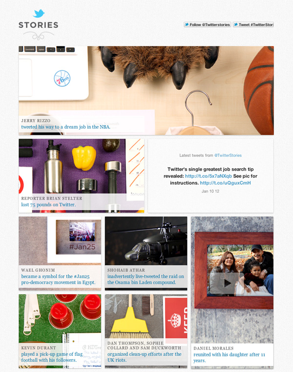
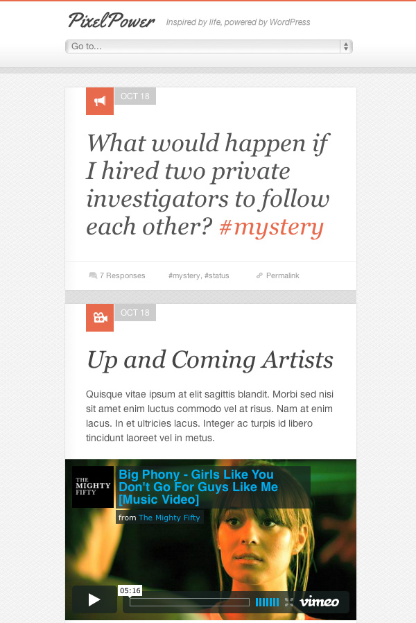
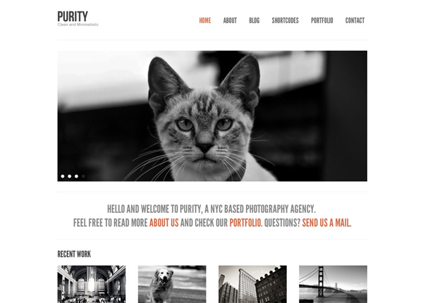
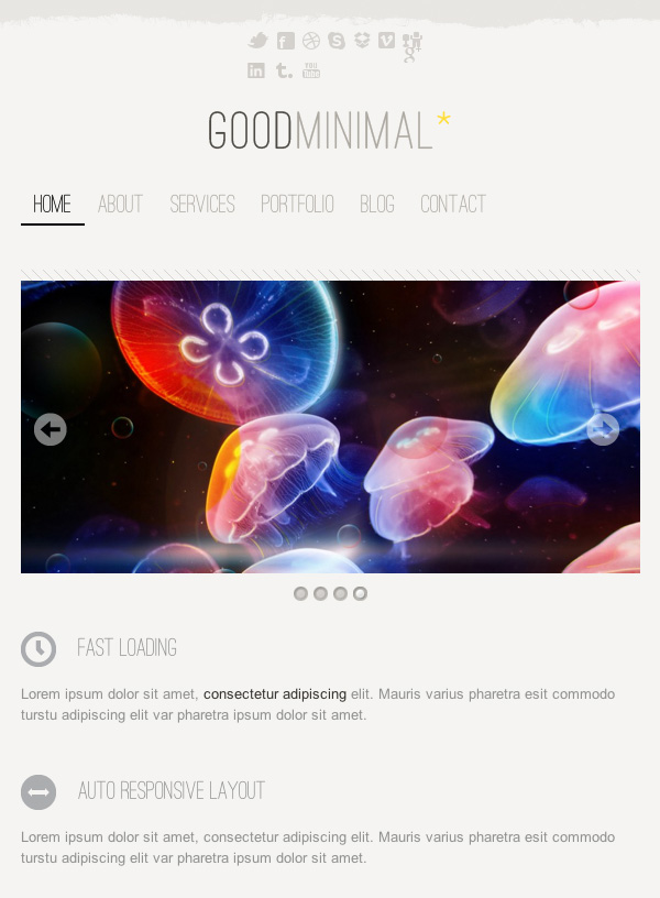
Modular Interfaces
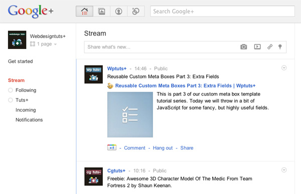
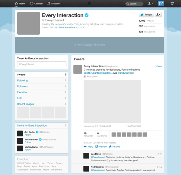
Approaching layouts in a modular fashion is again something favored by Responsive Web Design. Managing areas of a design in modular chunks allows fluid repositioning and segregates content clearly. You could argue that the rise of modular interfaces is down to the influence of apps. Increasingly we find ourselves publishing (and accessing) web content via external apps such as Facebook and Twitter; the lines are blurring between desktop screens and handheld devices.
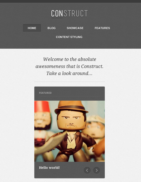
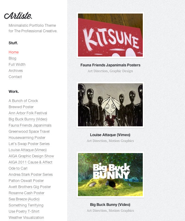
Themeforest
I asked Themeforest review maestro Ivor what he’d seen happening on Envato’s number one marketplace during the last year. He observed a couple of trending aspects:
- The portfolio layout is still dominating the market.
- Responsive Web Design and Mobile-focused sites are hot.
- Minimal Design has been consistent throughout the year.
2011 was the year of Minimal Design in ThemeForest – Ivor Padilla
You don’t have to look deep into the Themeforest archives to see what he means either..
Over to You
There’s no way I covered every significant development in the web design of 2011, so pitch in with your comments! Which trends struck you in 2011? Where do we stand at the moment, and where do you think things are going?