The word metaphor is probably most likened to a piece of writing, when it is used as a literary figure of speech for descriptive effect. However, today, we’re going to talk about a different type of metaphor: a visual one we can use in web design.
metaphor: a figure of speech in which an expression is used to refer to something that it does not literally denote in order to suggest a similarity – WolframAlpha
On the web, we use images and icons a lot to symbolize different things. When we visit a webpage, we scan to try and find what we need as fast as possible, and imagery is used to help speed up that process. We can interpret something much faster with familiar styling and images. For example, we can instantly recognize an error when there’s something like an exclamation mark, or a yellow or red color. It’s all down to familiarity.
Especially in recent times, we’ve started to see urban metaphors appear in web design, using familiar elements like a bookshelf or a wall within a design. However, there are loads of other metaphors that are used in web design to bridge the gap between actual and virtual life.
What is a Metaphor?
The “official” definition of a metaphor has not changed from the previous section: a figure of speech in which an expression is used to refer to something that it does not literally denote in order to suggest a similarity. That’s very truthful when we look at the web and the use of metaphors on that platform. There, we use pixels as representatives of real world objects to bridge some sense of familiarity between virtual and actual life.
There are several different types of metaphors we use on the web too: those on a smaller-scale that mimic real-life objects like buttons, iconic metaphors which copy real life associations and use them on the web, and extended ones where an entire design can revolve around a metaphor.
Real Life on the Web
A button on the web isn’t actually button is it? No, it’s a bunch of pixels made to look like a button because (a) we’ve made it so and (b) our users will recognize it and know that it’s something to be pressed (or, more correctly, clicked). We make this link look like a button because we’re used to recognizing a button as a point of interaction in real life, and will be able to distinguish that particular link from the rest of the page with little effort.
Imitating real life conventions helps us interact with the virtual world. It betters our user experience because the web doesn’t turn out to be some foreign interface that requires a whole lot of learning to interact with. We know buttons are buttons because they look pretty much the same everywhere, they’re a visual cue and users interact with them instinctively.

The same goes for windows, desktops, and tabs in UI design. Steve Krug, in his usability book Don’t Make Me Think famously uses the example of folder tabs as great use of metaphors in interface design.
I haven’t been able to prove it (yet), but I strongly suspect that Leonardo da Vinci invented tab dividers sometime in the late i5th century. As interface devices go, they’re clearly a product of genius. – Steve Krug
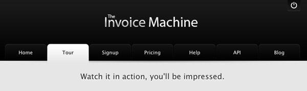
Tabs are the classic example of an intuitive interface metaphor.
Icons
Slightly different to identical metaphors are icons, just as we talked about before. For example, exclamation marks are used to represent some state of importance or alert so we use that icon in the same context on the web. Also, we might use the symbol of a phone or a letter to signify contacting.

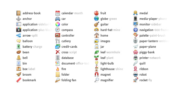
For a perfect example, we can look at the WordPress dashboard. Each of the menu items down the left side features some sort of metaphor, such as the push-pin to represent posts and the speech bubble for comments.
The encouragement to use such a metaphors is identical to those in the previous section: it creates some familiarity – a “link” if you will – to the real world that helps the reader to interpret and navigate a page with relative ease.
Active Metaphors
We’ve taken a brief tour of replicating real life objects and using icons to form links, but there’s one more important type of metaphor: those that extend beyond a single element. The most striking example I can think of is not a website, but an app. iBooks doesn’t look like a normal iPad app because it’s meant to imitate the look and feel of a real bookcase to add that sense of familiarity for the reader. You look at iBooks and you instantly know it’s got something to do with books. If done well, these types of websites can turn out to be really awesome!
Extended metaphors are less common that the other types which are used on the majority of website designs around the web.
Although “extended metaphor” might be the wrong terminology, this type of metaphor is still the widest type you can get. They offer a little window in your browser into real life, and can be an instant method of creating a first impression of what the website’s all about.
Why Use A Metaphor?
In writing, we use a metaphor to express, explain and describe. Metaphors can be a useful way of connecting an idea with one that it is not literally similar to (where a simile would most likely be used instead), but where the two can be used in conjunction to represent one another.
Metaphors in web design, like writing, are used as a descriptive mechanism by linking real life objects and ideas to the pixels in a website. It may seem very small, and something that can be overlooked, but web readers have a shorter attention span than print readers so time is of the essence when browsing a website. And, in those circumstances, metaphors become helpful by copying real life associations (like the color red with danger, or a magnifying glass with search) and using them on the web so the process of scanning a webpage is sped up.
Attraction
As designers, we can harness metaphors to enhance attraction to the design, and make our designs memorable. We want the users to connect with the website, and, already, most websites have some form of metaphors in use in order to suit their target audience. Websites reflect real-life concepts, companies, people and objects, and the styles chosen don’t different from those in real life. Not only do metaphors create a sense of familiarity between pixels on a webpage and real life matter, but they can also be used to connect to a specific audience.
Let’s take the BBC’s CBeebies homepage for example. The site is built around a background depicting a garden with trees and rainbows, an idealistic picture of the world that is common throughout a lot of child-oriented media. The metaphor of an online garden welcomes children to use the site whereas if it were designed like Microsoft’s homepage, it wouldn’t be so attractive for children to use.

Conclusion
Metaphors are used across all media to express something as something else, and, on websites, they’re a great way of communicating familiarity and attracting readers to a design. When we consider this in the scale of the world’s 4.5 billion years, the web is still a very new medium so creating links between real and virtual is a transitionary measure but one that works.
Metaphors in Action
Flourish
Flourish is a web design agency that takes it’s name seriously. With flourish defined as “grow or develop in a healthy or vigorous way”, the concept of a growing tree in otherwise barren land and an all-around nature-based design is presented.

Interior Design XHTML Template
The “Interior Design” template is a ThemeForest item styled to represent an office, a perfect example of a metaphor in play.

Launch
Launch is another ThemeForest item, but this one likens the release of a website to the launch of a rocket, as do many similar designs.

Mutant Labs
Mutant Labs, a software development company, takes the “lab” part of their name into a scientific context for the sake of their site’s design.
