Crowdpilot's landing page shows off just how simple and awesome SVG is in combination with JavaScript and CSS animations. In this tutorial, you'll learn how to recreate Crowdpilot's diagonal message rotator and curtain, plus we'll talk a bit about "flat" design and what it means to design digitally native elements.

Crowdpilot is an app that allows you to bring your friends' ears (and opinions) with you anywhere. We'll be recreating some of what the Crowdpilot website does, but for the sake of brevity this tutorial will ignore the social and privacy discussions that the app otherwise would demand.
A Quick Rant
Perhaps you've heard of the flat trend. It's making it's way around fast - if you're a web designer, you'll likely embrace this shift in some form or another.
But for the sake of elevating our design discussion, "flat" doesn't do the shift justice. For a more complete perspective on the driving factors behind the "flat trend", take a look at this awesome piece by Frank Chimero, "What Screens Want", from November 2013. In the piece, Chimero makes the argument that our brains are adapting to the digital landscape, and that what once was needed for us to understand, for instance, a "deleted" folder on a computer, was a representation of trash that we equate to our tangible representation of discarding; a 3d-looking trash can. But as our brains adapt to more native representations of digital deletion, we will no longer need these metaphors - what Chimero calls "padding" (in reference to the extra coating on an aspirin pill beyond the active ingredient that makes it easy to grasp).
From the piece:
So while the size of an aspirin pill is constrained by your stubby little fingers, your brain can normalize the patterns of an interface and make way for more nuanced abstractions.
With that said, let's take a look at a good example of a natively digital design element employed by Crowdpilot.
Back to the Tutorial
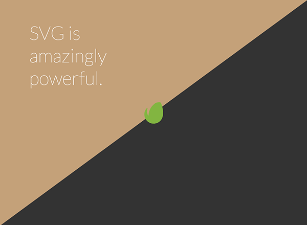
The relatively simple page has a large play button, and the screen is split horizontally by two colored triangles. Clicking the play button reveals a full screen video behind the triangles.
We're going to recreate this effect.
SVG: Making Triangles Easy Since 2001
Crowdpilot's secret sauce is two very simple SVGs. We've taken the source code of one of these SVGs straight from their code:
<svg enable-background="new 0 0 100 100" height="0" id="diagonal-top-image" preserveAspectRatio="none" version="1.1" viewBox="0 0 100 100" width="0" x="0px" xml:space="preserve" xmlns="http://www.w3.org/2000/svg" xmlns:xlink="http://www.w3.org/1999/xlink" y="0px" style="width: 1174px; height: 707px; fill: #7dbc4d; margin-top: 0px;"> <polygon points="100,0 0,100 0,0 "></polygon> </svg>
We can look at this one piece at a time.
enable-background="new 0 0 100 100"
This property is largely unsupported, and refers to background composition, which isn't actually relevant to this use case, so we will omit it from our example.
height/width
We will also be ignoring the width and height attributes of the SVG, as we can use CSS properties to accomplish the effect seen in the example.
preserveAspectRatio="none", viewBox="0 0 100 100"
This allows our SVG to scale to any ratio. Our viewBox values set up a canvas for our SVG, and is mostly used in reference to the child polygon element. The SVG canvas (not to be confused with the canvas element) in this case is 100x100 arbitrary units. (A good guess: Whoever created the Crowdpilot splash page wanted to use a 100x100 viewBox to allude to "100 percent".)
polygon points="100,0 0,100 0,0"
This creates a polygon at the locations listed as x/y coordinates, which produces: x = 100, y = 0 (top right)
x = 0 y = 100 (bottom left)
x = 0, y = 0 (top left)
This polygon combination with our square viewBox in the svg parent tag is what creates our triangle.
Building Our Curtain Reveal
A simplified version of our SVG will look something like this:
<svg viewBox="0 0 100 100" preserveAspectRatio="none"> <polygon points="0,0 100,0 0,100" style="fill:#222;"></polygon> <polygon points="100,0 100,100 0,100" style="fill:#333;"></polygon> </svg>
As odd as it may seem, we can place this directly within our body tag.
For our example, we will place a logo in the center and reveal a background image when you click the logo, then close the curtain by clicking the logo again. For this, we'll just add an anchor tag, and position it absolutely in the center of the screen.
<a href="#reveal" class="envato-logo"></a>
.envato-logo {
    width: 120px;
    height: 120px;
    position: absolute;
    top: 50%;
    left: 50%;
    background-image: url(envato-logo.png);
    background-size: cover;
    margin-left: -60px;
    margin-top: -60px;
}
For our reveal animation, we can use a bit of JavaScript to listen for a click on the anchor element, and toggle a class on the body.
$(".envato-logo").on("click", function (e) {
    e.preventDefault();
    $("body").toggleClass("curtain-open");
});
We then want to make sure our polygons have a CSS transform and transition applied. Since we know we want to also animate color later, let's use the all value for the property to be animated.
.curtain-open polygon:first-child {
    transform: translate3d(0, -100%, 0);
}

.curtain-open polygon:last-child {
    transform: translate3d(0, 100%, 0);
}

polygon {
    position: relative;
    transition: all 0.4s;
}
Note that these rules will also need to be browser prefixed properly.
Hint: try out something like Prefix Free to solve your prefix woes.
An important thing to understand here is that all of our animating power is accomplished with CSS. This makes our JavaScript very light and our presentation flexible.
Cycling Colors
To cycle through different colors for the top left triangle, we will set up an interval to loop through an array of information. In the example from Crowdpilot, we see a rotating background color of the top triangle as well as rotating text in the top left. Here's a quick explanation of how to accomplish this.
First, we'll set up an array of objects each with a background color and text.
    // message data
	var cycle_array = [
	    {
	        color: "#c479b7",
	        text: "Here's some text and whatnot."
	    },
	    {
	        color: "#c4a179",
	        text: "SVG is amazingly powerful."
	    },
	    {
	        color: "#222",
	        text: "Diagonals are in."
	    }
	]
Next, we will set up an interval to cycle through the colors and messages every two seconds.
var i = 0,
    messageHolder = $(".message"),
    poly = $("svg polygon").first();
var interval = setInterval(function () {
    i = i % cycle_array.length;
    var nextObj = cycle_array[i];
    $("svg polygon").first().css({
        fill: nextObj.color
    });
    $(".message").html(nextObj.text);
    i++;
}, 2000);
We use a clever trick in the second line of the setInterval function. We set up i to iterate until the last item, and we set it back to 0 using the modulus operator %, which returns the remainder of a division. In other words, on the third iteration, i will be equal to 3; 3/3 does not have a remainder, so i will be set back to 0.
The rest of this code is relatively straightforward; we assume that there is an element with the class of message. You might also have noticed that we are setting the CSS property (and not using the jQuery animate function); this is because we have already set up transitions in our CSS.
Bonus: Random Color Changes
Sure, you probably want colors that your text look good on. But if you want a random color, let's use a cool trick found on Paul Irish's blog to generate a random hex. The previously used JavaScript would change to this:
var i = 0,
    messageHolder = $(".message"),
    poly = $("svg polygon").first();
var interval = setInterval(function () {
    i = i % cycle_array.length;
    var nextObj = cycle_array[i];
    $("svg polygon").first().css({
        fill: '#' + Math.floor(Math.random() * 16777215).toString(16)
    });
    $(".message").html(nextObj.text);
    i++;
}, 2000);
Second Bonus: jQuery-less
If you don't need to support every browser and want to lose some weight by going jQuery-less, you can do that with this code.
// jQuery-less version
 (function(){

// logo click, polygon move
var envatoLogo = document.querySelector(".envato-logo");
envatoLogo.onclick = function () {
    document.querySelector("body").classList.toggle("curtain-open");
}

// message data
var cycle_array = [{
    color: "#c479b7",
    text: "Here's some text and whatnot."
}, {
    color: "#c4a179",
    text: "SVG is amazingly powerful."
}, {
    color: "#222",
    text: "Diagonals are in."
}]

// message intervals
var i = 0,
    messageHolder = document.querySelector(".message"),
    poly = document.querySelector("polygon");
var interval = setInterval(function () {
    i = i % cycle_array.length;
    var nextObj = cycle_array[i];
    poly.style.fill = nextObj.color;
    document.querySelector(".message").innerHTML = nextObj.text;
    i++;
}, 3000);

}());
We've replaced a lot of the jQuery-based calls with plain JavaScript, thanks to the evolving native selection and DOM manipulation APIs.
Conclusion
The simplicity of natively digital interfaces combined with the flexibility and power of SVG and CSS3 animations gives us the power to build experiences, like the one seen on Crowdpilot, with minimal effort.
It's important to keep somewhat informed of evolving APIs and technologies; to accomplish the same effect as what we've created in about 100 lines of code, we would have had to rely on much more difficult, inefficient ways of creating relatively simple shapes. As the web evolves, so do the tools we use to build it; this example shows just how powerful those tools have become.
