Quantcast
Channel: Envato Tuts+ Web Design
Viewing all 4338 articles
Browse latest View live

19+ Best WooCommerce Themes: To Make a Better Online Store

$
0
0

Adding an online store is a big step toward expanding your customer base and increasing your revenue. WooCommerce has many benefits that make it an ideal solution for small business owners who want to sell online in an elegant way, whether they are selling physical or digital products, or a combination of both.

Why Choose WooCommerce?

WooCommerce is easy to setup and use. The core plugin is free, which means you can have a fully functional store up and running within minutes.

It integrates with any WordPress theme, and it features a clean and minimal design which means your store won’t look out of place.

Payments are also easily setup and you can choose between PayPal, card handlers like Stripe, direct bank transfer, cash on delivery, or check payments. It’s worth mentioning that you can add additional payment methods with various WooCommerce extensions.

And that last point there is the most compelling reason for using WooCommerce. From adding email optin integrations to integrating WooCommerce with popular accounting software such as QuickBooks, WooCommerce can handle all of that and much more.

Finally, since WooCommerce is so popular, you can easily find answers and support from other users or developers who specialize in WooCommerce development and customization.

“WooCommerce powers over 26% of all online stores” — stats from Builtwith

So yeah. It’s pretty cool. 

Best WooCommerce Themes on Envato Market and Elements

In this post (updated regularly) we feature our best WooCommerce themes that will help you make a better store. Check out the best WooCommerce themes on Envato Market and Envato Elements now!
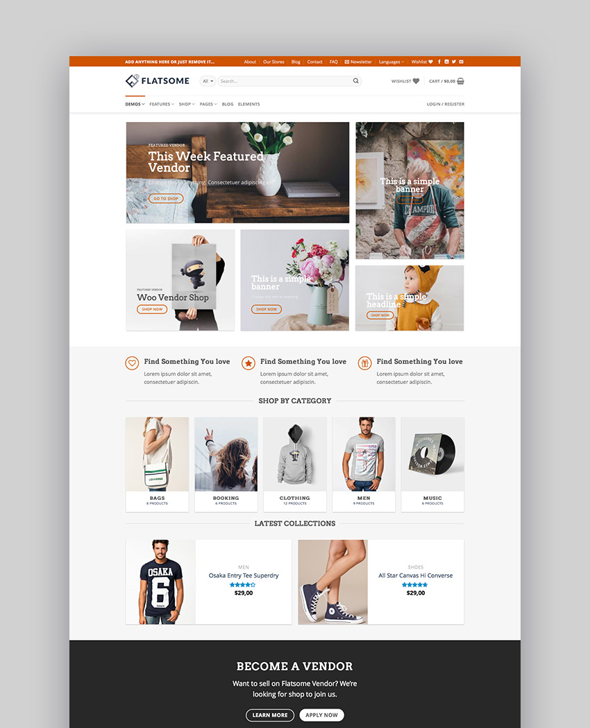
Best WooCommerce themes on ThemeForest

1. Flatsome

Flatsome is a stunning, responsive WooCommerce theme with modern design and plenty of features. It comes with Flatsome page builder which makes it easy to create unique and interesting layouts for your store, such as using a Pinterest-style layout for your homepage. 

The Theme options panel is easy to use and includes customization for colors, fonts, adding your own logo, and a shopping cart icon. Other features include instant live search, customized check-out pages, a built-in quick-view feature, unlimited sidebars, and much more. 

Flatsome is one of the biggest sellers on Envato Market, and with its constant updates it’s not difficult to see why it’s sold over 100,000 times since launching in 2013!

Flatsome  Multi-Purpose Responsive WooCommerce Theme
Flatsome | Multi-Purpose Responsive WooCommerce Theme

2. WP Configurator: WooCommerce WordPress Theme

Let’s kick off the list with a really cool example; this theme lives up to its name by allowing customers to configure their own products. WP Configurator comes packaged with the Panorama Addon giving you an awesome full width configurator:

WP Configurator
WP Configurator: the configurator itself

The possibilities for selling configurable products are endless; apparel, equipment, cars, furniture.. you name it! It comes with a ton of seriously stylish demos too–take a look at this parallax homepage selling headphones (configurable, of course):

WP Configurator headphones demo
WP Configurator: headphones demo

3. Marketo - eCommerce & Multivendor Marketplace

Marketo’s nine gorgeous homepage examples make it really difficult to choose which one to showcase for this roundup! Launched in July 2018, Marketo is a large scale storefront, making it ideal for multiple vendors or anyone looking to sell volume. Amongst the included options and extras comes Elementor; a superb page builder for anyone more comfortable with a visual, rather than code-based, design environment.

Marketo - eCommerce  Multivendor Marketplace Woocommerce WordPress Theme
Marketo - eCommerce & Multivendor Marketplace Woocommerce WordPress Theme

4. Barberry - Modern WooCommerce Theme

Brand new as of November 2018, Barberry has a touch of class; clean typography, elegant lines, and can turn its hand to many different products. Emphasis is placed on its confident use of AJAX, from pages, to products, to searches, and filters, there’s barely a single browser refresh to get in the way. Its maker, temash, is an Elite Author, and offers extensive support for this WooCommerce theme.

Barberry - Modern WooCommerce Theme

5. WoodMart - Responsive WooCommerce WordPress Theme

WoodMart offers a wide range of styles within a single theme (take a look at some of the real world examples to see just how varied WoodMart can be). The screenshot below demonstrates a rich, delicious layout, perfect for quality food products, restaurants, and catering. 

With great touches like advanced swatches for variable products, and a full screen AJAX search UI, WoodMart offers all the familiarity of WooCommerce with some brilliant extra bells and whistles.

WoodMart - Responsive WooCommerce WordPress Theme

6. Handmade Shop - Handicraft Blog & Creative Store WordPress Theme

Handmade Shop is a stylish niche theme, a trending item on Envato Market, and is a refreshing antidote to multipurpose alternatives. 

Handmade Shop - Handicraft Blog  Creative Shop WordPress Theme
Handmade Shop - Handicraft Blog & Creative Shop WordPress Theme

7. KALLYAS - Creative eCommerce Multi-Purpose WordPress Theme

Kallyas is a multi-purpose, responsive WooCommerce theme with an easy-to-use page builder, which allows you to create any type of layout, as well as go beyond a simple eCommerce website. This theme is optimized to load fast, thanks to its smart loader that loads only the necessary resources your page needs. 

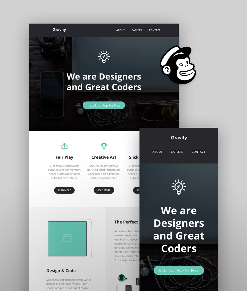
Other features include unlimited custom color schemes, support for Google Fonts, SEO optimized code, multi-language support, 12 pre-defined layout options, integration with MailChimp, and more—allowing you to make a full-featured online store. 

KALLYAS - Creative eCommerce Multi-Purpose WordPress Theme

8. Shopkeeper - eCommerce WP Theme for WooCommerce

Shopkeeper features a very clean and elegant design with plenty of powerful features behind the scenes. On top of being responsive, Shopkeeper allows you to choose from a number of predefined layouts to get your store running as quickly as possible; as well as allowing you to create your own custom layout. 

Other features include unlimited header options, custom color schemes and fonts, a gorgeous Revolution slider, a built-in order tracking system, intricate tax and shipping options, and a built-in coupon system.

Shopkeeper - eCommerce WP Theme for WooCommerce

9. Porto | Multipurpose & WooCommerce Theme

With 25 unique homepage layouts, light and dark versions, responsive design, and a powerful admin panel that allows you to customize almost any aspect of the theme, Porto is a great choice if you want your store to stand out. 

Make an online store quickly with options such as unlimited header and styles, sidebar layouts, vertical and horizontal mega-menus, customizable shop categories, integrated quick-view, and zoom options. These are just the tip of the iceberg with this popular WooCommerce theme. 

Porto  Responsive WordPress  eCommerce Theme
Porto | Responsive WordPress + eCommerce Theme

10. XStore | Responsive Multi-Purpose WooCommerce WordPress Theme

If you want a theme that will let you show your individual product pages in style, look no further than XStore. Individual product pages can be customized using different layouts and take it a step further by adding custom hover options which allow your customers to immediately purchase the product, zoom in on it, or add it to their wishlist. 

Design features include unlimited header options, the ability to filter products, adding videos to products, as well as showcasing brands you’re selling with a custom widget.

XStore - Responsive WooCommerce Theme

11. Electro Electronics Store WooCommerce Theme

Electro is a robust and flexible theme suitable for an electronics store with responsive design and integration with several popular WooCommerce extensions such as YITH Wishlist, YITH WooCompare, Revolution Slider, and Visual Composer page builder.  

Features include advanced live search, a product carousel, product deals, store directory, powerful customization features such as unlimited colors and fonts, different header options, and a mega menu. If you have an online store to make, and you’re selling cutting edge gadgets or electronics, Electro is a go to theme!

Electro Electronics Store WooCommerce Theme

12. Oxygen - WooCommerce WordPress Theme

Oxygen features a minimal, elegant design and offers many options to customize the look and feel of the theme via the theme options panel. You can choose between four header types, change the fonts, customize your shop and blog settings, and create unique page layouts with Visual Composer. 

You can also showcase your products as a beautiful slideshow thanks to the Revolution Slider plugin. Oxygen is also optimized for SEO and includes custom search and 404 pages.

Oxygen - WooCommerce WordPress Theme

13. Basel - Responsive eCommerce Theme

Basel is a clean, responsive WooCommerce theme suitable for a variety of niches. Thanks to the drag and drop page builder, customizing it is easy. What’s more, this WP theme integrates with Revolution Slider, Wishlist plugin, Contact 7 Form, MailChimp Newsletter as well as giving you the option to customize your colors, fonts, product pages, and more. 

Features include the ability to search products by categories, a quick-look view, four different product hover effects, product sliders, various shop filters, and attribute swatches. Make an online store now!

Basel - Responsive eCommerce Theme

14. Atelier - Creative Multi-Purpose eCommerce Theme

Atelier is a creative multipurpose theme which offers more than WooCommerce integration alone. On top of the responsive design and the fact that it’s designed to load fast, Atelier allows you to add a social dimension to your store with included support for bbPress and BuddyPress. 

Atelier’s design features include video or parallax backgrounds, animated headers, different cart layouts and animations, built-in shortcodes, custom icons, and multiple color scheme options. Atelier also comes with a built-in Swift Page Builder which makes it easy to create custom layouts.

Atelier - Creative Multi-Purpose eCommerce Theme

15. Aurum - Minimalist Shopping Theme

Aurum is a responsive minimalist WooCommerce theme with a modern design. It’s a beautiful, flexible, and super fast theme with features that include four demo layouts, a custom regional welcome page that redirects users to the appropriate store based on their location, and a design optimized for touch devices.

It also supports multiple header styles, image and category banners, a FAQ page, and includes support for Visual Composer and several other premium plugins.

Aurum - Minimalist WP Shopping Theme

16. Merchandiser - Premium WooCommerce Theme

Merchandiser is a simple, lightweight WordPress eCommerce theme perfect for a simple store that doesn’t need additional advanced features. This theme is responsive, loads fast, and is optimized for SEO. 

Even though it’s lightweight, it still has powerful customization options which allow you to tweak it to your liking. It also features gorgeous product images, an off-canvas shopping cart and quick-view, widgetized search, and extended shop catalog options.

Merchandiser - eCommerce Theme for WooCommerce

17. The Retailer - Premium WooCommerce Theme

If you’re selling both digital and physical goods online, then The Retailer is a great choice. It’s easy to showcase both with this theme and it also support product variations. 

This is a responsive WP theme capable of adapting to any niche. With features like Google Fonts, custom color schemes, pre-built page layouts, and sample content ready for import, it allows for quick and efficient store setup.

The Retailer - Responsive WordPress Theme

18. Mr. Tailor - Fashion and Clothing Online Store Theme for WooCommerce

Mr. Tailor is a WooCommerce theme suitable for a variety of niches, with responsive design, advanced typography options, multiple layout options built-in, and the ability to create completely custom layouts with a Visual Composer. 

The theme options panel allows you to customize any aspect of your website and create a unique store. Your products will stand out thanks to bold imagery, filterable products, a built-in coupon system, and zooming options.

Mr Tailor - eCommerce WordPress Theme Design
Mr. Tailor - eCommerce WordPress Theme Design

19. Royal - Multi-Purpose WordPress Theme

Royal is an easy-to-use professional WooCommerce theme with a clean and elegant design. It offers several store layouts, as well as landing page templates, services templates, and corporate layouts which are perfect for a larger company that needs eCommerce features. 

This theme includes several powerful plugins such as a Live Chat plugin and Revolution Slider which are nice added bonuses that can come in handy when building eCommerce sites.  

Royal
Royal

20. Suprema - Multipurpose eCommerce Theme

Suprema is a trendy, functional theme featuring a responsive design capable of adapting to a variety of niches. It supports striking imagery on both category and individual product pages, gorgeous product slideshows, wishlist functionality, and multiple shopping list options. 

Customization features include complete control over every aspect of your store, multiple header behaviors, the ability to include video in slides, parallax sections, widgets for social media accounts, and much more. It’s a great WP theme to make an online store with!

Suprema - eCommerce Online Store Theme

What You Should Look for in a WooCommerce Theme

Choosing the right theme isn’t always easy but here are some tips that will make the process easier:

  • Attractive Design - On top of looking good, your chosen theme should be appropriate for your audience and the type of products you sell. For example, if you sell clothes or toys for children, use a theme that has a playful look and bright colors.
  • Continued Updates and Support - Choose a theme that is well-supported and maintained to avoid any possible conflicts when WooCommerce or WordPress itself as they release their updates.
  • Custom Functionality - if you know that you will require custom functionality like sliders, custom widgets or different layout possibilities, choose a theme that already has those features integrated.
  • Responsive Design and Fast Loading Time - Keep in mind the increasing use of mobile devices and look for a theme that has responsive design and loads fast.

Many of our WooCommerce themes already have all those features built in and are sure to take your online store to the next level. 

Online Store Best Tips and Practices

The key to a successful online store is to focus on improving your users’ experience so that shopping at your site is easy, quick, and delightful. Here are a few ideas that will ensure your site is running smoothly and brings customers back to your store time and again.

1. Make Sure Your Store is Properly Set Up

Even though WooCommerce is easy to install and set up, take time to go through the more advanced settings options after the initial setup and make sure everything is configured to your liking. 

Customize the colors so that the store matches the rest of your website and add a personal touch to the emails that are automatically generated after a purchase. For more tips about setting up WooCommerce, check out our free course: Beginner’s Guide to WooCommerce. Here is an introduction to WooCommerce from the course:

2. Use Quality Photos

Don’t underestimate the power of photography when it comes to an online store. Make sure your product images are high-quality, show off plenty of details of each product, and are presented on a well-lit background. Also, make sure they scale nicely when viewed on smaller screens. Consider using a WooCommerce theme like Suprema or Mr. Tailor.

3. Optimize for Search Engines But Write for Humans

When writing product descriptions, include keywords related to your product but make sure your descriptions are written in a way that’s appealing to your human visitors. Let your brand’s personality shine through and incorporate storytelling. Keep in mind that compelling copy can make all the difference in your conversion rate.

4. Include Plenty of Details

Buying online is certainly more convenient than buying from a physical store. However, it can also be harder to find out particular details. This can be done by including a 360 view of your products, zooming features like those found in the Porto or XStore eCommerce themes, and adding custom pages like Aurum’s FAQ page which allows you to outline your shipping and return policies and any other important information. Finally, consider adding a Live Chat option or using a theme such as Royal which has this functionality built in.

5. Build Relationships with Your Customers

There is no better way to ensure repeat customers than to stay in touch with them. Sending out newsletters when you have a special offer at your store or sending them an email with a special discount code or a coupon as a thank-you note is a great way to establish a connection and show them that you care. This can ultimately lead to establishing trust and creating loyalty to your brand. Consider adding newsletter integration to your store by using a WordPress eCommerce theme such as Basel.

Finally, no matter which theme you end up choosing, make sure it’s well-documented, updated regularly, and the authors are available to help you along the way. 

Launch Your WooCommerce Store!

To start your WooCommerce store on the right foot, take a look at the best WooCommerce themes which not only have great design but also come with six months of free support.


7 CSS Units You Might Not Know About

$
0
0

Learn CSS: The Complete Guide

We've built a complete guide to help you learn CSS, whether you're just getting started with the basics or you want to explore more advanced CSS.

New CSS Techniques

It’s easy to get stuck working with the CSS techniques we know well, but doing so puts us at a disadvantage when new problems surface.

As the web continues to grow, the demand for new solutions will also continue to grow. Therefore, as web designers and front end developers, we have no choice but to know our toolset, and know it well.

That means knowing even the specialty tools - the ones that aren’t used as often, but when they are needed, are exactly the right tool for the job.

Today, I'm going to introduce you to some CSS tools you might not have known about before. These tools are each units of measurement, like pixels or ems, but it’s quite possible that you’ve never heard of them! Let’s dive in.

rem

We’ll start with something that’s similar to something you are probably already familiar with. The em unit is defined as the current font-size. So, for instance, if you set a font size on the body element, the em value of any child element within the body will be equal to that font size.

Here, we’ve said that the div will have a font-size of 1.2em. That’s 1.2 times whatever the font-size it has inherited, in this case 14px. The result is 16.8px.

However, what happens when you cascade em-defined font sizes inside each other? In the following snippet we apply exactly the same CSS as above. Each div inherits its font-size from its parent, giving us gradually increasing font-sizes.

While this may be desired in some cases, often you might want to simply rely on a single metric to scale against. In this case, you should use rem. The “r” in rem stands for “root”; this is equal to the font-size set at the root element; in most cases that being the html element.

In all three of the nested divs in the previous example, the font would evaluate to 16.8px.

Good for Grids

Rems aren’t only useful for font sizing. For example, you could base an entire grid system or UI style library on the root HTML font-size using rem, and utilize scaling of em in specific places. This would give you more predictable font sizing and scaling.

Conceptually, the idea behind a strategy like this is to allow your interface to scale with the size of your content. However, it may not necessarily make the most sense for every case.

Can I use it?

Feature: rem (root em) units on caniuse.com

vh and vw

Responsive web design techniques rely heavily on percentage rules. However, CSS percentage isn’t always the best solution for every problem. CSS width is relative to the nearest containing parent element. What if you wanted to use the width or height of the viewport instead of the width of the parent element? That’s exactly what the vh and vw units provide. 

The vh element is equal to 1/100 of the height of the viewport. For example, if the browser’s height is 900px, 1vh would evaluate to 9px. Similarly, if the viewport width is 750px, 1vw would evaluate to 7.5px.

There are seemingly endless uses for these rules. For example, a very simple way of doing full-height or near full-height slides can be achieved with a single line of CSS:

Imagine you wanted a headline that was set to fill the width of the screen. To accomplish this, you would set a font-size in vw. That size will scale with the browser’s width.

Can I use it?

Feature: Viewport units: vw, vh on caniuse.com

vmin and vmax

While vh and vm are always related to the viewport height and width, respectively, vmin and vmax are related to the maximum or minimum of those widths and heights, depending on which is smaller and larger. For example, if the browser was set to 1100px wide and the 700px tall, 1vmin would be 7px and 1vmax would be 11px. However, if the width was set to 800px and the height set to 1080px, vmin would be equal to 8px while vmax would be set to 10.8px.

So, when might you use these values?

Imagine you need an element that is always visible on screen. Using a height and width set to a vmin value below 100 would enable this. For example, a square element that always touches at least two sides of the screen might be defined like this:

If you needed a square box that always covers the visible viewport (touching all four sides of the screen at all times), use the same rules except with vmax.

Combinations of these rules provide a very flexible way of utilizing the size of your viewport in new and exciting ways.

Can I use it?

Feature: Viewport units: vmin, vmax on caniuse.com

ex and ch

The units ex and ch, similar to em and rem, rely on the current font and font size. However, unlike em and rem, these units also rely on the font-family, as they are determined based on font-specific measures.

The ch unit, or the character unit is defined as being the “advanced measure” of the width of the zero character, 0. Some very interesting discussion about what this means can be found on Eric Meyers's blog, but the basic concept is that, given a monospace font, a box with a width of N character units, such as width: 40ch;, can always contain a string with 40 characters in that particular font. While conventional uses of this particular rule relate to laying out braille, the possibilities for creativity here certainly extend beyond these simple applications.

The ex unit is defined as the “x-height of the current font OR one-half of one em”. Thex-height of a given font is the height of the lower-case x of that font. Often times, this is about at the middle mark of the font. 

x-height the height of the lower case x read more about The Anatomy of Web Typography
x-height; the height of the lower case x (read more about The Anatomy of Web Typography)

There are many uses for this kind of unit, most of them being for typographic micro-adjustments. For example, the sup element, which stands for superscript, can be pushed up in the line using position relative and a bottom value of 1ex. Similarly, you can pull a subscript element down. The browser defaults for these utilize superscript- and subscript-specific vertical-align rules, but if you wanted more granular control, you could handle the type more explicitly like this:

Can I Use it?

The ex unit has been around since CSS1, though you won’t find such solid support for the ch unit. For specifics on support, check out CSS units and values on quirksmode.org.

Conclusion

Keeping an eye on the continued development and expansion of CSS is incredibly important so that you know all of the tools in your toolset. Perhaps you will encounter a particular problem that requires an unexpected solution utilizing one of these more obscure measurement units. Take time to read over new specifications. Sign up for news updates from great resources like cssweekly. And don’t forget, sign up now for weekly updates, courses, free tutorials and resources like this one from Web Design on Tuts+!

Further Reading

More CSS unit goodness.

CSS Hover Effects: Techniques for Creating a Text “Wipe Fill”

$
0
0

In today’s tutorial, we’ll learn two different techniques for creating a “wipe fill” text effect on hover. We’ll even go one step further and give ourselves the flexibility to select the direction of the animation. 

Here’s what we’ll be creating:

As you can see, when you hover over the text a fill is applied, wiping across from one side to the other. The upper menu links have no apparent fill to begin with, but instead have a text stroke which then appears to fill up on hover.

Using CSS transitions you can alter the speed and easing of the wiping effect to whatever suits your project.

Technique #1

Let’s walk through the first technique, in which we use a bit of extra markup to create each link’s “wipe fill” element.

Specify the Page Markup

We’ll start with a plain unordered list which will represent a typical page menu. Each menu link will include a text node and a span element. The text inside the span will match the list item’s text. We’ll give this element aria-hidden="true" because we want to hide it from any accessibility devices. In actual fact, the only reason for its existence is to help us build the desired hover effect.

As a bonus, we’ll give ourselves the ability to set the direction of the hover effect animation. We can pass the data-animation custom attribute to the list items which will determine the starting position of their animation. Possible attribute values are to-left, to-bottom, and to-top. By default, the effect will appear from left to right.

Here’s the required markup:

Specify the Basic Styles

Let’s continue with the CSS styles.

We’ll add a stroke to the menu links by using the native text-stroke property. Nowadays, this property has great browser support. However, in case you need to support Internet Explorer or Microsoft Edge 12-14, you can use the text-shadow property to simulate a stroke.

If you don’t like the stroke around the text, I’ve created an alternative layout which will append a background color to the menu along with its links. To enable it, just attach the has-bg class to the menu.

The associated styles are as follows:

And Now for the Animation Styles

The outer span inside the links will be absolutely positioned. In addition, to this we’ll give it a dark cyan background color and set its overflow property to hidden. By default, we’ll move it 100% of its original position to the left and its inner span 100% of its original position to the right. Then, each time we hover over a link, we’ll remove their initial transform values. That simple trick will produce a fill text hover effect which will go from left to right.

Here are the associated styles:

Specifying Direction

Lastly, as discussed in the markup section, we can customize the direction of our hover effect by passing the data-animation attribute to a menu item. Depending on the effect direction (horizontal or vertical), we have to define reversed transform values for the .outer and .inner elements:

The resulting demo:


Technique #2

Let’s now examine the second technique, in which we keep our markup cleaner by using pseudo-elements to provide the “wipe fill”.

Specify the Page Markup

We’ll start again with a plain unordered list. Each menu link will include the data-text custom attribute. The value of this attribute will match the text of the related link.

Similarly to the previous example, we’ll be able to customize the starting position of an animation via the data-animation attribute. Possible attribute values are to-left, to-bottom, and to-top. By default, the effect will appear from left to right.

Here’s the required markup to get us started:

Specify the Animation Styles

The basic CSS styles for this are the same as in the previous technique. For the animation we’ll define the ::before pseudo-element of each menu link and absolutely position it. Its content will come from the data-text attribute value of the parent link. Initially, its width will be 0, but then, when we hover over the target link, it will be set to 100%. Also, we’ll give it white-space: nowrap , so the text will never wrap to a new line.

The related styles for this are as follows:

Add the Hover Effect Styles

Next, we’ll add the styles responsible for customizing the direction of our hover effect. So first, we have to check the direction of the desired animation (horizontal or vertical), then animate accordingly the width or the height property of the target pseudo-element. In addition, in case we’re interested in the “to left” or “to top” animation, we should swap the text color values of the target pseudo-element and its parent link.

The styles that handle these animations are as follows:

The resulting demo:


Conclusion

And, we’re done! In this exercise we discussed two different ways for creating a wipe fill hover effect. Hopefully these have inspired you to build something similar, or at least, incorporate the effect in an existing project.

As always, thanks for reading!

Learn CSS With These Projects

Few things are as fun in the world of front end coding as messing around with CSS; take a look these CSS projects on Tuts+ and learn while playing!

19 Best Shopify Themes For Clothing and Fashion

$
0
0

The design of your online store is crucial to its success, and nowhere is this more the case than in the fashion design industry.

Premium themes save you a lot of time when customizing your Shopify store; reflecting your brand and style without you having to design things from scratch. Since the code has already been created, you just need to make a few adjustments in order to suit your (or your client’s) requirements. 

Stunning Fashion and Clothing Shopify Themes on Envato Elements (With Unlimited Use)

You can find loads of awesome and stylish Shopify themes on Envato Elements. It’s an undeniably great offer: download as many as you want for a single monthly fee. 

Stunning Beauty and Cosmetic Shopify Themes on Envato Elements With Unlimited Use
 Download as many Shopify Themes on Envato Elements as you like

In this roundup we’ll highlight the best clothing and fashion Shopify themes available right now on Envato Elements. After that, we’ll go over some tips and advice so that your online store stands out from the crowd and draws in customers.

1. Novetty Responsive Shopify Theme

Novetty Shopify theme is beautifully designed with material design guidelines in mind to provide your visitors with a natural and organic user experience.  

It comes with an extensive theme editor that gives you complete control of how you want your theme to look. You can customize every color option in your store. It also has a fully responsive grid; you only need to set a minimum width for your products and they will automatically adjust to any screen size. 

Sliders, Ajax Add to Cart, Ajax Wishlist, mega menus and vertical mega menus, widgets are included for efficient functioning of your website. 

Novetty Responsive Shopify Theme

2. Fashion Boutique - Responsive Shopify Theme

Fashion Boutique is a stylish and fashionable Shopify theme that will make your store stand out from the crowd. It displays beautifully across all devices including laptops, tablets, smartphones, laptops and desktop computers. It comes loaded with cool features that make your store pop: responsive slider, product carousel, blog carousel. Finally, Fashion Boutique is Instagram integrated.  

Fashion Boutique - Responsive Shopify Theme

3. Glam - Fashion Shopify Theme

Whether you want to sell apparel for children or adults the Glam Shopify theme has you covered. Glam comes with excellent intuitive features needed for successfully running your online store. For example: product swatch option, timer countdown for highlighting sales offers, select filters that allow customers to search products by color, brand, type, and category as well as list and drop-down.

Rest assured, making purchases in Glam Shopify Theme is effortless and quick because of Ajax add to cart functionality!

Glam - Fashion Shopify Theme

4. Tote - Shoes and Bags Shopify Theme

Tote is a stylish and fashionable Shopify theme that is perfect for sellers of shoes and bags. It comes with two kinds of homepage sliders: revolution and flex slider. In addition to being responsive, it comes with 5 different types of mega menus, popup search options, product image zoom, product carousel and blog carousel.

Tote - Shoes and Bags Shopify Theme

5. Flone - Minimalist eCommerce Shopify Theme

Flone is a top notch Shopify theme that understands customer engagement is important for the success of your business. So if you want to boost your sales by engaging customers these features will be perfect: testimonials, product videos, contact forms, product reviews, Facebook comments, Disqus comments, contact maps, collection sorting, post comments and more. 

Flone - Minimalist eCommerce Shopify Theme

6. Crazy Fashion - Shopify Responsive Theme

Crazy Fashion theme is fully responsive theme with a clean, elegant design and is compatible all modern browsers. It has 2 eye-catching homepage layouts. The homepage also has large slideshows and a Mega Menu. The slideshow is great with smooth transitions of texts and nice images. 

Crazy Fashion - Shopify Responsive Theme

7. Midnight Responsive Shopify Theme

Consider Midnight Responsive Shopify theme for a beautifully designed professional store. Your products are displayed with image sliders in the header region, ability to show multimedia content to go along with the blog. It is also retina ready, and works smoothly across all modern devices. 

Midnight Responsive Shopify Theme

8. Michelie - Minimal Shopify Theme

Michelie is a modern, clean and professional Shopify theme which is fully responsive and looks stunning on all types of screens and devices. Some of its outstanding features include:

  • Automatic Price Change
  • Flexible Built-in Mega Menu
  • Advanced Layered Navigation
  • Quickview Product Colors
  • Smart Product Quickview
  • Unlimited Google Fonts
  • Amazing Slider built-in
  • Unlimited colours
Michelie - Minimal Shopify Theme

9. Perly Fashion Shopify Theme

Perly Fashion Shopify theme is built with customers’ convenience in mind. They will enjoy the options such as RTL Support, Multiple Currencies, Featured Products, Full Width Products, Product reviews, Instafeed, Multiple Banners, Facebook comments, Product Videos, Google Maps and many more.

Perly Fashion Shopify Theme

10. Bikini Beach Shopify Theme

Bikini Beach Shofy theme is perfect for any store that specializes exclusively in selling women’s bikinis and lingerie. This fully responsive theme comes with a whole lot of features including:

  • Custom About us and Contact page
  • Drag and Drop Sections
  • Supports for multiple currency
  • Quick Shop
  • Pop-Up Search Option
  • Font awesome icons integrated
Bikini Beach Shopify Theme

11. Aaron Fashion Shopify Theme

 Aaron Fashion Shopify Theme has intuitive features needed for successfully running your online store. It gives you options to change the home page layout order using a Drag & Drop builder. It has a featured products slider, product sale label, and carousel option to showcase products. In addition you can create amazing content using built-in sliders. 

Finally, it comes with a branded checkout which allows you to use your logo and color scheme to create a seamless checkout experience for your customers. You can also add a custom checkout header to your checkout screens. 

Aaron Fashion Shopify Theme

12. Boutique Multi-store Responsive Shopify Theme

Boutique is a beautiful responsive theme that gives your store an elegant professional look. You can customize and change colors of the footer, navigation menu and fonts with ease. You also have many display options for your products, your newsletters, blog posts, and animated blocks. 

Boutique Multi-store Responsive Shopify Theme

13. Jacket Shop

Jacket Shop theme has you covered if you're considering building an online store for selling jackets. It is responsive and easy to customize. 

Its features include: 

  • Multi-currency support with all major currencies
  • Option to view and sort products by item per page
  • Ability to filter products in terms of color, size, brand, type etc…
  • Ability to set timer for daily deals or weekly offers for each individual products

Finally, Jacket Shop uses the latest Shopify SEO features; its product data is formatted for Google rich snippets, so that product listings are optimized on search engines.

Jacket Shop
Jacket Shop

14. Fashonify

Consider Fashionfly if you’re looking to offer an “app like” experience for customers who browse your online store using smartphones and tablets. This elegant and intuitive theme is carefully developed with material design concepts in mind. 

It is lightweight so your website loads faster. It has a layered navigation sidebar for easy browsing, and quick view so shoppers can get a good visual sense of the products before purchasing.

Fashonify
Fashonify 

15. Fashion Planet Responsive Theme

If you want to sell luxury and high-end fashion products then Fashion Planet Responsive Theme is your best choice. Its slick and minimal design directs attention to your products. In addition, it is versatile, compatible with modern browsers, and easy to set up and customize. 

It has adjustable color settings and background images for all aspects of the theme. Its unique blog and news page design gives a highly polished look to your content. And finally, it offers a newsletter signup form with Mailchimp support to build your mailing list.

Fashion Planet Responsive Theme
Fashion Planet Responsive Theme 

16. Lena Responsive Shopify Theme

Lena responsive theme is a clean modern layout designed for all things fashion. You can use it to build websites for a variety of fashion related stores; from clothing stores, shoe stores, hats store, handmade fashion accessories and more. 

It has 6 unique home layouts and comes with unlimited colors to help you build a store that stands out. Other features include: mega menus, stick menus, built-in sliders, sliders for upselling and related products, cross Browser Support, Customer Reviews, Social networking, quick view and smart menu. 

Lena Responsive Shopify Theme

17. Emigo 

Want to start a fashion, accessories, shoes, or cosmetics store?  

Consider Emigo: a multi concept Shopify theme. Emigo helps you build your online shop easily and conveniently without any coding experience. It comes with 5 stunning predefined home page layouts, 6 header layouts, built-in product zoom, built-in product thumbnail, and product labels.

Emigo
Emigo 

18. Lorin Shapewear Shopify Theme 

Lorin Shapewear Shopify theme has you covered if you're considering selling shape-wear, body slim-fit, women shorts & underwear, and lingerie. 

This theme is built with the user in mind. Its pixel perfect and modern design allows you to beautifully showcase your products in a variety of ways including: shop grid view, shop list view, shop left sidebar, shop right sidebar, include product video.   

Others ways for shoppers to experience your online store built using Lorin Shapewear theme include: product with carousel, product with tab, sidebar with product, and banner with product.

Lorin Shapewear Shopify Theme
Lorin Shapewear Shopify Theme 

19. Insy Inner Wear Shopify Theme 

Insy Inner Wear Shopify theme is designed with user engagement in mind. Users can stay longer on the page because of features like:

  • Attention catching layouts 
  • Large slider screens that visualize the discount offers and latest collections 
  • Text and visual banners that can be added directly on the main navigation menu 
  • Product tab that allows your clients to browse your product catalog by item categories like new, featured, and best selling. 
  • Your customers can also share your products, blog posts, and newsletter by Twitter, Facebook, Google+ and Pinterest. 

Finally you can link your Mailchimp account to the built-in newsletter form. 

Insy Inner Wear Shopify Theme
Insy Inner Wear Shopify Theme 

4 Things to Consider when Choosing a Shopify Theme

1. Your Theme Must be Responsive

Shopify now requires all themes to be responsive and mobile friendly. Make sure that the themes you are selecting are responsive. This is to your advantage because 80% of people prefer to go online through their mobile devices and 90% percent of online searches result in sales. 

“82% of Internet users in the United States have used a mobile device to shop online”  buildfire.com

2. Thoughtful and Beautiful Blog Design

Content marketing is a large part of your eCommerce business. It’s how you reach potential customers that become regular customers. A well thought-out blog gives a great impression and keeps visitors to your website engaged. 

3. Go For Easy Navigation

Online stores offer a wide variety of products. It goes without saying that intuitive navigation guarantees better user experience. This in turn results in higher sales. But if your website is difficult to navigate, users may feel overwhelmed and move on to the next store.

4. Great Support and Documentation

Themes should come with clear and extensive documentation to help you set up, customize, and troubleshoot. Read reviews by other users who have bought the themes you’re considering to make sure developers of the themes offer support in case you should need it.

4 Tips for Creating the Best Shopify Store

1. Find a Niche 

Knowing your niche and target audience gives your store more focus and makes it easy for users to looking for particular products to find it. 

2. Create Visual Appeal 

Visual appeal makes engages visitors to your Shopify store and make them stick around longer. There are a lot of well built and visually appealing Shopify themes on Envato Elements to help you out. 

3. Look Into Shopify Apps

You can add Shopify apps to your Shopify store so you can provide the best user experiences to your customers. Some examples of free and premium Shopify apps include: Facebook live chats, One Click Social Login, Buy Button channel, Plug in SEO and more... 

httpsappsshopifycom
apps.shopify.com

4. Boost Your Marketing Game

People need to know your store exists! Promotion is something you will need to do on a daily basis without tiring. There are many platforms to promote your store online; social media platforms being just one avenue which provides a built-in audience eager to hear about your store.  

Launch Your Clothing and Fashion Site With a Great Shopify Theme

The design of your online store makes a strong and lasting impression on visitors to your website. Explore our best Best Shopify themes to start your online store with a design that reflects your brand.

Learn more about Shopify and find more inspiration with the following resources:


10 Common Regrets When Selecting WordPress Themes (+ Great Theme Examples)

$
0
0

Picking a WordPress theme can be overwhelming. There are so many to choose from that it’s all too easy to spend hours scrolling through endless options without ever settling on a theme. Sound familiar? You’re certainly not alone. 

Ive made a huge mistake
I've made a huge mistake (via Twenty20)

Rather than relentlessly scouring ThemeForest for a theme that fulfills every possible requirement, it can help to focus the mind if you instead consider the “deal-breakers”–or the things you know you want to avoid. And so, we’ve done the hard work for you and pulled together 10 common regrets when picking a WordPress theme to help you decide once and for all!

Let us know in the comments below if you’ve experienced any of the 10 mistakes–or if there’s anything else you’d add to the list.

1. Not Considering Responsive Design 

With mobile traffic now at a more than 51% share of global online traffic, it’s no longer enough to solely consider how your site will look and function on desktop. And of course, you also have to think about tablets and varying screen sizes. 

Even if in theory you’re aware of how important responsive design is, it can be easy to get carried away during the decision-making process and land on a template that looks far better on whichever device you’re using at the time. Try to avoid this! 

Most WordPress sites on ThemeForest will be fully responsive, but make sure to experiment and see how the template looks across as many different devices as possible. 

Responsive WordPress Theme: Avada | Responsive Multi-Purpose Theme

If you’re looking for a fully responsive theme, Avada is a great option. With more than 525,000 downloads so far, the template is designed to work perfectly across every device. 

Avada  Responsive Multi-Purpose Theme
Avada | Responsive Multi-Purpose Theme

Note: if you’re interested in learning the fundamentals behind responsive web design, you can’t go wrong with the second edition of Ethan Marcotte’s ground breaking book. Read it today with your Tuts+ subscription.

rwd

2. Being Unrealistic About Imagery 

There are so many beautiful templates out there that make striking photography the focal point. Although this can look extremely effective, it can be easy to get swept away and forget about the imagery you have available. Maybe you’re just starting out and you don’t have much photography at your fingertips, or you’re a business selling services rather than products, you don’t want to sacrifice the visual identity of your site because you can’t match the standards of the template.

That being said, imagery will always be an important aspect of your site so buying high-quality images from Envato Elements which you can easily edit is a good option. 

Image-led WordPress Theme: Photography WordPress

The Photography WordPress template is fantastic if you have strong imagery to feature on your site. The full-width template gives it a modern feel. 

Photography WordPress

3. Picking the Default WordPress Theme 

There’s a fine line here, as you want to avoid wasting time aimlessly searching for a theme, but then again, settling on the first template you see may not be the best option. The Twenty Nineteen Wordpress default theme is clean and simple, and according to WordPress, is “built to be beautiful on all screen sizes” and designed to be “adaptable”.

It could be that it works well for your needs, but with more than 4,000 downloads a day, you may want to go your own way and choose a theme more aligned to your requirements. 

Default WordPress Theme: Twenty Nineteen

twentynineteen
Twenty Nineteen

4. Only Considering Free Themes 

Of course, WordPress templates are designed for a huge array of reasons–including business, personal, and non-profit, and everyone will have different budgets at their disposal. Although there are a whole host of great free templates out there, it could be that premium themes (many less than $100) offer many more features that can help to take your business to the next level.

Premium WordPress Theme: BeTheme - Responsive Multi-Purpose WordPress Theme

For example, the BeTheme is one of the most popular ThemeForest templates out there, partly because it is highly customizable and even comes with more than 450 pre-built templates. A regular license costs $59. 

BeTheme - Responsive Multi-Purpose WordPress Theme

5. Abandoning Different Browsers 

It can be easy to “design for yourself”–i.e. for the browser and device you happen to be using during the creation process. But WordPress templates can look quite different on each browser, so you need to make sure that you pick a theme that works well across Chrome, Internet Explorer, Safari, Firefox, etc. 

If you currently have a site–WordPress or otherwise, that you’re looking to update or replace, looking at your analytics to understand which browser is most commonly used by your users is a good place to start. 

Multi-Browser WordPress Theme: Newspoint - Creative Personal Blog WordPress Theme

There are plenty of great options out there but the Newspoint theme certainly works well across all major browsers. 

Newspoint - Creative Personal Blog WordPress Theme

6. Ignoring Load Time 

Picking a site with swathes of multimedia can look appealing, but it can impact the site’s load time. Not only will this negatively impact the user experience, it’s likely to affect your bounce rate as users get tired of waiting. In fact, every second counts as the probability of bounce increases 32% as page load time increases from 1 second to 3 seconds

This should be an important part of your selection process, and if you like a theme it’s worth checking the reviews to see if other users have rated the speed. There are many tools, like this one, which test the speed of your template–both when it’s in the demo stage and when your website is up and running.

Fast WordPress Theme: TheGem - Creative Multi-Purpose High Performance WordPress Theme

Again, there are many options depending on the requirements of your site, but TheGem templates are well-known for their fast loading speeds. 

TheGem - Creative Multi-Purpose High Performance WordPress Theme

Check out these best-selling themes on Themeforest and see how their demos fared in basic performance tests:

7. Not Planning Ahead 

Perhaps you’re starting a business you may want to scale, or you’re creating a crowdfunding site with various campaigns you’re looking to fund in future–a lot can change over a few months! You need to make sure you’re picking a template that offers flexibility–i.e. the ability to add a blog, or videos, or additional pages to hammer your message home. 

Make sure to check all the theme’s available features–even if you don’t use them all at once, picking a theme that will be equipped to evolve with you will save you time. 

Customizable WordPress Theme: The7 – Multi-Purpose Website Building Toolkit for WordPress

The7 theme is one of the most customizable around–it comes with loads of plugin options which you can add post your website’s launch. There are more than 250 page options so you can design around your needs. 

The7  Multi-Purpose Website Building Toolkit for WordPress
The7 – Multi-Purpose Website Building Toolkit for WordPress

8. Dismissing ECommerce 

Similar to the previous point, but it’s so important it deserves its own section. Maybe you’re using your WordPress site to share imagery of your photography, pottery, or painting, and then, as your work is seen by more people, people start requesting to buy your products. 

If you pick a theme with the option to add the WooCommerce plugin, you can quickly and easily monetize your craft, turning it into a business. Even if you think this is a year or more away, selecting a template now with this as an option will prevent you from starting from scratch further down the line. 

ECommerce WordPress Theme: Manufactura - Handmade Crafts, Artisan, Artist

The beautifully clean Manufactura theme could be used to showcase your arts and crafts–but the WooCommerce plugin is also fully supported for when you’re ready to make some money!

Manufactura - Handmade Crafts Artisan Artist
Manufactura - Handmade Crafts, Artisan, Artist

9. Not Speaking to the Developer

Asking the theme’s developers any questions before you buy is a great way to clear up any outstanding queries while assessing how helpful their support is. Whether you’re completely new to WordPress or a seasoned pro, many themes offer long-term support which can prove invaluable, not only as you set your site up, but also as you make any future changes. 

Support WordPress Theme: Oshine - Multipurpose Creative WordPress Theme

Many WordPress templates come with dedicated help and advice from coders plus the wider community, but the highly editable Oshine theme is no stranger to five-star reviews regarding the support they offer!

Oshine - Multipurpose Creative WordPress Theme

10. Not Designing for Accessibility 

Having an accessible website means that people with disabilities can use it. If you make accessibility your focal point from the beginning rather than an afterthought, your website will be inclusive from the get-go. Not only is it the right thing to do and your users will thank you, but by making your site accessible to all, you’re also likely to reduce your bounce rate and increase your potential number of customers. Plus, accessibility is known to boost sites’ SEO. 

Things to think about are using alt tags to describe each picture you use and opting for clear color contrasts so text is easy to read. You can read WordPress’ accessibility guidelines here. There are also plenty of tools to test how accessible your site is, like this one from the Bureau of Internet Accessibility

Accessible WordPress Theme: Monument Valley – Accessible WooCommerce & Business Masterpiece

Monument Valley is designed with accessibility in mind–in fact, the theme demo content is 99% accessible, with any exceptions clearly stated. 

Monument Valley - Accessible WooCommerce  Business Masterpiece
Monument Valley - Accessible WooCommerce & Business Masterpiece

Now the Journey Begins!

Knowing what to avoid when selecting your WordPress theme can be half the battle, so we hope this guide helps you pick a template that works best for you. There are many great templates to choose from over on ThemeForest, so take a look and try to avoid these 10 common regrets!

Have you ever made any mistakes when picking a WordPress theme? Spread the wisdom and let us know in the comments below!

What is CSS Specificity and How Does it Work?

$
0
0

When working with CSS conflicting styles can be a thorn in your side, especially when you don’t know where the conflict is originating from. This tutorial will give you a firm understanding of CSS specificity which will help fill in any knowledge gaps so you don’t end up pulling your hair out of frustration.

Note: perhaps you’re a seasoned CSS pro? This is a topic developers have enjoyed talking about since the earliest days of CSS, but it’s always fun to refresh your memory!

Everything You Need to Know About CSS

This tutorial is part of our Learn CSS: The Complete Guide—check it out and get bookmarking!

What is CSS Specificity?

MDN put it nicely (as always):

“Specificity is the means by which browsers decide which CSS property values are the most relevant to an element and, therefore, will be applied.”

That means that CSS specificity is a set of rules used by browsers in determining which of the developer-defined styles will be applied to a specific element. For a style to be applied to a particular element, the developer has to abide by the rules, so that the browser knows how to apply the style.

Frustrated at CSS specificity
Come on mate, it’s not that bad

When two or more styles target a particular element, the style with the highest specificity is the one that gets applied.

Understanding the Hierarchy of CSS Specificity

The specificity of a style is dependent on where the selector ranks when compared to other conflicting selectors. Selectors define how you target the element you want to style in CSS. Let’s look at the selectors in the hierarchy of highest to lowest:

Inline Styles

These are styles defined in the HTML document, directly attached to the element that’s to be styled. For example:

These kinds of styles are not commonly used as it’s considered best practise to “separate concerns” and have your styles in an external stylesheet. Yet, in the hierarchy of styles, inline styles rank highest.

ID Selectors

ID selectors are the next in the queue. These are selectors that target an element using the element’s ID. IDs are unique; an element can have just one ID, and that ID can be used only once within an HTML document.

They can be overridden by inline styles.

Classes, Attributes, and Pseudo Classes

ID selectors are followed by class selectors, attribute selectors, and pseudo-class selectors. Here’s some example markup, showing corresponding CSS selectors with each one:

Elements and Pseudo Elements

Element selectors allow you style the selected element, while pseudo-element selectors let you style part of the selected element.

These selectors rank lowest in the hierarchy of CSS specificity.

Using Rank to Score CSS Specificity

To calculate the specificity of a style, we’ll start at 0 for each rank. We can then increment the rank based on the selectors used to target the element. Here’s how our starting point looks:

specificity score of 0000

For inline styles we’ll have a specificity scored like this:

inline style specificity score of 1000

In this case, an inline style is given a score (in the simplest terms) of 1000. A single ID selector would have a 1 added to the box underneath ID, effectively giving a score of 0100. Let’s look at some specific examples to make it clearer.

CSS Specificity Rules and Examples

Class Selectors Override Multiple Element Selectors

Let’s say we have a snippet like this in our HTML markup–an h1 heading nested in two div elements:

And in our CSS we have the following two styles, both targeting the same h1 heading:

Which do you think will be applied? In this case, we have one class selector:

score of 0010

 versus three element selectors:

specificity score of 0003

10 against 3 specificity points. Red wins:

Even if you have more elements within your selector, the style applied using classes will be chosen.

The Last Rule Wins

What do you think happens when you target an element using exactly the same selectors and make use of different styles. Something like the example below?

Take a wild guess.

The lower one (the most recently processed style rule) is viewed as being “closest to the element” and therefore the most specific in this case. Based on that fact, it gets applied to the element. This also applies to all cases where the selectors used have equal CSS specificity.

Below is an example of us making use of elements and pseudo-elements selectors–selectors with equal specificity.

The style applied to the element, in this case, is the last style.

ID Selectors Override Attribute Selectors

If you have HTML code like this:

with the following style rules:

You should be aware that the first will override the last, as you can see below.

These two styles are both targeting the ID of the element, but the first declaration does so using the ID selector (0100 points), whereas the second does so via an attribute selector (0010 points).

Inline Styles Have More Specificity

As we’ve mentioned, rules defined on the style attribute of the element itself have even more specificity as they are “closest” to the element that is to be styled. These kinds of styles override styles defined elsewhere.

The purple color in this case is out ranking both the red and green used in the previous example (1000 against 0100 and 0010).

!important Rule

You might be thinking, where does the !important rule fit in? The !important keyword is often used in a last-ditch attempt to win the CSS specificity wars when all else fails. Let’s see it in action by adding a new rule to the last example we have above.

Making our declarations look like this changes the whole game.

Without the !important rule, that last style stands no chance as (being an element selector) it ranks lowest.

It’s important to know that this rule has nothing to do with specificity, it’s simply overriding the other rules and its use is considered bad practice.

Universal Selectors

Universal selectors target anything on the whole page. Here is an example of a universal selector:

They can also be used as child selectors (eg: div * {}). These kinds of selectors have a specificity of 0000.

Conclusion

When next you have issues with conflicting styles, don’t pull your hair out! Calm your nerves, remember the hierarchy of specificity that starts with inline styles through IDsclasses, attributes and pseudo-class selectors to elements and pseudo-element selectors.

And when writing CSS remember that you should only be as specific as you need to be, and not more. By being overly-specific with your style rules you’ll make it more difficult to counter those styles in certain situations.

Learn More About CSS Specificity

There are tons of resources that you’ll find useful if you plan to dig deeper into CSS specificity. You can start with these:

23+ Best HTML Resume Templates to Make Personal Profile CV Websites (2019)

$
0
0

A personal website is one of the greatest assets you can have in 2019. 

A personal resume website puts you in complete control over your name and your personal brand. It also increases your visibility and makes it easier for employers, or even clients, to find you online.

Example of professional resume website design
Example of professional resume (CV) website design from MotiCV site template.

Whatever your situation, you need a personal resume website that represents your skills:

  • fresh out of college and looking for employment
  • trying to break into the freelancing world
  • seasoned pro wanting to attract more clients

For the best resume website templates and HTML profile templates, be sure to check Envato Elements and GraphicRiver. We've also shared over 23 resume website examples in this post to help you find ideas and inspiration.

Best HTML Resume Website Templates on Envato Elements (With Unlimited Use)

You can find many of the best resume website templates on Envato Elements, with a great offer. Download as many as you want for one low price.

Each of these awesome website resume designs from Envato Elements has tons of professional and creative marketing options. They're stacked with pro design features and great visuals to choose from. Yet, they're also simple and easy to work with. 

The Best HTML Personal Resume Website Templates on Envato Elements
Resume Website Templates on Envato Elements - (personal website examples in HTML - 2019).

Grab one of these personal, resume, curriculum (CV), or portfolio website templates. Use it to quickly create a memorable first impression. They come with ready-to-use designs to showcase your:

  • personal information and brand,
  • educational background,
  • work experiences, portfolio, blogs,
  • offered services, testimonials,
  • social media accounts and contact details.

Add your personal text, creative graphics and preferred colors to these already visually impactful HTML resume code templates. Swiftly prep your resume website with your custom info. Launch your new curriculum (CV) website online. You're all ready to impress your future employer or client. It's that easy!  

5 Top Resume Website Template Examples (New From Envato Elements - 2019)

Here are a handful of the top personal website template examples in HTML (with creative and professional layouts to represent you). These are trending on Envato Elements: 

1. The Book: Personal Website Template for Resumes

The Book Personal Resume Website Template

The Book is retina ready and responsive. It's an easy to customize, v-card/portfolio/mini website template made with HTML and CSS. Introduce yourself with the most important information to your future clients or employers. This unique resume website design comes with many other awesome features like:

  • tabbed navigation
  • google map
  • single portfolio page
  • filterable portfolio
  • single blog page 
  • Instagram feed

2. Minimal Folio – Simple HTML Resume Portfolio Template

Minimal Folio  Resume Portfolio Template

The Minimal Folio is one of the simplest to use and best resume website templates. It's ideal for the creative person who needs to showcase their work as images or videos in a portfolio format. Let your past work bring life to your personal resume website and stand out from the crowd. This clean white background with 960 grid system in color has many page layouts to keep things simple and professional.

3. Selfer Portfolio – CV Personal Website HTML Template

Selfer Portfolio  Personal Website Template

This is a creative, mobile first personal portfolio landing page. It's suited for designers, developers, coders, freelancers, architects or any creative person. Stand out from other portfolio templates with this bold dark background. Gentle and smooth interactive animations make the user experience more natural and comfortable.

4. BookCard – 3D Animated Folded Web Resume Template

BookCard  3D Animated Folded Web Resume Template

This four-page resume website template (cover page + three inner pages with custom styled scrollbars) is a creative way to showcase your online identity. It's absolutely unique and sleek. This personal website template is easy to customize. It comes with 50 predefined styles. It also comes with over 20 popular social icons and is Google map ready.

5. Hire Me – Personal HTML Resume/CV Website Design

Hire Me  Personal Resume Website

Hire me works well for any business; chef, blogger, designer or even an astronaut. It's a perfect, modern and simple resume website template. No need for custom code. Many options and features are included to make it easy to edit. It'll save you a lot of time and make your personal HTML resume creation simple and easy. 

Envato Elements (Design Without Limits)

Envato Elements - Unlimited creative template downloads
Envato Elements - Unlimited creative template downloads for one low price.

Envato Elements has a single compelling (all inclusive) offer:

Sign up for Envato Elements. You'll get access to thousands of creative graphics and templates (with unlimited use), from design files, professional fonts, to HTML website templates, and more—all for one low price.

Envato Elements Creative Assets
Get unlimited downloads from a massive digital warehouse of creative assets. 

That’s right! Download as many creative templates and graphics as you want. Then customize them to fit any of your project needs.

Envato Elements is a powerful option. But if you prefer to buy new resume website templates one at a time (instead of getting unlimited access to hundreds of creative designs), check out the selection from our ThemeForest marketplace below.

18+ Best Personal Website Examples in HTML Templates (From Envato Market – For 2019)

We've got you covered if you need to buy a template one at a time. In our online CV and web resume templates category on Envato Market, you can choose from hundreds of creative layouts. All are modern, easily editable, feature minimalist design, and won’t break the bank. 

We also have many professionally designed best resume website template on Envato Market, such as these trending best-sellers below:

Best HTML Resume Templates
Best Personal Resume Website Template, available for sale on Envato Market. 

Here's a curated selection of professional HTML profile templates geared toward making personal, resume, and portfolio sites. Browse through these inspirational resume website examples. Find one that's got the right style and features that fit your personal brand best.

1. Material/CV Resume & vCard - Resume HTML Site Template

MaterialCV Resume  vCard - Resume HTML Site Template

This material resume and CV template looks modern and fresh. It’s a great choice for any type of industry and can easily be customized to match your brand colors and style. The personal profile template includes:

  • fully responsive layout
  • SEO-friendly code
  • custom icons
  • pricing tables
  • an availability calendar
  • and more 

2. Flato - Flat CV/Resume HTML Profile Template

Flato - Flat CVResume HTML Profile Template

If you want a template that allows you to showcase your past projects, this is the personal profile template for you. You can share your artwork, illustrations, photography, graphic or web design projects. Plus, list your education, skills, and previous experience. The template is fully responsive, and you can customize colors, fonts, and more. 

3. MEE - Responsive Resume in HTML Site Template

MEE - Responsive Resume HTML Site Template

The MEE template is sure to make you stand out. It uses a horizontal layout, which makes it easy to focus on one section of your resume at a time. The personal profile template comes with four premade color schemes, but you can easily customize them to your liking. You'll also find a blog page as well as a custom 404 page, skill pie charts, portfolio section, and a working contact form.

4. Flatrica - Flat CV/Resume HTML Site Template

Flatrica - Flat CVResume HTML Site Template

Make an impact. Grab a potential employer's attention with this simple HTML resume template with professional design. 

Flatrica comes with several demo versions, including a video slider in the header. This template is a great choice for anyone who wants to stand out from the crowd. You can make an excellent impression with a personal video message.

The website resume template also includes an animated timeline of your past experience. Plus, there are skill bars and a button that links to the downloadable version of your resume. The template includes 12 different site color schemes to choose from. And it’s fully responsive.

Learn how to quickly customize this HTML resume template for your personal brand use: 

5. Desmond - Personal HTML Resume Website Template

Desmond - Personal HTML Resume Website Template

Desmond is a stunning and elegant resume website that comes in light and dark versions. The resume website design is rather minimal. All the information is included on a single page, without looking cluttered. 

The personal profile template includes portfolio and client sections where you can display logos of previous clients and examples of your previous work. Create your own sections and change colors. Plus, include FontAwesome icons to highlight different sections.

6. Decent - Material CV & Personal Resume Site Template

Decent - Material CV  Personal Resume Site Template

If you’re serious about adding a blog to your site, don’t forget to check out the Decent template. It can help you create one of the best resume websites. There's a minimal timeline, filterable portfolio, and smooth animation effects. This template also includes a beautiful blog page where you can share your industry knowledge and establish yourself as the go-to expert in your field.  

The contact information is very detailed too, allowing you to include not only your email, phone, and your address along with a Google Map. It also includes a working contact form.

7. MUU - Creative and Interactive Resume/Folio Template

MUU - Creative and Interactive ResumeFolio Template

MUU allows you to integrate your personality into your resume. You can insert an image of yourself in almost every section of the resume. MUU presents your skills, past experience, and education in a list format and offers a unique slideshow in the header. 

Visitors can scroll with their arrow keys to navigate the website. The entire layout looks great on both standard computers as well as mobile devices. On top of that, MUU comes with a blog page as well as a coming soon template.

8. CVitae - Responsive HTML Resume Website Template

CVitae - Responsive HTML Resume Website Template

Try out the CVitae curriculum website template to use the popular parallax design and make an impression on potential employers. The template offers 14 various intro sections and many helpful features, which include:

  • the ability to link to your social media profiles 
  • show your skills with animated skill bars 
  • list your education in an expandable section 
  • and much more 

Projects can be placed and organized in albums and employers can download the resume with a click of a button.

9. Resume Dojo - Feature-Rich HTML Website Template

Resume Dojo - Feature-Rich HTML Website Template

Consider the Resume Dojo HTML web resume template if you’re looking for a personal site design with plenty of features. You can display not only your skills and education, but your hobbies and awards as well. 

There's also a filterable portfolio section to showcase your past projects in style. Plus, there's a testimonial section to build your social proof. The contact section includes a stylish contact form and links to your social media profiles and your email address and phone number.

10. Tile - Simple, Elegant Resume/Curriculum Site Template

Tile - Simple Elegant ResumeCurriculum Site Template

This HTML profile template is perfect for a personal resume website. It's got plenty of sections to highlight all the relevant information. It also gives you the option to add your own personality to it by including a large headshot and your preferred color scheme. 

A testimonial section is available. You can include client's photos as well as their position at the company. The contact form is a bonus, as well as the blog page. So, you can keep your site updated and full of fresh content that positions you as a real authority.

11. RStill - Minimal, Stylish HTML Resume Website Template

RStill - Minimal Stylish HTML Resume Website Template

This simple resume website template is rather minimal with plenty of white space, which helps visitors focus on your content. Different skill bars are used to show off your skill level. You can display both professional skills and extra interests as well. 

Build your credibility with testimonials and quality content on your blog. The working contact form ensures that HR managers and potential clients can easily inquire about your availability and schedule an interview.

12. ProResume - Professional Resume/CV Site Template

ProResume - Professional ResumeCV Site Template

Try out the ProResume HTML profile template for a more traditional approach to an online resume. You can include a slideshow in the header area along with a button to download your resume. Share your skills, education, and interests and highlight it with beautiful typography. Add icons for extra visual appeal in your skills section. Use the filterable portfolio so potential employers can see examples of your skills in action.

13. Difference - Customizable HTML Resume Website Template

Difference - Customizable HTML Resume Website Template

The main selling point of this personal profile template is the easy customization and fun design. The resume site template puts your primary information immediately below a beautiful header image. 

Add a button for a downloadable version of your resume. All the major sections are included to showcase your education, skills, experience, interests, and more. Testimonials from previous clients are an excellent way to display your references. Plus, the contact section includes a Google Map.

14. Jordan - Interactive Resume Website Template With Portfolio

Jordan - Interactive Resume Website Template With Portfolio

Consider using the Jordan HTML resume code template to incorporate videos in your portfolio projects. This ready-to-use site template has an elegant portfolio section that allows you to use both videos and images. The animated timeline makes the skills and education section visually appealing. 

Display your thoughts and work process, showcase testimonials, and even include pricing tables if you’re freelancing. And do it all while searching for your dream job.

15. Moraco - Clean, Personal HTML Resume Template

Moraco - Clean Personal HTML Resume Template

Moraco comes with two different demo versions. Both feature a trendy and clean look. Start off with a brief summary of your background. Then transition into displaying the main content of your resume.

Aside from all the traditional elements, you can also display your services. This comes in handy if you want to work with clients until the right opportunity comes along.

16. I’m Rex - Material HTML Resume & CV Website Template

Im Rex - Material HTML Resume  CV Website Template

This responsive, one-page, personal resume in HTML site template shows off your expertise and resume in a stylish material design. There's plenty of white space so employers can focus on the details. 

Animated skill bars allow you to display your skill level, work experience, and education online. It comes with an interesting hover effect that makes them stand out. Portfolio items can be filtered based on the type of project. This entire online CV website template is responsive. It works great across various browsers and screen sizes.

17. Classic - Lightweight Personal HTML Website Template

Classic - Lightweight Personal HTML Website Template

The Classic personal website template starts off with a large background image overlaid with your logo, your name, and your profession. Share information about yourself. Then display the usual education, skills, and past project sections. 

What makes this simple HTML resume site template stand out is the clever placement of testimonials right next to the work experience. Skill bars sit right next to the education section. On top of that, this great resume website example includes Ionicons fonts, which add extra visual appeal.

18. Vertica - Multipurpose Resume HTML Site Template

Vertica - Multipurpose Resume HTML Site Template

The Vertica is a multipurpose resume in HTML template with a modern design. The template stands out with its full-width background image. So, you can easily add your photo. The template uses a one-page layout, which makes it easy to see all the information at once. The template is also fully responsive and includes an interactive timeline.

19. SLAMR - Clean Resume in HTML Site Template

SLAMR - Clean Resume HTML Site Template

The SLAMR template has a clean and simple resume website design that allows potential employers to focus on the information in your resume. It comes with two premade color schemes and several layout possibilities such as a static background or a slideshow. The template has plenty of sections to showcase your education, skills, and previous work experience. The template is easy to customize and fully responsive. 

What Are the Key Features of Great HTML Resume Templates?

When trying to create an awesome personal site, focus on choosing an HTML template with the features you need to translate a traditional resume onto the internet. 

The best resume websites have many important ingredients in common. Here are a few key site template features to keep an eye out for:

  • Well Designed Resume Sections. The right sections form the backbone of a good html resume. So, use a site template that's got sections for skills, education, and to showcase your experience. Make sure you can enter the information where needed without having to code it yourself. 
  • Working Contact Form. Ensure the resume contact form is working and doesn’t require installing extra scripts before employers can get in touch with you.
  • Downloadable Resume Version. The ability to download a printable version of your resume is important. Hiring managers may need to have a traditional resume, so make it convenient for them to download.
  • Professional Design and Resources. Responsive design and documentation so you can easily customize the personal profile template to suit your needs.

These are exactly the types of features you'll find in these web resume templates in this article. They've got the right components you need to make a great personal resume website quickly.

Best HTML Resume Template Trending in 2018
HTML Resume Template - One of the top resume website design examples that's trending in 2019.

5 Quick Tips to Make the Most of Your HTML Resume/CV Template

Using an HTML profile template might seem intimidating, especially if this is your first time working with the code. Here are five tips that'll help you make the most out of your personal website template:

1. Familiarize Yourself with HTML and CSS

If you want to customize your curriculum web template, you’ll need to get familiar with the basics of working with HTML and CSS. Thankfully, the web is full of resources that'll help you understand the basics. And as a bonus, you’ll have another skill to add to your resume!

Learn the basic of HTML and CSS
Learn the basic of HTML and CSS. (photo source)

2. Make Use of the Documentation

Before doing anything with your personal profile template, read through the documentation. It'll lead you through the installation and setup process and the customization options. 

Using an HTML resume code template that comes with professional resources—such as the personal Moraco site template set—is a great way to quickly discover the features it includes and how to change it to your needs. 

3. Show Your Personality

Employers want to see the person behind the resume. Don’t be afraid to include your profile image or a headshot, which shows them there is a real person on the other end. 

Feel free to include your hobbies or your interests. This lets employers understand whether you would fit into their company culture. A simple HTML resume template like Tile does an excellent job of letting your personality come through:

Tile HTML resume website template with personality
Tile - Simple HTML resume website template with personality.

4. Use Fonts That Are Easy to Read

While you might gush about cursive and calligraphy fonts, refrain from using them on your personal website. Limit your fonts to no more than two. Also, make sure your content can be easily read no matter the screen size. Consider a template like ProResume, which includes gorgeous typography right off the bat.

5. Choose a Responsive Site Template

Even though you used your laptop to send out your resume and create your personal website, don’t assume that employers will only use their desktop computers or their laptops to review your website. Most people consume content and even work from mobile devices. So, give your site a leg up and choose a responsive site template

Creative Personal CV Resume Template

Find More Resume Website Templates

Do you want more choices? We've got even more HTML profile templates and personal profile sites. Here are several articles that feature extra options:

Get Started With Making Your Personal Site

There are plenty of ways to create your personal resume website. Browse our huge selection of HTML resume templates from Envato Elements or personal website designs form Envato Market. Grab the one that’s right for your work experience and portfolio. Customize it quickly and land that dream job.

If you’re looking for a more robust option though, consider using WordPress and a WordPress resume themes. Either way, you're certain to create a stunning personal site that fits your brands and goals best. Start making one now, so you can better represent yourself online!

Editorial Note: Our staff updates this post regularlyadding new, exciting HTML resume templates and personal portfolio sites with the latest trending designs.

How to Design Your Website for Generation Z (+ Great Theme Examples)

$
0
0

Generation Z can’t remember a time before the internet. Born between the late 1990s and early 2000s, they’re true digital natives—the first generation to grow up knowing that a world of information is available at the click of a button or swipe of a screen. 

And they’re powerful. With this generation expected to account for 40% of all consumers as soon as 2020, they’re a force to be reckoned with. Plus, now holding $44 billion in buying power, it’s clear that their finances have gone way beyond pocket money. As their influence and financial prowess continue to grow while they progress through working life, attracting and maintaining the attention of this key group can make or break your business. 

attracting and maintaining the attention of this key group can make or break your business

Therefore, if you’re looking to set up or update your WordPress site by selecting a template from ThemeForest, follow these key tips to make sure you’re doing everything you can to appeal to this young yet influential generation. 

1. Keep it Simple

Growing up with technology means Gen Z are used to sifting through the noise to find the information most relevant to them. And with that, attention spans are decreasing—Gen Z have an attention span of just 8 seconds versus millennials’ 12 seconds. They’re hungry for information, so make sure your user experience is simple and you don’t bombard them with unnecessary content. 

Simple WordPress Theme: The Simple - A Simple Multi-Purpose Business Theme 

The clue’s in the name—this WordPress theme is as simple as it gets! With more than 30 demos, you can easily see what your site might look like once you’ve added your content, plus the visually appealing fullscreen pages give the template a modern feel.

Simple WordPress Theme The Simple - A Simple Multi-Purpose Business Theme
Simple WordPress Theme: The Simple - A Simple Multi-Purpose Business Theme 

2. Quality is More than a ‘Nice to Have’

55% of Gen Zs won’t go more than five hours without internet access—and 27% won’t go more than one. With figures like that, it’s fair to say they’re going to be your harshest critics. 

You’d just need to briefly see the internet history of a typical Gen Z to see how many sites they typically visit in a single day. For your site to stand any chance of getting noticed, you have to make sure it’s designed to the quality they’re used to. 

Professional, Quality Theme: Argenta - Creative Multipurpose WordPress Theme 

Although ThemeForest is packed with high-quality WordPress themes, the Argenta theme regularly scores five stars for not only great code quality but also excellent customer support. 

Argenta - Creative Multipurpose WordPress Theme
Argenta - Creative Multipurpose WordPress Theme 

3. Fast Loading Speeds 

Of course, in a world where we’re all used to getting information when and where we want it, fast loading speeds are essential if you want to keep people’s eyes on your products. In fact, as mentioned in my recent article, every second counts as the probability of bounce increases by a staggering 32% as page load time increases from 1 second to 3 seconds

A generation used to constant information will not respond well to slow-performing websites—after all, they’re not going to remember the days of painstakingly slow dial-up internet. 

Fast Loading WordPress Theme: Light & Bold - Speed-Focused WordPress Theme

Again, the vast majority of WordPress themes are optimized for fast loading time, but this Light & Bold theme places speed front and center. 

Light  Bold - Speed-Focused WordPress Theme
Light & Bold - Speed-Focused WordPress Theme

4. No Barriers to Content 

Continuing the theme of limited time and attention, Gen Z list pop-up forms as their top frustration within websites. Of course, for the website in question, it can be a valuable way to capture data, but it can be at the cost of upping your bounce rate and losing potential customers. 

Check out our video tutorial on best practices for using pop ups:

Easy User Experience WordPress Theme: Adorn - Minimal WooCommerce Theme

Rather than immediately putting your potential customers off with clunky data captures, choosing a theme which cleanly presents content in an immediately digestible format is far more likely to appeal to Gen Z. Adding an option to sign up for a newsletter without blocking the user experience can be a good compromise. 

Adorn - Minimal WooCommerce Theme

5. Make it Personal 

Despite wanting to remove barriers to a streamlined user experience, Gen Z are willing to trade some of their personal information to gain a more personalized user experience. In fact, 67% of Millenials and Gen Z expect offers that are personalized to them—a full 16% higher than Gen X (those born between 1961 and 1981). 

You can appeal to this need for personal content by installing free plugins like Advanced Personalization. It’s super easy to use and doesn’t require any coding skills to do so.  

Advanced Personalization
Advanced Personalization free plugin for WordPress

6. Mobile, Mobile, Mobile

Although research suggests that Gen Z enjoy visiting physical stores, they are savvy customers and 67% say they will search for products online before they make a purchase. What’s more, 6 in 10 Gen Zs have purchased on their mobile within the last month. 

Whether they’re researching or buying via mobile, you need to make sure your website is fully responsive to encourage them to part with their funds through your site rather than losing out to a competitor. It’s essential to integrate your site with WordPress’ WooCommerce plugin if you want to enable your users to buy directly from your site. 

Mobile WordPress Theme: Puca - Optimized Mobile WooCommerce Theme

Designed with mobile in mind, this WordPress theme will provide a top-notch user experience for any customer who wants to research your product via their smartphone. It’s also fully integrated with WooCommerce to help users to purchase quickly and simply. 

Puca - Optimized Mobile WooCommerce Theme

7. Be Aware of Trends

Ever heard of Millennial Pink? It took social media by storm a few years ago, covering picture-perfect Instagram posts and other online content in a rose-colored hue. Well, today it’s officially been replaced by a cheery color dubbed Gen-Z Yellow. 

Of course, you need to make sure your site reflects your overarching brand, but it’s worth paying attention to design fashions to see if you can incorporate them in imagery or otherwise. With some going so far as to suggest Gen Z spend 10 hours a day engaging with online content, they’ll be au fait with trends and you want to make sure you can follow suit. 

Colorful WordPress Theme: North - Responsive WooCommerce Theme

Although most templates from ThemeForest offer the potential to amend color schemes, this clean and simple North WordPress theme really makes the most of color to bring a clean, clear, and modern theme. With pops of color like this, you could amend hues as fashions come and go.

North - Responsive WooCommerce Theme

8. Make it Accessible 

This is essential no matter the generation, but with Gen Z being the most diverse demographic yet, you must do everything you can to make sure everyone can use it. Not only is it the right thing to do, making your site accessible to all will also help to increase your potential number of customers, plus boost your SEO. 

For advice on making your website as accessible as possible, you can read WordPress’ accessibility guidelines here. You can also test how accessible your site is, like this one from the Bureau of Internet Accessibility. You can also read more about accessibility in my recent article. 

Accessible WordPress Theme: Ginger – Restaurant WordPress Theme

Again, there are many options to choose from, but this theme lists the option for adding an accessible image lightbox as one of its key features. It means alt tags can be added to image galleries to ensure everyone can hear image descriptions if they are visually impaired (alt tags also help with SEO).

Ginger  Restaurant WordPress Theme
Ginger – Restaurant WordPress Theme

9. Look Beyond the Bottom Line

Gen Z want to do good. Around 60% say they want to have a job that makes the world a better place—plus, 82% say social responsibility is an important characteristic of their favorite brands. Many believe this widespread philanthropy was born due to Gen Z growing up as social media and instant messaging made political, social, environmental strife impossible to ignore. 

Whether it’s donating a portion of your profits to charity, or even offering consumers the chance to donate to a crowdfunding campaign, thinking beyond the bottom line is certainly appealing to this young generation. 

Crowdfunding WordPress Theme: Green Nature - Environmental / Nonprofit WordPress

Whether you’re trying to launch a business or a not-for-profit, there are many options out there to integrate crowdfunding as part of your site. Green Nature allows space for lots of impactful imagery while trying to encourage people to donate. 

Green Nature - Environmental  Nonprofit WordPress
Green Nature - Environmental / Nonprofit WordPress

10. Don’t Patronise 

This is a hyper-aware generation, with 84% saying they’re interested in current affairs, world affairs, politics, etc. It goes without saying that this is a generation not to be patronized, so you want to avoid doing so in any aspect of your website—whether via copywriting, the color scheme and branding, or even the overall messaging. 

Being authentic and not hiding behind tired marketing messages or design is essential when considering your web design. 

Authentic WordPress Theme: Authentic - Lifestyle Blog & Magazine WordPress Theme

This no-fuss template includes 13 demos which are all very different so you can pick one that is most relevant to you. It’s integrated with WooCommerce, SEO-friendly, and highly customizable. 

Authentic - Lifestyle Blog  Magazine WordPress Theme
Authentic - Lifestyle Blog & Magazine WordPress Theme 

Ready, Set, Go!

Of course, it’s impossible to paint an entire generation with the same brush—everyone is different and what will work for one individual may not be as important to the next. However, with so much research out there, it can be helpful to think about how you can best cater for Gen Z within your web design! 

If you’re still searching for the perfect template, head on over to ThemeForest to find just what you’re looking for! If you’re still looking for advice, check out these suggestions:


Alternatives to Google Tools for Web Designers

$
0
0

Google is essentially at the center of the web as we know it, meaning it is in turn at the center of many aspects of web design. We typically spend a good amount of time thinking about optimizing our content for Google’s search engine, testing our sites in their Chrome browser, hosting our videos on their YouTube platform, using their web font service, and so on.

googling

However, as with any set of tools, it is always worthwhile knowing what additional choices are available. Even if the tools and services provided by Google are the perfect fit for your needs today, one thing web designers all know at this point is that the online world can change quickly. It’s only prudent to be aware of all the options we have to choose between, or we might find we are missing out on some of the best the web has to offer at any given time.

Note: the purpose of this article is not to malign Google’s collection of tools and services, because undoubtedly every one of us has found them to be very useful across the years. Rather, it’s to refresh our knowledge of all the other very useful tools and services also out there on the wide web.

How This Article Can Help

We’ll be going through some of the Google products, services and tools used in web design, talking about why alternatives can be of benefit in each case, and exploring the most compelling options capable of delivering said benefits.

There are many Google based tools you may currently be using indirectly in your web design work, such as office software or email, but to avoid getting off track we’re focusing on things you might implement directly into a site or use during the actual web design process. We’re also not going to talk about every possible benefit a tool or service might have in comparison to Google, just those specifically relevant to web designers and our clients.

To that end we’ll start every section with a bullet list entitled “Use in Web Design” so we can see why we’re talking about the tool or service in the first place. We’ll follow that up with a brief summary of the web design specific benefits you may be able to get out of alternatives.

I should also point out that I haven’t listed every single alternative in every single category, so if there’s an option you have experience with and know is excellent, go ahead let everyone know about it in the comments.

Among the alternatives we look at you may find options you want to use to complement your existing Google based solutions, or even use to replace them entirely. Let’s begin!

Table of Contents

  1. Alternatives to Chrome DevTools
  2. Alternatives to Google Fonts
  3. Alternatives to Google Analytics
  4. Alternatives to YouTube Video Hosting
  5. Alternatives to Google AMP
  6. Alternatives to Google Cloud CDN
  7. Alternatives to Google Search
  8. Alternatives to Google Hosted Libraries

1. Alternatives to Chrome DevTools

Use in Web Design

  • Debugging
  • Performance and other audits / analysis
  • Testing code tweaks

Why Consider Alternatives?

  • Access features that may not be present in Chrome DevTools

1. Firefox Dev Tools

Firefox Dev Tools

The DevTools alternative I personally know best, (given it’s my go to when coding), is Firefox DevTools. Just as the Chrome team is busily working away adding helpful new features to their developer tools, so too is Mozilla’s team.

There have been several features available only in Firefox DevTools, (either for a time before matching features appeared in Chrome or still unique to this day), that I have found incredibly helpful in the web design process.

For example:

Learn more about Firefox Developer Tools with these articles:

2. Alternatives to Google Fonts

Use in Web Design

  • Web font downloads
  • Web font hosting

If you’re new to working with web fonts you can learn all the essentials here in 60 seconds:

Why Consider Alternatives?

  • Complete control over font loading process
  • Use fonts not available on Google Fonts

I’m sure we’ve all used Google Fonts many, many times in our sites over the years. It’s certainly made it very easy to just grab a URL and add it into your <head> section then call it a day. However there is a whole world of beautifully designed fonts out there we can access for our designs, some of which will never appear in the Google Fonts library.

Additionally, if we decide to handle hosting and loading fonts ourselves we have the ability to completely dictate when and in what manner the files are bought in, ensuring the methods used fit with our site optimization strategies.

Let’s start by looking at alternative locations from where we can download fonts, then we’ll touch on alternatives for font hosting.

1. Envato Elements Fonts

envato elements fonts

Key Features:

  • 2,767 web fonts
  • All fonts available as part of a single monthly subscription

Website: https://elements.envato.com/fonts

2. Graphic River Fonts

fonts on graphic river

Key Features:

  • 7,500 fonts
  • Several formats available
  • Test fonts inline before purchase

Website: https://graphicriver.net/fonts

3. Font Squirrel

font squirrel

Key Features:

  • Free fonts, commercial use allowed
  • @font-face generator

Website: https://www.fontsquirrel.com/

4. FontSpace

FontSpace

Key Features:

  • 2,784 font designers sharing free fonts
  • 61,687 fonts

Website: https://www.fontspace.com/

5. The League of Moveable Type

The League of Moveable Type

Key Features:

  • Open source fonts you can study to learn how fonts are made
  • Free of charge

Website:https://www.theleagueofmoveabletype.com/

Now let’s turn our attention to some hosted fonts alternatives.

6. Fonts.com

Fontscom

Key Features:

  • Pay according to the amount of traffic your sites have
  • 14,959 web font families

Website: https://www.fonts.com/

7. Typography.com (aka H&FJ, aka H&Co)

Typographycom aka HFJ aka HCo

Key Features:

  • Pay per year with tiers depending on your level of traffic
  • Uses a CSS only, no JS font loading method

Website: https://www.typography.com/

8. Self Hosting

Sometimes the best alternative for hosting fonts is simply the server infrastructure you already have setup for your sites. All you need to do is upload your fonts of choice to your site’s hosting space then use @font-face to load them into your site. For faster loading speed you might like to deliver your font file through a CDN (content delivery network), something we’ll talk more about in just a moment.

If you’ve never worked with @font-face check out our guide:

3. Alternatives to Google Analytics

Use in Web Design

  • Tracking site traffic and related metrics

Why Consider Alternatives?

  • Ability to self host
  • Multiple data sets for a “second opinion”
  • Control over collected data
  • Ensure analytics respect user privacy

1. Matomo (formerly Piwik)

Matomo formerly Piwik

Key Features:

  • Free and open source
  • GDPR compliant
  • Self hosting option
  • Claims greater accuracy than Google Analytics
  • WordPress plugin available - automatically sets up self hosted analytics on your WP site
  • Add-ons available e.g. WooCommerce analytics, A/B testing, user flow, heatmaps

Notable clients:

  • NASA
  • United Nations
  • Amnesty International
  • Red Bull

Website:https://matomo.org/

2. Fathom

Fathom

Key Features:

  • Doesn’t require cookies
  • Single page, “at a glance” presentation of data
  • GDPR compliant
  • Data policy clearly explains how they ensure visitor privacy

Website:https://usefathom.com/

3. Countly

Countly

Key Features:

  • Self hosting option
  • 15 open source SDKs so you can deploy to mobile, web, desktop, smart devices and other platforms
  • Plugins available, e.g. A/B testing, heatmaps, user retention, funnels
  • Free community edition available

Notable Clients:

  • Microsoft
  • Coca Cola
  • Ubisoft
  • Verizon

Website: https://count.ly/

4. Plausible

Plausible

Key Features:

Website: https://plausible.io

4. Alternatives to YouTube Video Hosting

Use in Web Design

  • Hosting video content to be embedded in client sites and our own sites

Why Consider Alternatives?

  • Maximize focus on your video topics rather than losing attention to suggested videos / auto-playing queued videos
  • Customizable video players
  • Add branding and calls-to-action
  • Gain more analytics data
  • Replace videos without losing tracking data

1. Vimeo

Vimeo

Key Features:

  • Custom, branded video players available
  • Option to charge viewers to watch content
  • Collaboration tools available
  • Live streaming available
  • Analytics included
  • One-click cross post to other platforms

Website: https://vimeo.com/

2. Vidyard

Vidyard

Key Features:

  • Unlimited bandwidth
  • 55 global CDNs
  • 99% uptime
  • Integrated calls to action
  • Customizable player
  • Analytics and A/B testing
  • Support for 360 videos
  • Automatic transcription

Website: https://www.vidyard.com/

5. Alternatives to Google AMP

Use in Web Design

  • Page speed optimization
  • Boost in search rankings

Why Consider Alternatives?

  • Ability to use standards based code
  • Ability to use external JavaScript
  • Retain control over your URLs and traffic
  • Ensure graceful degradation, e.g. works without JavaScript

1. Good Code and a CDN

Sure, this is a little reductionist, but at the end of the day that’s all AMP really is - optimized code and content pre-cached in a CDN. What AMP does is handle the optimization and CDN setup for you, but if you take the reins yourself you can achieve optimization to the same or greater level. If you take this task on yourself instead, you have greater freedom in how you write your code, and can ensure visitors come to your site and your URLs rather than the version of your site hosted on Google’s servers.

Learn techniques to optimize your site without AMP, keep up to speed with the state of SEO, optimize your images using current HTML5 responsiveness techniques and new file formats. Stay on top of requirements for specific kinds of development work, such as SEO friendly theme creation. Know why each and every line of code exists in your projects, and cut anything that doesn’t need to be there.

Once you’ve written your beautiful, clean, minimal and efficient code, use a quality CDN to deliver your sites as quickly as possible to your visitors. If you really want to emulate AMP you can even deliver your sites through Google’s own cloud without using AMP itself, for example, simply by hosting a WordPress site with Kinsta on its Google Cloud based network. Or, select another CDN of your choice, a selection of which we’ll be covering in the next section.


6. Alternatives to Google Cloud CDN

Use in Web Design

  • Optimize site load speed by delivering from servers near your site’s visitors

Why Consider Alternatives?

  • Platform specific features

1. QUIC.cloud

QUICcloud

Key Features:

  • WordPress specific, responding to WordPress events
  • DDos protection
  • Cache views by user group

Website: https://www.quic.cloud/

2. CloudFlare CDN

CloudFlare CDN

Key Features:

  • Unmetered DDoS protection
  • Cloudflare cache API available to control caching
  • Cross origin resource sharing
  • Large global network

Website: https://www.cloudflare.com/

3. Amazon CloudFront

Amazon CloudFront

Key Features:

  • DDoS mitigation
  • Elastic load balancing
  • 200 points of presence
  • Integrated with AWS

Website: https://aws.amazon.com/cloudfront/

4. KeyCDN

KeyCDN

Key Features:

Website: https://www.keycdn.com/

7. Alternatives to Google Search

Use in Web Design

  • Searching for technical information

Why Consider Alternatives?

  • Use shortcuts to jump to searches on additional sites, not just the search engine itself
  • Access development help, such as inline code samples and cheat sheets

1. Duck Duck Go

Duck Duck Go

Bangs

Bangs are little shortcuts you can add to your search phrase to search sites other than DuckDuckGo.

Want to learn some HTML? Just search learn html !tutsplus

Need a Powerpoint template? Search for powerpoint !graphicriver

See all the bangs available at: https://duckduckgo.com/bang

Inline Code Samples

Many searches for coding related questions will provide answers with inline code you can directly copy and start using in your work. In this example I have searched for “jquery select element” and been presented with the relevant information from jQuery’s API page:

Duck Duck Go search results

Cheat Sheets

DuckDuckGo has the ability to display cheat sheets for several different languages. Just search for “<language> cheat sheet” as seen below:

Website:https://duckduckgo.com/

2. Qwant

Qwant

Qwick search shortcuts

Qwick search shortcuts work in essentially the same way as DuckDuckGo’s bangs, with the difference being you will use the & symbol instead of ! to prefix the shortcut.

For example, if you wanted to search for a multi-purpose theme through Theme Forest you can simply type multi-purpose theme &themeforest and be taken straight to a list of search results on Theme Forest.

Or find a slider plugin for WordPress at Code Canyon with slider plugin &codecanyon

More on qwick search shortcuts.

Inline Code Samples

Qwant, like DuckDuckGo, also has the ability to provide inline code in its search results. I have found that it is a little bit less likely to show code in results, but when it does it provides more code in a format more easily read. For example:

Inline Code Samples

Website: https://www.qwant.com/

8. Alternatives to Google Hosted Libraries

Use in Web Design

  • Quick and easy loading of files from third party libraries

Why Consider Alternatives?

  • Load libraries not available on Google Hosted Libraries
  • Spread risk by using multiple CDNs to avoid a single point of failure

1. jsDelivr

jsDelivr

Key Features:

  • Libraries from NPM, GitHub and WordPress
  • Combine files
  • Minify files
  • Version aliasing
  • Usage statistics
  • API available
  • Free of charge

Website: https://www.jsdelivr.com/

2. cdnjs

cdnjs

Key Features:

  • 3,442 libraries available
  • Aims to host all popular libraries
  • API available
  • Free of charge

Website: https://cdnjs.com/

Wrapping Up

The great thing about the internet and the web design field is there is always someone innovating, coming up with the next amazing tool that is going to take our profession to the next level. So even if you’re quite happy with your current tools it pays to take a moment to look around from time to time.

I hope you’ve found some tools and services in here that piqued your interest and potentially helped bring some new utility into your web design workflows.

Best MailChimp Templates to Level Up Your Business Email Newsletter 2020

$
0
0

People love MailChimp because of its ease-of-use and flexibility. The problem is, it’s often cumbersome to try and use your own customized templates if they’re not specifically optimized for MailChimp. Instead, you end up sacrificing either the intuitive interface or the jaw-dropping user experience, neither of which are what you want.

Happily, we’ve once again updated our list of the top MailChimp email newsletter templates that provide simple, drag-and-drop functionality without sacrificing style.  

The Best Source of MailChimp Templates (With Unlimited Use)

Envato Elements is the perfect place to find winning simple MailChimp templates. For a low monthly fee, you can unlock unlimited downloads of website themes, email templates, photos, videos, fonts, and other creative resources to use in your next project. 

download unlimited MailChimp templates with your Envato Elements subscription
Download unlimited MailChimp templates with your Envato Elements subscription

Elements is truly one of the best value subscriptions out there for creatives today. And with unlimited downloads, you have the freedom to try out a variety of options as you build out your new MailChimp newsletter. 

Browse through the hundreds of simple MailChimp templates available on Envato Elements
Browse through the best MailChimp templates available on Envato Elements

Best MailChimp Templates

Here’s the full list, updated with the newest and best MailChimp template examples, plus a few helpful quick tips at the end to highlight how to use them.

1. Gravity - Responsive Creative Email + Builder

Gravity is one of the most popular email templates on Envato Elements; it’s compatible with Campaign Monitor and MailChimp (as well as others), and includes the PSD design files should you need them.

With its online builder you can drag and drop whichever modules your MailChimp template needs, preview it at various screen sizes to check its responsive design, then download and deploy to MailChimp when you’re ready.

Gravity - Responsive Creative Email  Builder
Gravity - Responsive Creative Email + Builder

2. Sentinel - Responsive Email + StampReady Builder

Sentinel is another of the most downloaded MailChimp templates on Envato Elements, largely because of its versatility and clean design. Choose from modules in the StampReady template builder, design the email you want, then deploy to MailChimp or one of the many other top email platforms.

Sentinel - Responsive Email  StampReady Builder
Sentinel - Responsive Email + StampReady Builder

3. Cloe - Responsive Email Template + Builder Access

Cloe is a simple email template for your MailChimp newsletter or campaign. It comes with color variants and interchangeable background images, several modules to choose from and design with on the fly. Its documentation is extremely helpful and ensures you won’t suffer any problems working with this template.

Cloe - Responsive Email Template  Builder Access
Cloe - Responsive Email Template + Builder Access

4. Rigo - Responsive Email and Newsletter Template

Rigo has literally everything you need in a MailChimp newsletter template; a host of modules to choose from, well-designed layout and typography, and compatibility with all the major email platforms (MailChimp included). Rigo is available for you to download right now with your Envato Elements subscription.

Rigo - Responsive Email and Newsletter Template
Rigo

5. Koble | Business Email Set

A stylish multipurpose email collection, Koble offers solid default style across all 28 of the included templates, whilst allowing plenty of opportunity to edit and customize each design. Compatible with MailChimp, Campaign Monitor, FreshMail, ActiveCampaign, Mailster, StampReady, iContact, and with a plain ol’ HTML template included to boot, this template is ready to go.

Koble  Business Email Set
Koble

6. Jaynix

Jaynix is built by DynamicXX, email specialists, and makers of 20 more email templates on Envato Elements. Like all their templates, Jaynix has a huge range of modules to choose from and customize, making it a great option for people looking for versatility in their templates.

Tested with Litmus, Jaynix is compatible with MailChimp and Campaign Monitor, as well as iContact, Constant Contact, and Aweber. 

Jaynix - Responsive Corporate Portfolio Email

7. Shop

Shop is (unsurprisingly) an eCommerce email template which is ideal for any online or physical store newsletter. It has a wide array of modules to arrange how you like with CastelLab Builder, plus it’s compatible with MailChimp, CampaignMonitor, and Freshmail.

Shop - Responsive Email  Online Template Builder
Shop - Responsive Email + Online Template Builder

8. Retro

Retro is something a little bit different–at least nowadays. It’s a hark back to the days of texture and detail in design, though its clean lines and whitespace give it just enough of a modern feel. Retro also features some neat CSS animation, which isn’t something seen in many email newsletter templates.

If orange isn’t your thing, you can easily change it (along with all the other colors) using the controls in Themebuilder.

Retro - Responsive Email  Themebuilder Access
Retro - Responsive Email + Themebuilder Access

9. Kant

Kant is described as being an elegant, professional and focused email template, directed at startups, and you won’t fail to notice that it boasts 50+ template sections for you to mix and match. Its makers, ThemeMountain, offer premium support with each of their products on ThemeForest. Check out this screenshot of Kant’s eCommerce variant:

Kant - Responsive Email for Startups

10. Carol

Carol is a multipurpose email template and comes packaged with a whopping 100+ sections for you to build with. Like many templates on offer through ThemeForest, Carol can be edited and built using Stampready.

Carol  100 Modules - Responsive Email
Carol – Responsive Email

11. Announce

Announce does what you might expect: it announces your presence. It’s perfect as a way to introduce yourself, market a product or service, or send out a CV of some kind. The online builder (as with all these demos) makes constructing the exact email you want straightforward, and you can edit the colors and styling to suit your brand too.

 All Items  Web Templates  Email Templates
Announce - 4x Responsive Notification Email

12. Exon

MaestoMail are specialists in the world of email design and marketing, and several of their email templates feature in the top selling list on ThemeForest. Exon is one such example; a stylish responsive email template, and purchasing gives you free access to MaestoMail’s online template editor: Maesto Mail Builder.

Exon - Responsive Email Newsletter Template

13. Magma

Magma is a modern and clean template set containing 35 modules to drag-and-drop. The flat design makes for a very simple, elegant email with lots of white space (for those who love minimal designs). Some of the newest modules include “Specs”, “Reviews”, “Blog”, and “Partners’. 

Magma - Email Template  EmailBuilder
Magma - Email Template + EmailBuilder

14. Multimail

Multimail is one of the best selling email template sets over the last year for a reason: it comes standard with over ten multi-purpose email templates for a variety of uses. It’s compatible with MailChimp and a number of additional popular email marketing providers. 

But if that’s not enough, it also contains over 179 modules to offer literally thousands of different possibilities—sure to help you stand out from the crowd.

Multimail - Responsive Email Set  MailBuild Online
Multimail - Responsive Email Set + MailBuild Online

15. Emailio

Emailio contains over ten templates, made up of more than 60 different modules. Beyond some of the more common email templates you’re used to seeing, Emailio contains templates perfect for weddings, restaurants, new product launches and real estate too. 

Emailio also works with the latest version of Outlook (2016), which can be notoriously problematic for many pre-built email newsletter templates.

Emailio - Responsive Multipurpose Email Template

16. Moka

Moka is a traditional business-focused email template that contains sections to describe your services at a glance, highlight team members, and even put the spotlight on specific products.

Moka also features unlimited colors and variations to perfectly match your specific company’s brand identity.

Moka - Creative Email and Newsletter Template

17. inCorp

The visuals for inCorp say it all: clean, sharp, and very corporate. If you’re after something to communicate professionalism and a no-nonsense attitude this is the template to serve your email campaign.

Initially released in November 2016, inCorp also offers new sections and templates with each update.

inCorp - Corporate Email Newsletter Templates

18. Atellar

Atellar is a contemporary business template compatible with the StampReady Builder for painless editing.

Perfect for agencies and other technology companies, Atellar features unique module designs including a chart bar and product pricing tables.

Atellar - Email Newsletter  StampReady Builder
Atellar - Email Newsletter + StampReady Builder

19. Fashionistas - Responsive Email with MailChimp Editor

Very chic dah-ling; if you’re looking to sell your products and services with a mature, classy aesthetic, look no further. This template boasts, not only 59 different modules to build your campaign, but subscribe to the author’s email list and receive an additional free template every month.

Fashion  Ecommerce - Responsive Email with Mailchimp Editor  StampReady Builder
Fashion & Ecommerce - Responsive Email with Mailchimp Editor & StampReady Builder

20. Breathe

Breathe provides businesses a minimal yet modern email design that can work in a variety of traditional industries. 

The modules feature portfolio spaces to show off your latest work, a “skills” section to highlight service options and a client section with offset background color to make your impressive credentials stand out.

Breathe - Responsive Email  Online Builder
Breathe - Responsive Email + Online Builder

21. Anne

To finish off, Anne is a little bit different; a strong aesthetic, with bold type and impacting details. Be aware that some email clients might ignore the Google fonts used, but with sound fallbacks that won’t be a problem.

Anne  Responsive Email  StampReady Builder
Anne – Responsive Email + StampReady Builder

3 Emails You Should be Sending (In Addition to Your Regular Newsletter)

Emails are five times more likely to be seen than a message on Facebook or Twitter. And they still, after all this time, produce a better ROI than social media (and almost any other channel).

email marketing vs social media
source: optinmonster

Chances are, you’re already familiar with sending out a standard email newsletter. A semi-frequent round-up sent weekly (or monthly) to a general audience. These help, but only to a point. 

If you’re only sending a single weekly or month newsletter, the odds are you’re leaving money on the table. Event-triggered messages can boost results 600% according to one study from market research firm Gartner.

Adding these into your regular email marketing workflow can give you tremendous leverage with a tiny amount of effort. Because the best news is that you can automate these messages. Just create and set them up once, and then set them on autopilot.

Here are three quick examples that most companies can (and should) begin sending this week.

1. Welcome Emails

These are simple introductory emails to welcome new people and begin building trust. Typically new contacts need 7 ’touches’ before they start to recognize who you are. So start building familiarity as soon as possible with a welcome email sent immediately to new subscribers or contacts.

2. Post-Purchase Emails

Sending emails to new customers and clients is a smart move to confirm their order and expand on what comes next.

But they’re also a powerful way to continue earning trust, moving quickly to squash any potential buyers remorse before it strikes.

Following up after purchases also presents a new opportunity to capitalize on their interest to upsell, cross-sell, or encourage referrals to friends, family, and colleagues.

3. Past Customer Emails

We’re all going to lose customers or clients at a certain point in time. Unfortunately, that’s a given.

The good news is that you don’t have to completely abandon the relationship. Instead, you can send out emails to win back or recover lost customers and clients by highlighting new or different offerings.

Grab a MailChimp Email Template Now! 

MailChimp is one of the simplest email marketing services to use. 

But when you try to upload a pre-built template that’s not built specifically for them, problems occur.

Difficulty going back to edit images and copy are routine. Compatibility with other email service providers like Gmail or Outlook can be a nightmare. And don’t even bring up responsive for mobile.

Fortunately, the best selling MailChimp email templates listed here are all perfectly compatible with MailChimp, simplifying your life with easy-to-use, drag-and-drop modules. Browse them today to find one that’s perfect for your business.

And they do it without sacrificing beauty or aesthetic, so your email newsletter will look as good when published as it does when you originally edited it. 

Start browsing them today to find one that’s perfect for your business.

Many More MailChimp Templates

We regularly publish roundups of the best MailChimp templates for all kinds of situations–check out these posts if this one didn’t give you what you’re looking for!

How to Build an Accordion Component With the CSS Checkbox Hack

$
0
0
Final product image
What You'll Be Creating

In this short tutorial, we’ll learn how to build a CSS-only flexible accordion component by taking advantage of the “CSS checkbox hack technique”. Most importantly, our component will be fully responsive and its layout will switch between horizontal and vertical depending on the viewport size. 

Along the way, we’ll discuss how the CSS Checkbox Hack works, and look at some other Checkbox Hack inspiration from developers on CodePen. Sound interesting?

Our Responsive CSS Accordion

Here’s what we’ll be building during this tutorial:

Note: This tutorial assumes some flexbox knowledge. If you’re just beginning, check out this beginners flexbox tutorial:

Wait, What’s the CSS Checkbox Hack?

The CSS checkbox hack allows you to control certain styles depending on whether checkboxes (or radio buttons) are checked or not. It uses the :checked pseudo-class selector, which enables us to say “if a checkbox is checked, apply these style rules to its sibling etc.”

Developers usually hide the input itself, controlling the checked value via its label, so users can’t even tell they’re toggling a checkbox at all.

It’s a favourite of mine; in fact, I’ve used the same technique in several tutorials:

1. Begin With the HTML Markup

For the purposes of this exercise, we’ll grab some content from Wikipedia about four different things: animals, plants, space, and rivers.

Then, we’ll create the corresponding radio buttons which we’ll group under the wiki keyword:

Build an Unordered List

Next up, we’ll specify an unordered list with four list items. Each list item will represent an accordion item/pane and hold two elements: 

  1. Firstly, a label which will serve as the accordion’s title and be responsible for opening the target item. Its for value should match the id value of one of the aforementioned radio buttons. 
  2. Secondly, a div  element which will serve as the accordion’s content area.

By default, one pane in our accordion must be open. With that in mind, let’s add the checked attribute to the first radio button.

Putting it all together, here’s the markup that we’ll need:

2. Define the Styles

With the markup ready (and inline with the CSS checkbox hack I described earlier) we’ll first visually hide the radio buttons by moving them off screen:

The accordion will have a maximum width, a minimum height, and behave as a flex container:

Also, each list item will serve as a flex wrapper:

The accordion items should be separated, so let’s give them a border:

Each title (label) inside an item will be a flex container and its child elements will be distributed vertically across the main axis. In addition, all items will have a 70px width:

The text inside the .accordion-heading will be rotated vertically:

Initially, apart from the first pane, all the other panes will be hidden:

3. Checkbox Hack: Toggle the Panes

Now for the Magic. Each time we click on a label, its associated content should appear. To make that happen, we’ll take advantage of the :checked pseudo-class, the subsequent-sibling selector (~), and the adjacent sibling combinator (+). If you need a refresher of what these selectors do, check out this tutorial:

So, when an item becomes visible, it will receive display: flex and not display: block. This is because we want to vertically center its content by taking advantage of the align-items: center property value. Additionally, the colors of the active pane have to change, so a visitor can clearly understand which pane is open.

Optionally, each time a radio button receives focus, we can add an outline to its associated label. This small detail will help us enhance the accessibility of our component.

Here’s the related CSS stuff:

4. Going Responsive

As we’ve already discussed, on small screens the items inside the accordion should be stacked, so the accordion will have a vertical layout. Thanks to flexbox, we can implement this design without putting in too much effort. In fact, all we have to do is to update the direction of the flex wrappers and reset the transform property value of the .accordion-heading.

Have a look at the responsive styles within a media query below:

5. Bonus: Limited Content

In our case, there’s a lot of content inside each of the accordion items, so everything looks great. But, let’s ensure that the accordion will still work fine when there isn’t enough content within the panes (e.g. a pane contains only social links). 

The accordion with limited content

To satisfy this scenario, we have to do two things:

  • Add flex-grow: 1 to the list item which contains the active pane. To target only that item and not all of them, we'll need to add a new custom attribute (data-radio) to the list items with value their label's value.
  • Add flex-grow: 1 to the .accordion-content, so it will expand and cover the full parent width.
  • Center horizontally the content of the .accordion-content thanks to the justify-content: center.

With all the above in mind, we’ll modify our HTML as follows:

Then, in the CSS we'll include these styles:

Conclusion

That’s it folks! In this quick tutorial, we managed to build a pure CSS accordion by taking advantage of the “CSS checkbox hack technique”. Hopefully, you enjoyed this exercise and you’ll spend some time extending it for your own specific purposes.

Here’s a reminder of what we built:

Extra Project

To conclude, just keep in mind that with this implementation only one pane of the accordion can be open at a time. That’s because we used radio buttons in the markup. In case you want to display multiple accordion items at the same time, replace the radio buttons with checkboxes and make the necessary changes (hide the checkboxes) in the CSS.

As always, thanks a lot for reading!

Checkbox Hack Inspiration on CodePen

Where better to see what others have built with the CSS Checkbox Hack than CodePen? Here are some great examples to whet your appetite:

Responsive Emoji Toggles by George W. Park

CSS Only Tabbed Content by Stephen Greig

Modal pure CSS - “Checkbox Hack” by BeardedBear

CSS checkbox hack nav by JAD3

Further Reading

Check out these resources to learn more about similar CSS techniques, and other ways of building accordion components (did someone say Bootstrap?!):


How to Create Your Own AJAX WooCommerce Wishlist Plugin

$
0
0

In this tutorial we will create lightweight wishlist functionality for WooCommerce using AJAX, WordPress REST API, and SVG graphics. WooCommerce doesn’t come with wishlist functionality as standard, so you’ll always need to rely on an extension to do the work for you. Unless you build it yourself for complete control..

Wish Upon a Star

Wishlist functionality will allow users to mark certain products, adding them to a list for future reference. In some eCommerce stores (such as Amazon) multiple wishlists can be created, and these can be shared with others, which makes them ideal for birthdays or weddings. In our case, the WooCommerce wishlist we’re going to create will enable customers to easily revisit products they’re considering.

Our wishlist functionality will add a heart icon to the product thumbs, which when clicked will add the product to a wishlist in a table.

woocommerce wishlist solution
Click the heart icon to add a product to the wishlist

Take a look at the demo for a proper idea of how it works.

1. Create the Plugin Structure

Let’s start by building our plugin. Create a folder with the name “wishlist” and a PHP file with the same name. Add the following snippet to the PHP file:

We won’t go into detail about the plugin creation process, but if you are new to plugin development I highly recommend this amazing new course by Rachel McCollin:


Add the Plugin Functions

Let’s sketch out our plan so we know what to build:

  • Add wishlist toggle to products in loop and single pages using WooCommerce hooks
  • Create wishlist table shortcode to hold the products added to the wishlist
  • Create wishlist custom option in the user profile

All the plugin code will go inside the init action for the plugin, as we first need to make sure that the WooCommerce plugin is active. So right after the plugin details add the following code:

And now let’s enqueue our plugin scripts and styles.

Add the following code to the main plugin file:

Here we enqueue the main style.css file and the main.js file for the plugin, also we pass some parameters to the main.js file to work with:

  • ajaxUrl– required to fetch some data from WordPress, like current User ID
  • ajaxPost– required to update user wishlist
  • restUrl– required to list the wishlist items in the wishlist table
  • shopName– required to add wishlist items to the session storage for non-registered or non-logged-in users

And some strings instead of hardcoding them into the js file, in case they need to be translatable.

So for now create a css, and js folder and put the corresponding files inside those folders: style.css in the css folder and main.js in the js folder.

2. Hook the Wishlist Toggle

Right inside the init action add the following code:

Here we add a wishlist toggle to each product in the loop and to each single product layout, using the woocommerce_before_shop_loop_item_title and woocommerce_single_product_summary hooks.

Here I want to point out the data-product attribute that contains the product ID–this is required to power the wishlist functionality. And also take a closer look at the SVG icon–this is required to power the animation. 

3. Add SVG Icons

Now create an images folder in the plugin folder and put the following icon.svg in it:

If you are new to working with SVGs I highly recommend you read these amazing tutorials on the subject:

Our SVG animation has 3 states:

  1. Default: the heart path
  2. Process: loading group (g tag)
  3. End: check group (g tag)

If you now go to your shop page you will see the unstyled SVG icons piled on top of each other:

unstyled svg icons

Let’s add some styling to fix this mess! Open the style.css file and paste the following code:

The logic here is as follows: 

  1. Initially we show the heart path of our SVG.
  2. When the user clicks on it we will hide the heart path and show the loading path.
  3. Once the loading finishes we will show the checkmark indicating that the product was successfully added to the wishlist.

We will toggle the loading state via JavaScript later; the loading animation is a simple transform rotate. So for now if you refresh the page (don’t forget to clear the browser cache as sometimes old styles are cached) you will see a nice heart icon with each product. 

This toggle currently does nothing, so we’ll sort that out. But for now let’s keep with our plan.

4. Create Wishlist Table Shortcode

Add the following code in the init plugin action:

This is a very simple shortcode that you can add to any page, and the wishlist items will appear inside it. I won’t describe the shortcode creation process, but if you are new to this, I highly recommend reading this amazing tutorial:

Make a Wishlist Page

Now from inside the WP admin create a page called “Wishlist” and put the [wishlist] shortcode inside it. Now if you go to the wishlist page you will see an empty table.

Did you notice the loading class on the table? We will remove the loading class with JavaScript later, once the wishlist items are ready to be appended to the table. But for now open the style.css and add the following code:

Add the loading.svg image to the images folder:

This is the same loading SVG separated from the main icon.svg. We could use SVG sprites, but I decided to stick with a separate loading SVG.

Now, if you go to the wishlist page and refresh it you will see an empty table with loading on it. Nice, let’s move further.

5. Wishlist Custom Option in the User Profile

Our wishlist functionality will work both for logged-in users and guest users. With logged-in users we’ll store the wishlist information in the user’s metadata, and with guest users we’ll store the wishlist in the session storage

You can also store the guest users’ wishlist in local storage, the difference being that session storage is destroyed when the user closes the tab or browser, and local storage is destroyed when the browser cache is cleared. It is up to you which option you use for guest users.

Now add the following code to the init action:

Again, in order to remain within the scope of this tutorial, I won’t explain how to work with user metadata. If you are new to this I highly recommend reading this amazing tutorial:

All we do here is create a text field input that will hold the wishlist items comma-separated IDs. With show_user_profile and edit_user_profile actions we add the structure of the input field, and with personal_options_update and edit_user_profile_update actions we power the save functionality. 

So once the wishlist is updated it will save to the database. I you go to your profile page you will see a new text field added to it. Add whatever value you want and hit save to test if the update functionality works. With admin CSS you can hide this field if you don’t want users to see it. I will leave it as is.

6. Turn it On!

Now we are ready to power everything up!

Open the main.js file and put the following code in it:

All our code will go inside this function.

Now let’s gather the required data and create some variables:

As you might remember when we enqueued our main.js script we passed some parameters to it. Here, with JavaScript, we can collect these parameters.

Next, we will create an empty wishlist array that will contains wishlist items. We will need the session storage data with our shop name (the ls variable stands for local storage), and we will need to know if the user is guest or logged-in.

Let me explain the logic here: whenever the user visits the shop page we will need to know if he or she is logged-in or is a guest-user. If the user is logged-in we will need to check if he or she has wishlist items, and if so highlight these items. If not we need to see if there are any items in the session/local storage and highlight those. 

Why this is done like this? Imagine, if the user first visits the website as a guest, adds items to the wishlist, and then decides to login. If the user does not have items registered in the profile wishlist, we will need to show the ones that he or she added before login, that are stored in the session/local storage.

So let’s do that step by step:

If User is Logged-in

  • Fetch current user data with AJAX
  • If success update the wishlist
  • Highlight the wishlist items
  • Remove the session/local storage
  • If fail show error message in the console for the developer

If User is Guest

Fetch wishlist from the session/local storage

As you may have noticed here we have double-AJAX and some helper functions. So first let’s create the actions of the AJAX requests, and after that I will explain our helper functions. I won’t describe in detail the AJAX functionality in WordPress, but if you are new to AJAX and WordPress, I highly recommend reading this amazing tutorial on it:

Our first AJAX request gets the user id and the user wishlist data from WordPress. This is done with a custom AJAX action added to the plugin code file:

The most important part here is the action name (fetch_user_data)–make sure it is the same for AJAX and for functions wp_ajax_fetch_user_dataandwp_ajax_nopriv_fetch_user_data.Here we’re preparing JSON formatted data with user ID and user wishlist data.

Our next AJAX request updates the user wishlist if there were already wishlist items from session/local storage. Take a close look at the url option–see it is different.

The logic is the same as for the first action–the difference is that here we don’t return or echo any data, but we update the wishlist option for the current user.

And if our user is a guest we will need to check if there are any wishlist details in the session/local storage.

Helper Functions

Before we move to the events part I want to explain our helper functions

The first helper function makes the array unique, by removing duplicates, the second one checks if the given value is present in the given array. The next function executes when an item is added to the wishlist and the last one shows items that are in the wishlist.

Add Toggle

Now let’s add a click event to the wishlist toggle to power the actual functionality. On each toggle click event the animation is triggered and if the user is logged-in the wishlist update action fires with AJAX. If the user is a guest the item is added to the session/local storage. 

Now if you go to the shop page, refresh the browser, and click on any wishlist toggle you will see it is working!

7. List Items in Wishlist Table

Now it is time to list our wishlist items in the wishlist table we created earlier.

Add the following code into main.js at the very bottom of our wrapper function:

Here we are using the WordPress REST API to get the products by ID in the wishlist array. 

For each of the products we get we are adding a table row with the required data to display. We need the product image, title, stock status, button and price. 

Here we have two options for the REST API: 

  1. using the WordPress REST API 
  2. using the WooCommerce REST API. 

The difference here is that product data is already present in the Woocommerce REST API, but an API key is required. With the default WordPress REST API product data is absent by default, but can be added, and no API key is required. For such a simple task as a wishlist I don’t think that an API key is needed, so we will do it by extending the default WordPress REST API to return our product price, image code and the stock level.

Go to the main plugin file and at the very bottom add the following code:

All this does is create new fields for REST API and extends the maximum items limit per request. Again, if you are new to this subject I highly recommend reading this series.

For now, if you go to your wishlist table and refresh the page you will see the list of items that are added to your wishlist. 

8. Removing Items From Wishlist

We are almost done; only the remove functionality remains. So let’s create that! Add the following code at the very bottom of the wrapper function in the main.js file

Once the remove icon is clicked (make sure you have a remove.svg in the images folder, you can use whatever icon you want), we need to check if the user is logged-in. If so, we then remove the item ID from the wishlist using AJAX with the user_wishlist_updateaction. If the user is a guest we need to remove the item ID from the session/local storage.

Now go to your wishlist and refresh the page. Once you click on the remove icon your item will be removed from the wishlist.

Conclusion

That was quite a project! A simple, but comprehensive wishlist feature for your WooCommerce stores. You are free to use this plugin in any project; you can extend, modify it and make suggestions. I hope you liked it. Here is the link to the source files on GitHub. And here is the demo.

Learn More WooCommerce Theme Development

At Tuts+ we have a great collection of tutorials and courses to learn WooCommerce development. Check out these four great courses to get started!

15 Best Learning Management System (LMS) WordPress Themes

$
0
0

Online education continues to gain popularity among diverse segments of the population. Not only does it offer the convenience of learning from anywhere or at any time, it also provides an endless variety of subject matter. Learners can study to earn a formal degree, advance their career or pursue a hobby.

Online education continues to gain popularity

If you’re looking to build your own online course, you have number of terrific options that don’t require technical expertise. Through the use of a Learning Management System (LMS) and compatible theme, you’ll have the ability to put together course materials (including text and video), allow students to sign up, test their knowledge, and even award a certificate of completion.

Today, we’ll introduce you to some of the best LMS WordPress themes available on ThemeForest. These top-quality themes cover a variety of use cases and will help you get your online education website off to a fast start.

Best LMS WordPress Themes on Themeforest

Themeforest, part of the Envato Market marketplaces, has thousands of premium WordPress themes, including a whole host of education and LMS WordPress themes. Take a look today and see if one fits your own online learning project!

Best LMS WordPress Themes on Themeforest
Browse the best Learning Management System WordPress themes on Envato Market

Top LMS WordPress Themes

Now that you know the benefits of running an online education site, let’s take a look at some of the outstanding WordPress LMS themes we just mentioned. Each one has something unique to offer and you’re sure to find one that matches your needs.

1. WPLMS Learning Management System for WordPress, Education Theme

WPLMS has been built for a wide range of uses and includes everything you need to run an enterprise-grade education site. Sell your courses, award certificates, and enable learning on the go through an additional mobile app. 

The theme also works in conjunction with the popular BuddyPress and WooCommerce plugins, for social and eCommerce functionality.

WPLMS Learning Management System for WordPress Education Theme
WPLMS Learning Management System for WordPress, Education Theme

2. Education WordPress Theme – Masterstudy

Built for use with its free LMS companion plugin, Masterstudy offers tons of flexibility. Choose from 10+ unique demos to get the exact look and layout you need. The theme supports live streaming of lessons, content dripping, a gradebook and compatibility with BuddyPress. You’ll also find the ability for multiple instructors and custom quizzes.

Education WordPress Theme  Masterstudy
Education WordPress Theme – Masterstudy

3. DotLife | Coach Online Courses WordPress

DotLife is a great choice for individuals looking to build and sell their own online courses. This WordPress learning management system theme caters to life coaches, consultants, teachers and more. 

Lots of demo sites are included, as is the ability to create courses with rich media content. Students can check their progress and take quizzes to reinforce their knowledge.

DotLife  Coach Online Courses WordPress
DotLife | Coach Online Courses WordPress

4. LMS WordPress Theme

A clean and colorful theme, LMS focuses on customization and ease of use. Your students will be able to register using their social media accounts and can also rate courses. Communication is also a key feature, as a private messaging system can be added via BuddyPress.

LMS WordPress Theme
LMS WordPress Theme

5. Colead | Coaching & Online Courses WordPress Theme

Use Colead in tandem with the free LearnPress LMS plugin to create a full-featured online education platform. The theme leans towards individual educators, trainers, etc. and includes extras such as an events manager, timelines and some exciting visual effects.

Colead  Coaching  Online Courses WordPress Theme
Colead | Coaching & Online Courses WordPress Theme

6. University - Education, Event and Course Theme

By itself, University enables you to create and manage courses. But it’s also compatible with LearnDash, a full-on LMS plugin for WordPress that will take things to the next level. Also included is an event management feature (you can even sell tickets via WooCommerce), comment integration with Facebook and Disqus, along with plenty of attractive demo sites.

University - Education Event and Course Theme
University - Education, Event and Course Theme

7. Clever Course - Education / LMS

Clever Course can be used to sell both online and offline courses. Students can register and pay using a number of available payment gateways, including PayPal, Stripe and Authorize.net. The theme supports multiple instructors and you can even pay them commissions. Courses are fully-featured and include quizzes, a student dashboard and curriculum listings.

Clever Course - Education  LMS learning management system wordpress theme
Clever Course - Education / LMS

8. Education Center | LMS Online University & School Courses Studying WordPress Theme

Geared towards educational institutions, Education Center can be combined with the LearnDash plugin to create a full-fledged LMS. The look and layout are flexible as it includes a number of demo sites, prebuilt pages and a selection of color schemes (though you can also create your own). In addition, you’ll find tons of custom shortcodes, widgets and a rating/review system.

Education Center  LMS Online University  School Courses Studying WordPress Theme
Education Center | LMS Online University & School Courses Studying WordPress Theme

9. Guru | LMS, Sensei WordPress

Guru pairs up with the free Sensei LMS plugin to help you build online courses beautifully. Not only that, but you can also create custom quizzes, allow students to register on your website and keep tabs on progress with course analytics. 

Other goodies include mega-menu navigation, multiple blog and portfolio types, and support for WooCommerce.

Guru  LMS Sensei WordPress
Guru | LMS, Sensei WordPress

10. Academy - Learning Management Theme

With Academy, you’ll find everything you need to start your own online course. Sell your courses via WooCommerce and award certificates of completion to students. There are also a number of helpful options, such as the ability to assign lesson perquisites and a quiz system.

Academy - Learning Management Theme

11. eSmarts - Education & LMS Theme

eSmarts comes complete with a WordPress LMS plugin so you can start building your education site right away. The theme supports WooCommerce for selling your courses, along with bbPress to add helpful forums for students and teachers. With nine demo sites, you’ll be sure to find a design that fits your needs.

eSmarts - Education  LMS Theme
eSmarts - Education & LMS Theme

12. Talemy - LMS Education WordPress Theme

If you’re looking to leverage the LearnDash plugin for LMS functionality, Talemy may be the theme for you. It fully integrates with LearnDash 3.0 and supports the new high-end features this version brings to the table. 

Also included are plenty of customization options, along with an AJAX-powered login and registration system.

Talemy - LMS Education WordPress Theme

13. WizeEdu - Education LMS Courses and Events

WizeEdu has been built to work with the LearnPress plugin, allowing you to quickly put together an attractive and powerful website. Among the theme’s many slick features is the ability to filter courses via an isotope script. Its smooth, instantaneous transitions will surely impress your prospective students. You’ll also find lots of custom templates, scrolling effects and more.

WizeEdu - Education LMS Courses and Events

14. Univero | Education LMS & Courses WordPress Theme

Univero is a highly-customizable WordPress theme you can use to create, manage and sell online courses. LMS functionality is included, complete with powerful course administration options. Other awesome features include mega menus, a variety of layouts and templates, along with a collection of custom widgets.

Univero  Education LMS  Courses WordPress Theme
Univero | Education LMS & Courses WordPress Theme

15. Educon - WordPress Education Theme with LMS compatibility

Optimized for use with the Tutor LMS plugin, Educon brings drag-and-drop ease to online course creation. There are also functions for building custom quizzes, course monetization and awarding certificates to your students. Even better, the theme is optimized for the Gutenberg block editor – so you know it’s future-friendly.

Educon - WordPress Education Theme with LMS compatibility

Top Reasons to Create an Online Education Website

1. Share Your Expertise

Do you have vast knowledge of a particular subject? Online courses are a great way to share what you know. Whether you’re a top programmer or a real estate expert, you can create a forum to help others learn.

2. Train Team Members

Ensuring that your team understands policies and procedures is vitally important. With an online educational portal, you can share this information with colleagues around the world. Plus, it’s easy to make changes to your courses as your business evolves.

3. Supplement In-Person Courses

If you teach in a traditional classroom setting, having an online supplemental course can be invaluable to students. You might use it as a resource where they can review previous lessons, take online-only quizzes or as a tool to improve communication.

4. Build a Recurring Revenue Stream

Utilizing an LMS website template won’t limit you in terms of content. And many offer integrations with popular payment gateways. This means that you’ll be able to continually add new courses and entice learners to stick around for the long haul.

student offering help to another

5 Quick Tips for Building and Running an LMS

1. The LMS and Theme are Separate Components

WordPress themes exist to handle the look and layout of your website. But when it comes to heavy functionality, plugins are best suited for the task. That’s why you’ll notice many of the themes above mention a specific LMS plugin, such as LearnPress or Sensei. In most cases, you’ll need both a theme and plugin to create and manage online courses.

Sensei LMS plugin for WordPress

2. Offer a Detailed Syllabus

It’s worth remembering that potential students who are interested in your course are making an investment in themselves. But before they spend their time and money, they’ll want to know what’s in it for them. Adding a detailed syllabus of what your courses have to offer can help them make the right decision.

3. Consider Payment Options

If you plan to sell access to your courses, you’ll want to work with an LMS and payment gateway that fit your needs. For example, recurring subscriptions may not be universally supported. Therefore, it pays to do some research beforehand so you’re in the know.

4. Use Rich Media

To keep your students engaged, be sure to include lots of multimedia. Elements such as videos and infographics will help to explain concepts and serve as a helpful reference later on.

5. Communicate

A great aspect of many of the featured themes above is their compatibility with both BuddyPress and bbPress. These plugins work in tandem to add social media-like features to your website, including user profiles and forums. It’s a great way to stay in touch with your students and develop strong relationships.

The Power and Flexibility of a WordPress LMS

The beauty of WordPress is its ability to enable powerful functionality with just a few clicks. By pairing one of the themes above with an LMS plugin, you’ll have a great head start on your online education website. That means you can keep your focus on creating compelling content.

Looking for more options? Be sure to check out the huge selection available at ThemeForest, or check out these additional resources for education, LMS, and coaching WordPress themes:


Want the Secret to Insta-Success? Enrol in the School of Instagram

$
0
0

Why do some people seem to gain Instagram followers effortlessly, while others struggle to get any traction? Find the answer by enrolling in the School of Instagram. It's completely free to join, and the lessons you learn will take your Instagram account to the next level.

Here's a quick overview of what you can learn from the School of Instagram. (Hint: it's just a fraction of what's on the site itself, so you might want to dive right in and get started with your first free lesson right away!)

1. How to Stand Out on Instagram

Instagram has over a billion active users, with over 100 million photos and videos uploaded every day. How can you possibly stand out in such a crowded field?

Start by binge-reading the ten dedicated lessons in the School of Instagram's first subject area: How to Stand Out on Instagram.

You'll learn, among many other things, how to:

How to write an Instagram caption

Successful Instagrammers seem to do all these things naturally, but the truth is that they've spent years honing their techniques and learning what works and what doesn't. The School of Instagram helps you take a massive shortcut and begin using these tried-and-tested tactics right away.

2. How to Plan Your Instagram Content

What do you mean, you don't plan your Instagram content?

If you're just using Instagram to connect with friends and family, it's fine to post off-the-cuff photos of whatever's happening in your life from moment to moment. But if you want to use Instagram to reach a wider audience, you need to be more strategic. Learn how to do that in Part 2 of the School of Instagram's curriculum: How to Plan Your Instagram Content.

Planning your Instagram content

You'll discover time-saving apps you can use to plan your content, create better Instagram Stories, and more. Plus you'll discover exactly how paid partnerships work and learn how you can grab a slice of the $6.5 billion influencer marketing budget, even if you don't have a gazillion followers just yet.

Oh, and have you always wondered how to get one of those beautiful blue "Verified" checkmarks next to your name? See the verification process demystified right here.

3. Stuff They Don't Teach You About Instagram

If you're an Instagram old-timer, you probably think you know all there is to know about using it.

Think again.

Instagram may be a fairly simple app, but with a billion users, and with humans being the creative beings they are, Instagrammers have come up with a ton of useful hacks to do things Mark Zuckerberg never thought of. Learn all about them in Part 3: Stuff They Don't Teach You About Instagram.

For example, do you know how to respond more quickly to comments by using the text replacement feature on your phone? How to add animated GIFs to your stories with a few taps? How to offer more poll options with the emoji slider? These are just a few of the Instagram hacks you'll discover.

Plus Instagram is always adding new features. Learn how to get the most out of the brand-new Instagram Create Mode, launched just last month.

Instagram Create Mode Templates

There's so much more there too, from killer video trends to turning your Instagram content into a career. To see all of it, just head over to the site and start taking your free lessons.

4. Learn From the Insta-Experts

Let's face it: there's a ton of Instagram advice out there. But have you ever noticed that a lot of it is written by people whose own Instagram profiles are... kind of underwhelming?

If you want to succeed on Instagram, you probably want to learn from people who have tens or hundreds of thousands of followers. You want to know what they've done to achieve that success. What have they learned along the way? What can you do to reach the same level?

That's where the "Asking for a Friend" interview series comes in. Watch some successful Instagram entrepreneurs talking about their biggest lessons, their best Instagram tips, how they deal with setbacks, and much more.

You can find these fun and inspiring interviews on the School of Instagram homepage. Here's one of them, with stylist and digital influencer Kristy Wu.


Create an Insta-Site With Milkshake

If you follow the lessons from the School of Instagram, you'll soon be building a healthy and fast-growing Instagram following. But how do you translate that into sales or traffic for your other projects? After all, Instagram only lets you put one link in your profile.

The best solution is to build an "Insta website": an eye-catching, mobile-friendly site that quickly states who you are and what you do. Forget complex web design and hosting fees: you can set up a site quickly and easily using the free Milkshake app.

With Milkshake, you can build a bespoke Insta-site on your phone in minutes, and use it to connect your followers to everything you offer.

The site is specially designed for Instagram’s mobile web browser, so your followers can swipe through your site just like Instagram Stories. Seamless!

You can update the site as often as you like. It's free to create, and the best part is that no software or design skills are needed! What's not to like? Download the Milkshake iOS app to get started.

And don't forget to enrol for the School of Instagram to ensure you're getting the most out of the platform. They're adding more lessons and interviews all the time, so sign up to make sure you're the first to find out about the latest Instagram tips and tricks!

Demystifying CSS Pseudo-Classes (:nth-child vs. :nth-of-type)

$
0
0

Styles are applied to a web page using CSS selectors; selectors which make it possible for you to target a specific element or sets of elements. Usually, when you are starting with CSS, you’ll make use of element selectors before pivoting to use classes and IDs.

As powerful as these selectors are, they can be quite limiting, making it impossible to select an element based on its state. If you’ve ever worked with frontend frameworks like React and Vue, you possibly understand what state means. I am not referring to the overall state of the application, but the state of elements within the HTML code.

The humble link is a simple example–it can be created using an anchor tag <a>. The link can then have different states:

  • before the link is clicked
  • when a user hovers a mouse cursor over the link
  • when the link has been visited

Selectors used to target elements depending on their state are called pseudo-classes. nth-child and nth-of-type are pseudo-classes which select an element based on its position (the position of the element is also considered a state). Let’s take a closer look.

nth-child and nth-of-type pseudo classes

How to Work with :nth-child()

The nth-child pseudo-class is used to select an element based on its position in a list of siblings. There are things to take note of here:

  • Siblings: where a parent and children elements are present. In selecting a sibling you’re trying to target a specific child of the chosen parent. A ul and bunch of li are examples of parent and children elements.
  • The position of the element in the list of its siblings is determined by values that are passed to the pseudo-class.

We’ll be making use of the HTML code below to learn how nth-child works.

There are two different ways of specifying the position of the element: the use of keywords and functional notations.

:nth-child(even/odd)

If using keywords you can specify elements whose position is either an even or an odd number, like this:

This gives us the following:

:nth-child(2)

When we specify a particular number (like the 2 in this example), we're selecting the element in the list of siblings whose position matches the number we’ve passed. Here we’re targeting the second child of the unordered list.

You can probably imagine what the result looks like:

One common pitfall here is after specifying the element, you might add a new element (like a heading) to the parent without realising the selected element will change. To show this, let’s add a heading to the list like this:

Even though this is actually invalid use of HTML, browsers will still render it fine, and in this case the first li element will be selected as it is now the second child of the unordered list.

:nth-child(An)

Okay, now we’re taking it up a notch. Here the elements (plural) we select will be determined using functional notation. n denotes a counter and  A represents the size of the cycle, giving us a sequence. For example, when we pass 2, it will select elements in the sequence 2, 4, 6, and so on:

To see it in action, let’s go back to our HTML code and add a few items to the list. We’ll also make the list an ordered list so that we can clearly see the items’ numbers:

Our result is as follows:

:nth-child(An+B)

Here we’ve added an extra calculation to our cycles: +B. The elements whose position in the list of siblings matches the pattern will get selected. We need to know how the calculation happens, so let’s try a functional notation like this:

This will select the items whose position matches 1, 4, 7, 10, and so on:

The calculation starts counting from 0, which is the default value of n, and as such the elements to be styled will be calculated like this:

  • First Element: 3(0) + 1 = 1.
  • Second Element: 3(1) + 1 = 4.
  • Third Element: 3(2) + 1 = 7.
  • Fourth Element: 3(3) + 1 = 10.

Think of it as an algebraic equation where the value of n increases arithmetically, and the element to be styled is the result of the equation. Here is another example, which you can edit yourself to see what happens:

You can also use this method to select even numbers, using the formula:

And odd numbers can be selected using:

How to Work with :nth-of-type()

In all the examples we have seen for the nth-child pseudo-class, it is important to note that the goal is to select elements in a list of siblings. This does not take into account the element type. To ensure the selection is also scoped to a particular type, we can make use of the nth-of-type pseudo-class.

To see this at work let’s edit the HTML code to look like this (again, this is technically misuse of HTML, but browsers will interpret it just fine):

To select the li elements whose position is an odd number, we can do this,

which gives us:

To select the li elements whose position is an even number, we would do

You may think that using nth-child would work just as effectively as long as you’re specifying the li, for example:

but that isn’t the case. Try it yourself!

Conclusion

These pseudo-classes come in handy when you have to select specific elements in a list of siblings. To learn more about them, check the MDN Web Docs for nth-child() and nth-of-type().

More CSS Fundamentals

Learn more about CSS, and CSS selectors with these fundamental guides:


20 Top Education WordPress Themes: To Make School Sites

$
0
0

Should you use WordPress for your school website?

Running a school is complicated; whether it be a kindergarten, a university, or somewhere in between (not to mention online courses, MOOCs, and speciality schools!). WordPress is ideal for school sites because it’s customizable and adaptable. Maybe you run events, in which case you’ll need an event calendar. Have smart students on your campus? You should include a blog for student writing and perspectives. Selling your own webinars online? You’ll need a way to process those payments.

WordPress can do all of that, and starting with a WordPress theme custom-built for education and school sites is a simple shortcut (don’t worry, it’s not cheating!).

Best WordPress Themes for Making a School Website 

Themeforest has hundreds of great Premium WordPress themes to provide a starting point for your school website. 

education wordpress themes for creating school websites
Education WordPress themes available on Themeforest

In this post we’re going to list our favorite education WordPress themes–categories include: schools for kids (kindergartens), university websites, speciality/niche school sites, and online learning.

Our editorial team keeps this post regularly updated, with older and obsolete themes being removed, and the newest and most popular WordPress themes added.

For the Kiddos (Kindergarten School Websites)

1. Baby Kids - Education Primary School For Children

Baby Kids - Education Primary School For Children

This theme is a top-seller with a strong rating. It comes with all the best plugins, including Visual Composer, Revolution Slider, WooCommerce, and WPML Multilingual. You can also hire the makers to install it for you through Envato Studio. Either way, this is a great choice for any kindergarten school website template.

2. Preschool - Nurseries Kindergarten and School WordPress Theme

Preschool - Nurseries Kindergarten and School WordPress Theme

Bright colors and bold sections make this website well-suited for preschool and kindergarten schools.

3. Carry Hill School - Education Wordpress Theme

Carry Hill School - Responsive Wordpress Theme

The demo site for this WordPress theme is an elementary school, but with its class timetables and eCommerce support, it could also work for more complex sites.

4. Smarty - School Kindergarten WordPress theme

Smarty - Kindergarten School High school College University WordPress theme
Smarty - Kindergarten, School, High school, College, University WordPress theme

Smarty has demo sites for kindergarten, schools, and universities. It comes with four predefined color skins, so you know you’ll end up with a color scheme that’s designer-approved.

5. Enfant - School and Kindergarten WordPress Theme

Enfant - School and Kindergarten WordPress Theme

A pixel-perfect theme that comes with a simple video installation tutorial and premium plugins. Like all of the themes on this list, it’s mobile-friendly and responsive.

6. Krish | Kids School WordPress

Krish  Nursery School Pre School Theme
Krish | Nursery School, Pre School Theme

Krish is made for kids. It’s bright and fun, with more than eleven header types and unlimited page layouts.

High School and University Website WordPress Themes

7. University of Education WordPress Theme - Courses Management WP

University of Education WordPress Theme - Courses Management WP

Built with Bootstrap, this university-level website has teacher profiles, online shops, quizzes, events, and more. The photo gallery on the home page is a great way to showcase the personality of your school.

8. School Time - Modern Education WordPress Theme

School Time - Modern Education WordPress Theme

With two demo layouts and a drag-and-drop page builder, this WordPress theme is super easy to customize. Add Google Maps, contact forms, and Font Awesome typography.

9. Ed School: Education WordPress Theme

Ed School Education Elementary-High School WordPress Theme
Ed School: Education, Elementary-High School WordPress Theme

This is one of my favorites on the list; a simple, stylish theme that rivals the design of a tech or business website. There’s a list of websites using this theme on the product page, so you can check out real-life examples for inspiration.

Themes for Specialized & Niche School Types

10. Dance Studio - WordPress Theme for Dancing Schools & Clubs

Dance Studio - WordPress Theme for Dancing Schools  Clubs
Dance Studio - WordPress Theme for Dancing Schools & Clubs

Running a dance website means your website can’t be uncool. This layout is interesting without being too confusing or complicated.

11. Lighthouse | School for Handicapped Kids with Special Needs WordPress Theme

Lighthouse  School for Kids with Special Needs
Lighthouse | School for Kids with Special Needs

A website built for a schools or kindergartens for children with special needs. It’s compatible with ThemeREX Donations plugin and has a powerful, fully responsive framework.

12. Melody - School of Arts & Music School WordPress Theme

Melody - Music School WordPress Theme

Need to book private music lessons, offer group classes, and add audio to your site? If you’re making a music school website, check out this theme, Melody.

13. Driveme - Driving School WordPress Theme

Driveme - Driving School WordPress Theme

This WordPress theme is highly rated for its support team. It was a winner in the category of “Best Education & Learning Theme” for the Envato Most Wanted contest.

Online Learning Platform WordPress Themes

There are various Learning Management System (LMS) plugins available for WordPress. With them, in combination with a premium WordPress theme, you can build a comprehensive online learning website to host courses, tutorials, curriculums, and whole communities of eager students.

14. Education WordPress Theme | Eduma

Currently shipping version 4.0 Eduma has been one of the most popular education WordPress themes on Themeforest for a long time. With over 20k downloads, and an almost perfect star rating, the numbers speak for themselves!

Eduma ties in with the author’s own LMS plugin “LearnPress”, allowing you to build your own online learning platform (in any educational niche you choose) with excellent support from the development team.

Education WordPress Theme  Eduma
Education WordPress Theme | Eduma

15. Skilled | School Education Courses WordPress Theme

Skilled  School Education Courses WordPress Theme
Skilled | School Education Courses WordPress Theme

Okay, now we’re getting into the more complicated website types: learning management systems (LMS) and online courses. Skilled, a theme from elite WordPress designer Aislin, is one of the top sellers in this category–it’s a great starting point for any LMS website.

16. Elysian - WordPress School Theme + LMS

Elysian - WordPress School Theme

A WordPress theme that’s easy to install, with modern typography choices and standout design.

17. Course & LMS WordPress Theme | CBKit

WordPress LMS Theme for Online Courses Schools  Education  Course Builder
WordPress LMS Theme for Online Courses, Schools & Education | Course Builder

This course builder supports online webinars, comments, email notifications, sales on courses, subscriptions, and more. This is ideal if you’re a teacher or starting your own online school/classes.

18. Guru | LMS, Sensei WordPress

Guru  Learning Management WordPress Theme
Guru | Learning Management WordPress Theme

Guru works with it all: WordPress, WooCommerce, WPML, MailChimp, Sensei, and Event Calendar. There’s super-detailed documentation, course analytics, grading, and it’s SEO-friendly.

19. Academy - Learning Management Theme

Academy - Learning Management Theme

Includes user profiles, lesson plans, blogs, and a built-in media player.

20. Varsita - Online Course Platform Theme with Built-in Learning Management System

Varsita - Education Theme A Learning Management System for WordPress
Varsita - Education Theme, A Learning Management System for WordPress

Designed by Themeum, Varsita is a top-seller for schools and online learning systems. It has PayPal payment integration, events management, five homepage variations, and Visual Composer. There’s also a dedicated support forum on their website.

Inspiring Education Websites in the Wild

Having walked through the best education WordPress themes available on Envato Market, let’s take a look at some standout examples of education websites to see how others do it:

edX

edX.org is one of the largest online course providers in the world. Their homepage is simple and actionable, and highlights the credibility of their courses.

William and Mary

A top liberal arts university in the United States (and, okay, my alma Mater), William and Mary’s website is a recent redesign. It ties in their newest “For The Bold” marketing campaign, uses school colors as accents, and has consistent branding throughout the site.

Code Like a Girl

Code Like a Girl runs coding workshops for young women. Their website is stylish, fast-loading, and user-friendly–all “must-haves” for any website, but especially important for a company that works in the web development space.

More WordPress School Themes

Here are a few more WordPress theme picks that we couldn’t fit on the list, plus some additional roundups which might suit your niche even more perfectly:


How to Create 7 Different CSS Hover Effects From Scratch

$
0
0

In today’s tutorial, we’re going to create 7 different CSS hover effects. We’ll learn loads along the way, including how to animate font icons, borders, and SVG paths. You’ll be able to apply these CSS hover effects to all kinds of situations. Let’s dive in!

Just to give you an idea of what you’ll learn during this tutorial, check out one of the demos we’ll be building:

Let’s start with this one, see you in the first step..

1. Revealing Icon CSS Hover Effect

In this first example, we’ll explore the demo you’ve already seen: a hover effect where text is replaced by an icon with a slide animation.

The animation in action

Start with the Page Markup

We’ll start with a plain unordered list which will represent a typical page menu. Each menu link will include two span elements. The first span will contain the anchor text, while the second one will hold a Font Awesome icon:

Specify the Styles

The list will be a flex container with horizontally centered content:

Note: This basis style will be added to all the demos we build, so we won’t discuss it again. The demo also has some aesthetic styles we’ll reuse every time (such as the dark background etc.) which you can copy from the CodePen demo.

The first span in each item will have some padding around it:

Then the second span will be absolutely positioned and hidden by default. Plus, its icon will be horizontally and vertically centered:

Each time we hover over a link, its text will disappear. On the other hand, at that point the associated icon will become visible:

Happily enough, there’s the option to modify the direction of the slide animations according to our needs. By default during the hover animation, the icon will appear from top to bottom, while the text will be moved to the bottom. To change that behavior, we have to pass the data-animation attribute to the target list. Possible values are to-top, to-right, and to-left.

The corresponding styles are shown below:

Here’s the full CodePen demo that summarizes the aforementioned cases:


2. Revealing Swipe CSS Hover Effect

In this second example we’ll continue with another hover effect where text is replaced by a Font Awesome icon. But, this time, the replacement will happen in the background and won’t be visible to us, thanks to a “swipe” which happens in the foreground:

The animation in action

Specify the Page Markup

As ever, we’ll start with an unordered list which will contain the page links. In this case though, each of our links will have a data-icon attribute. The value of this attribute will match the Unicode respresentation of a Font Awesome icon:

Specify the Styles

We’ll then define the ::before and ::after pseudo-elements of all links. 

  • The ::before pseudo-element will be positioned in the center of the link, though it will initially be invisible. 
  • The ::after pseudo-element will cover the full link dimensions, but it will also be hidden by default. Its content will hold a Font Awesome icon stored in the relevant data-icon attribute:

Each time we hover over a link, first the ::before pseudo-element will quickly appear. Then, it will be moved to the right and the icon will appear. During that time, the anchor text color will set to transparent. 

To achieve this precise timing synchronization, we have to customize the transitions speed. For instance, we’ll add delays to the links as well as their ::after pseudo-element:

If you prefer a reversed animation, just add the data-animation="to-left" attribute to the corresponding list:

The animation in action

Here’s the Codepen demo that covers both cases:


3. Animated Underline CSS Hover Effect

In our third example we’ll look at a common hover effect where an underline is revealed with a slide animation:

The animation in action

Specify the Page Markup

We’ll start with an unordered list which will store the page links:

Specify the Styles

We’ll then define the ::before pseudo-element for all the links. We’ll place it to the bottom of its container and give it translate: scaleX(0), so it will initially be hidden. 

In addition, we’ll apply transform-origin: left to it because we want the animation to start from left to right:

Each time we hover over a link, its pseudo-element will appear:

Similarly to the previous example, we have the option to change the direction of the slide animation. The line will appear from left to right by default, but to change that behavior, we have to pass the data-animation attribute to the target list. Possible values are to-left and center.

The corresponding styles are as follows:

Bonus!

We can go things one step further and change the transform-origin property value of the pseudo-element depending on its state. This makes the underline appear from one side, and disappear from the other:

The animation in action

Here are the rules that implement this functionality:

Here’s the CodePen demo for the scenarios we discussed:

4. Multiline Animation CSS Hover Effect

Moving on, in this fourth example we’ll cover a hover effect where multiple lines will be revealed sequentially. The beauty of this technique is that it will give us the impression that the border of the hovered element is being painted. How cool is that!

Note: this effect can also be achieved with SVG, and we’ll look at something similar in a later demo.

The animation in action

Specify the Page Markup

Again, our markup will consist of an unordered list. Each of the menu links will contain four empty span elements:

Specify the Styles

The span elements will be absolutely positioned and hidden by default. However, their position and transform-origin will be different:

As we hover over a link, its spans will become visible sequentially, following a clockwise rotation. To do so, we’ll control when the second, third, and fourth spans become visible:

By modifying the transform-origin property value and canceling the delays of our elements, we can easily generate another nice effect:

The animation in action

To incorporate this effect in our menu, we have to append the data-animation="diagonal" attribute to it. This will result in the following CSS styles:

Take a look at the CodePen demo that gives us those effects:


5. Animated Circle SVG Hover Effect

In this fifth example, we’ll walk through a hover effect where an SVG path is animated, encircling our link. The technique we’re going to use isn’t something new; in actual fact, Jake Archibald wrote about it some years ago.

The animation in action

Specify the Page Markup

Once more, we’ll start with an unordered list, but this time we’ll include an SVG nested inside each link:

The SVG will be an ellipse and is represented via the path element. We’ll give it preserveAspectRatio="none" because, as we’ll see in a moment, it should cover the full parent dimensions, even if it’s stretched.

Specify the Styles

The SVG will be absolutely positioned and centered within its container. Plus, as mentioned above, it will be big enough to cover the anchor text:

The path element will have a stroke and its fill color will be transparent:

To animate the path, we’ll need two additional properties. Specifically, the stroke-dasharray and stroke-dashoffset properties. 

The stroke-dasharray property is responsible for creating dashes/gaps in our stroke. For example, by setting stroke-dasharray: 50 to the path, it will look as follows:

The svg with dashes around it

The stroke-dashoffset property is responsible for changing the position (offsetting) of those dashes.

So here’s the trick:

  • First, the value of the stroke-dasharray property should match the length of the path. Instead of guessing it, JavaScript provides a handy way for grabbing it through the getTotalLength() method. 
  • Next, we’ll also assign the resulting value (or its negative one for a reversed effect) to the stroke-dashoffset property. This neat combination will hide the SVG. 
  • Then, each time we hover over a link, we’ll run an animation which will move the stroke-dashoffset property value to 0. As a result of that, the path will be gradually “drawn”.

With all the above in mind, let’s first retrieve the path’s length (just for the first path) via JavaScript:

Then, we’ll assign this value to the corresponding properties:

Lastly, as an improvement, instead of hard coding the stroke-dasharray and stroke-dashoffset values, we could have specified them dynamically through JavaScript (see if you can do that bit yourself!).

Here’s the final demo, which gives us a cool chalkboard hover effect:

6. SVG Wavy UnderLine Hover Effect

Now that we know the basic principles behind the SVG path animation, let’s have a quick look at two other very similar examples. In both examples, there won’t be any need to stretch the SVGs, so we won’t make use of the preserveAspectRatio="none" attribute.

The first one will reveal a wavy underline.

The animation in action

Here’s the demo:

7. Pointing SVG Arrow Hover Effect

The third SVG demo will reveal an Iconmonstr icon (a pointing arrow). 

The animation in action

Here’s the demo for you to reverse engineer:


Conclusion

That concludes another tutorial, folks! It was quite a long journey, but I hope that you enjoyed it and have learned some new things which you will include in your front-end toolkit.

Last but not least, I have added all the demos of this tutorial to a CodePen collection. Be sure to check it out and give it some love!

I’d love to see your favorite CSS hover effects. They can come from CodePen, an inspirational website, or somewhere else. Don’t forget to share them with us in the comments section.

As always, thanks a lot for reading!

More CSS and JS Hover Effect Tutorials

Learn how to create even more interesting CSS hover effects with these Tuts+ tutorials:

25 Newspaper WordPress Themes to Make Awesome News Sites in 2020

$
0
0

It’s no secret that the way the world consumes news is changing. Gone are the days when people would rely on daily newspapers for their dose of information–instead, a world of online information is available every second of every day. 

bygone era
A bygone era

The figures speak for themselves. In the US alone, 47% of millennials get their news every day from social media, 23% from news websites, and just 7% from newspapers. Couple that with the fact that weekday print circulation in the US decreased by 12% last year, it’s clear to see the overarching trend for 2020. 

Top Newspaper WordPress Themes on Themeforest

Whatever your views on the changing face of the newspaper industry, if you get your newspaper website right, it’s an environment with ample opportunity to attract audiences hungry for the latest news. Selecting a newspaper WordPress theme from ThemeForest can be a great way to do just that–even if you don’t have any traditional design or coding skills, you can set up a high-quality and professional site in next to no time. 

Top Newspaper WordPress Themes on Themeforest

With such a vast industry, there are many newspaper themes to choose from, so read on for a round-up of some of our favorites for 2020 and beyond. 

1. Newspaper 

With more than 6,000 reviews and an overall five-star rating, this theme certainly has popularity on its side. It supports YouTube videos to help you bring your content to life, is fully SEO optimized, and has a fast loading time – a feature that couldn’t be more important if you want to reduce your bounce rate. For when you’re ready to monetize the site, it also supports responsive Google Ads and Adsense, plus there’s an option for the WooCommerce plugin. 

The slick theme comes with many different templates to choose from, so you can easily select a site that reflects the content you want to show to the world. 

Newspaper
Newspaper 

2. Newsroom – Newspaper Theme

This modern newspaper theme leaves plenty of room for customization. Content is organized by clean and clear blocks, which can be ordered based on the stories you want to tell. There are also four post sliders to choose from, each enabling the user to scroll through content in an aesthetically pleasing way. Social share functionality is also available and designed in a way that it doesn’t detract from the site’s sleek feel. 

Newsroom  Newspaper Theme
Newsroom – Newspaper Theme

3. TIMES - Newspaper Magazine Theme

If you’re looking to really engage your audience, this WordPress online newspaper theme puts comment functionality front and center. Whether you want to stick with the black and white scheme provided in the template or add additional color palettes, there’s also a live customizer which makes editing seriously simple. 

TIMES - Newspaper Magazine Theme

4.  PRESSO - Modern Magazine / Newspaper / Viral Theme (translation)

Satisfy your readers’ desire for content with this premium newspaper WordPress theme, which allows for infinite scrolling with no wait time for full page load. Instant search also makes finding relevant content super simple, allowing users to explore way beyond the homepage. 

It couldn’t be easier to translate this theme into your preferred language, you just need to use a translation plugin or bundled .po file. 

PRESSO - Modern Magazine  Newspaper  Viral Theme translation
PRESSO - Modern Magazine / Newspaper / Viral Theme (translation)

5. Newspread - Magazine, Blog, Newspaper and Review WordPress Theme (support)

Praised online for the team’s customer support, Newspread is one of the best newspaper wordpress themes out there if you’re a real beginner as any questions are likely to be answered quickly. There’s also support for Mailchimp widgets if you’d like to start sending out a regular newsletter to subscribers, plus 7 post formats to enable you to make the site your own. 

Newspread - Magazine Blog Newspaper and Review WordPress Theme support
Newspread - Magazine, Blog, Newspaper and Review WordPress Theme (support)

6. Patch - Unconventional Newspaper-Like Blog Theme

Inspired by traditional newspapers, this theme really stands out. Overlapping imagery and content boxes put navigation in the users’ hands, allowing them to explore the site in their own way by choosing the content most useful to them. Again, it’s fully customizable so you can adapt the colors and fonts to best reflect your style. 

Patch - Unconventional Newspaper-Like Blog Theme

7. Vinkmag - Multi-concept News Magazine WordPress Theme

This newspaper template WordPress theme is packed with fantastic features that give it a truly high-end feel. The reading progress bar quickly shows people how far they’ve got in the article, adding to the already clear user experience. You can also pick your website width and choose between light and dark modes based on the look and feel of the site you’re trying to create. The theme is also praised for its regular updates and easy-to-use layout. 

Vinkmag - Multi-concept News Magazine WordPress Theme

8. Saxon - Viral Content Blog & Magazine Marketing WordPress Theme

With 27 reusable homepage blocks, there are loads of different ways you can experiment with this theme until you find the perfect style. This template also ticks off all the essentials – it’s  optimized for SEO and page speed, is fully responsive, plus it supports WooCommerce. There’s also the option to include a ‘breaking news’ banner at the top of the site to catch readers’ attention. 

Saxon - Viral Content Blog  Magazine Marketing WordPress Theme
Saxon - Viral Content Blog & Magazine Marketing WordPress Theme

9. Newsbeat - Optimized WordPress Magazine Theme

With 9 demos included within this versatile mobile-first theme, you can quickly see how it can be adapted to the content you’re looking to produce. There are also 5 header styles mixable with more than 25 header layouts which makes organizing your site simple.

Newsbeat - Optimized WordPress Magazine Theme

10. Darpan - News Magazine WordPress Theme

At just $19, this is one of the best WordPress themes for news websites that won’t break the bank. Offering 24/7 support, it comes with useful features like an integrated contact form plus the option for Mailchimp newsletters. There are interesting features like photo color changes as the user scrolls. 

Darpan - News Magazine WordPress Theme

11. Bayan - Newspaper & Magazine WordPress Theme

With more than 10 slider layouts, you can edit the page as you go – ensuring that your site constantly feels fresh for return visitors. Widgets like recent posts and popular posts are all included, which are helpful ways to ensure ‘old’ content isn’t forgotten as soon as it leaves the homepage. 

Bayan - Newspaper  Magazine WordPress Theme
Bayan - Newspaper & Magazine WordPress Theme

12. Liv - A Newspaper WordPress Blog Theme

With a magazine feel, this template may not be the best option for breaking news but its aesthetically pleasing design will help keep evergreen content easily accessible to readers. More than 800 Google fonts are included so you won’t be limited in terms of creativity. 

Liv - A Newspaper WordPress Blog Theme

13. Fineglobe - Classic Newspaper Theme

This is about as classic as it gets! If you want to simulate a traditional broadsheet newspaper, this is an excellent newspaper theme to choose. You can still have some fun creating your unique style as there are more than 30 modules to create a frontpage layout from and more than 600 fonts. 

Fineglobe - Classic Newspaper Theme

14. Flash - Newspaper WordPress Theme

This template allows for lots of content to be aggregated in one spot so it will work especially well if you have bitesize stories to share. With the option for a breaking news bar plus various lists which layer over imagery to show the most popular posts or relevant links, there are many tactics to maximize the readership of your content. 

Flash - Newspaper WordPress Theme

15. NewsPaper - News & Magazine WordPress Theme

If, like the Darpan theme previously mentioned, you’re not quite ready to ‘let go’ of print newspapers, this template is a good option for you. Rated highly by users for originality, you can experiment with the font styles if the header selected in the demo is too old school for your tastes. 

NewsPaper - News  Magazine WordPress Theme
NewsPaper - News & Magazine WordPress Theme

16. Digiqole - News Magazine WordPress Theme

A very different feel to the previous theme, Digiqole combines highly visual content blocks with bright splashes of color. The layout would work well as a news or a magazine site, or anything in between. 

For only $25 it’s one of the cheaper options plus it has collected multiple five-star reviews for a range of topics including flexibility, code quality, customer support, and customizability. The gradient used on the navigation bar also mirrors the design trend widely considered to have been inspired by Instagram’s logo redesign

Digiqole - News Magazine WordPress Theme

17. Read and Digest - Newspaper Theme

This WordPress newspaper theme looks like it belongs on Pinterest. Full-width imagery gives scope for a really eye-catching website, a great option for photo journalists looking to make their imagery a focal point of the news story. It’s fully responsive and social sharing integration is included. 

Read and Digest - Newspaper Theme

18. PantoGraph - Newspaper Magazine Theme

The people behind PantoGraph have thought of everything. After all, there’s more than 300 pre-built demo pages and more than 100 theme options so it’s a great all-rounder. Once you’ve taken in some of the demos you can easily drag and drop content blocks to make the site fit your needs. 

PantoGraph - Newspaper Magazine Theme

19. Jannah - News Magazine Newspaper BuddyPress AMP

You just need to briefly scroll through the demo homepage to see the wide variety of features the Jannah template has to offer. You can select the size of your content block based on which news articles you would like to feature on any given day, plus include a summary of trending news as well as lists of recent, popular, and most commented stories. The five-star reviews speak for themselves. 

Jannah - News Magazine Newspaper BuddyPress AMP

20. Woohoo – Multi-Purpose Newspaper for WordPress

Colorful, fast, and easy to navigate – three important qualities of any news website and Woohoo has them all in abundance! The template is also regularly updated so even though it was created in 2016, it’s fully WordPress 5.0 and Gutenberg compatible. Regular improvements and new features mean it’s a great option for a 2020 WordPress news theme. 

Woohoo  Multi-Purpose Newspaper for WordPress
Woohoo – Multi-Purpose Newspaper for WordPress

21. GoodLife - Magazine & Newspaper WordPress Theme

With more than 2,500 downloads, this is a popular theme and many users praise developers for its design quality. 

The template fully supports Accelerated Mobile Pages (AMP) articles which helps pages load quickly on mobile devices – something that can go a long way in decreasing bounce rate. The easy to navigate design makes the WordPress theme a valid option for a wide variety of news outlets. 

GoodLife - Magazine  Newspaper WordPress Theme
GoodLife - Magazine & Newspaper WordPress Theme

22. Papr | News Magazine WordPress Theme

With 8 homepage variations, this is another versatile theme – and for $19, it’s one of the cheaper options too. Only created in October 2019, it’s a new contender but it’s collecting plenty of positive reviews already. It’s one to watch for 2020. 

Papr  News Magazine WordPress Theme
Papr | News Magazine WordPress Theme

23. Zox News - Professional WordPress News & Magazine Theme

Another popular theme, Zox has been downloaded almost 3,500 times so it must be doing something right. This is the sort of theme to select if you have plenty of content to display as it’s packed with many different blocks. 

There are more than 800 fonts to choose from too, so the only risk you have with this one is being spoilt by choice! The optional ‘continue reading’ button for mobile devices is a nice touch as it breaks up longer content which otherwise could seem overwhelming. 

Zox News - Professional WordPress News  Magazine Theme
Zox News - Professional WordPress News & Magazine Theme 

24. Discussion - News Portal Theme

Clean lines, easy to navigate homepage, and attention-grabbing sliders – Discussion is another WordPress news theme with a lot going for it. This theme is highly praised for the support offered by the team, so it’s a good option for WordPress beginners. 

Discussion - News Portal Theme

25. Bold News - Magazine & Newspaper

With four different homepages, you can select the template that works best for you. Subtle touches like image movements as you scroll make Bold stand out. 

It’s easy to use, colors can be adapted quickly, plus it comes with its own set of business-orientated icons which can be used to visually signpost content themes. 

Bold News - Magazine  Newspaper
Bold News - Magazine & Newspaper

Now, Your Turn!

As you can see, there are plenty of brilliant templates out there to take your news site into 2020! If you’re still on the search for your perfect Wordpress news theme 2020, head to ThemeForest and search the full selection. What’s your best WordPress theme for news blogs? Let us know in the comments below!

Extra! Extra! More Newspaper Theme Resources

How to Create an AJAX-Powered Live Product Search Widget for WooCommerce

$
0
0

AJAX (Asynchronous Javascript and XML) is a way of getting a web page to communicate with a server, updating its content without reloading the page. In WooCommerce AJAX enables us to add products directly to the shopping cart, customize products on the fly, filter product lists, and much more.

In this tutorial we’re going to build a product “live search” plugin, with a product category filter and keyword input. All, of course, powered by AJAX.

Our plugin will give us a custom widget which can then be placed anywhere in the WooCommerce store. It will look like this (the aesthetics will change depending on the WordPress theme you’re using):

ajax product search

1. Create the Plugin Folder

Begin by creating a folder called “product-search” and the main php file within it “product-search.php”. Open the file and add the following header comment, changing the pertinent details to your own:

Here we describe what our plugin is and what it does. I won’t cover plugin development in details as that”s beyond the scope of this tutorial, but if you are new to plugin development, I highly recommend taking a look at this beginner’s course:

2. Plan Our Plugin Development

So here is our plan: we will have a search input with a select element to define the product category. All this will be packed inside a widget. Users will be able to search for a keyword within a specific product category.

Whenever the user enters a product keyword or product SKU we will make an AJAX request to query products that match the category (if defined), and contain the given keyword in the title, content, or match the given SKU. The user will be presented with a list of search results. 

Our next step is to enqueue the plugin style and script files.

3. Enqueue Plugin Files

Add the following code after the plugin intro:

Make sure you create corresponding folders for styles and scripts (css and js folders) and the corresponding files (style.css and main.js).

For the main.js file we will need to pass some parameters with the wp_localize_script function. These parameters give us the AJAX url and the “no results text” so we don’t have to hardcode them into our script.

4. Get Product Category Taxonomy with Hierarchy

Next we will need to collect and cache all the product categories with hierarchy. This will be used for the category select options.

This task has 4 steps:

  1. Get product category taxonomy with hierarchy
  2. List product category taxonomy with hierarchy as select options
  3. Cache the product category taxonomy results
  4. Delete product categories transient (cache) on term edit and post save

Get Taxonomy

Here I’ve created a recursive function that collects the given taxonomy terms with the parent child relationship:

List Product Categories as Select Options

Next we need to list the collected terms with another recursive function. It creates the option and optgroup based HTML structure:

Cache the Product Category Results

Queried results need to be cached so as not to slow down the filter render process. So here we need to create a transient for product categories. I won’t describe in detail the Transients API, but if you are new to the topic I highly recommend reading these amazing introduction tutorials:

For now, here is the product category transient:

Delete Product Categories Transient (Cache) on Term Edit and Post Save

Finally we need to delete the transient whenever a user updates or creates a product category, or updates/creates the product itself.

We will add actions for create_term, edit_term, delete_term and save_post

5. Create the Widget

Now it’s time to create the widget itself. I won’t describe in detail the widget creation process, but if you need to get up to speed I recommend this tutorial:

For now, add the following code to create the widget:

Our widget has no options, but does allow you to enter a title. It is a simple form with one search field and a category select. And for the category select we use the function we created earlier:

get_product_categories_hierarchy and list_taxonomy_hierarchy_no_instance. Also, we will need an SVG file to denote the loading when making the AJAX query.

For now, if you go to Appearance > Widgets you will see a new widget available, so you can add it to the widget area and see the following on the front end:

search widget

Looking awful! Let’s add some styles. 

6. Add Some Styles

Open the style.css file and add the following:

Now refresh the browser, (don’t forget about browser cache) and your widget should look much better:

product search

For now, it does nothing at all, so let’s apply some functions. 

7. Add Search Functions

Open the main.js file; here we’ll create our core search functionality. 

The idea is simple: we will add event listeners to search input keyup (typing) and select field change. Whenever any of these events fire we will make an AJAX request to send the keyword, query products based on the keyword, and output the given results. 

Add the following code to the main.js file:

Here we’ve defined some required variables and added event listeners to the select search. As you can see both events trigger the same function productSearch that has several parameters:

  • form
  • query
  • currentQuery
  • timeout;

productSearch Function

We don’t actually have that function yet, so the search won’t work for now, so let’s create that function. Add the following code right before the earlier one.

In this function we first make sure that our keyword has at least 3 characters in it and doesn’t have and spaces

Next, if our keyword length is more or less equal to 3 characters we add the loading class to the search field parent wrapper–this is required to run the CSS animation while we are making our AJAX request.

And here we will need to check the keyword entered doesn’t equal the current keyword, to avoid double AJAX requests on the same keyword. Next we set the Timeout for 500ms and make an AJAX request. With the request we pass the keyword, category and the AJAX request action search_product.

As we don’t have search_product action yet we will get an internal server error when making the AJAX. So let’s now create that action.

search_product Action

Open the main product-search.php file and at the very bottom add the following code:

For now, pay attention to the add_action part of the code. See the action names, with the prefixes wp_ajax_ and wp_ajax_nopriv_? We must use the same action names as we specified in the main.js file–search_product.

Now the Action Core

Here we are using the $wpdb query method to speed up the query process. I am no MySQL guru, so I guess the professionals can make it more optimized, but for our task it is good enough and working as expected. 

Here we first check if any category was specified, then query results under that specific category. If no category is specified we perform a regular product query that contains the keyword in the title, or the content, or matches the SKU. And if we have the results we create the output based on the queried results.

Now back to the main.js. If our AJAX request is successful we return the output data in the list and append to the search-results empty div. All that remains is to clear the timeout.

searching logo items

That’s it! An effective and powerful product AJAX search. Now if you go to the front-end, reload the page (don’t forget about the browser caching) you can search for products and see the widget in action.

Conclusion

You are free to use this plugin in your projects, both commercial and non-commercial. I hope you like and if you have any ideas you are free to write in comments section. You can download the plugin from GitHub. And here is the plugin demo. Thanks for reading!

16+ Best WordPress Themes for Writers and Authors (2020)

$
0
0

There is no shortage of professional WordPress themes for making a website in 2020, for every niche imaginable!

Whilst you can use almost any theme for your writer’s website, there are some text-based WordPress themes out there that are better suited for anyone who wants to showcase their writing skills.

Whether you’re a writer trying to break out into the world of freelancing, an established author looking to create a platform to promote and sell your ebooks, or a pro blogger ready to take your website to the next level and grow your audience; your website should have a professional design with features focused on highlighting the written word.

WordPress theme for writers and authors
WordPress theme  with professional features made for writers and authors.

What to Look for in Great Writing Themes in 2020?

When you set out to find the best WordPress theme in 2020 for your online writing platform, consider the following features:

  • Clean and Optimized Typography: A WP theme with strong typographic features will ensure your content is always legible no matter which device your visitors are using.
  • Responsive and Minimal Design: Consider foregoing flashy design elements in favor of a minimalistic design to allow your content to shine.
  • Portfolio/Gallery Support: If you’re looking to attract new clients, a portfolio or gallery support is a must to present your content in a visually appealing way.
  • WooCommerce Support: WooCommerce will allow you to create a beautiful shop where you can sell your ebooks. If that is one of your goals, make sure your chosen theme includes support for WooCommerce.

In today’s post, we bring you a curated selection of the best WordPress writer themes for authors, journalists, and pro bloggers, which are available on ThemeForest in 2020:

Best WordPress Writer Themes for 2020 available for sale on ThemeForest
Best WordPress Writer Themes for 2020, available for sale on ThemeForest.

With a great WordPress writer theme, you can make your online presence stand out, so your home base online is easy to find, navigate, and promote your writing. 

A great writer website can help you land more gigs if you're a blogger, showcase your best writing as a journalist, or sell your books and promote your profile as an author. 

Now let's jump into the most popular coaching and consulting WordPress themes from ThemeForest. 

Best WordPress Themes for Writers, Authors, and Pro Bloggers (2020)

It's time to make the most of WordPress for writers and authors. Here are over fifteen text-based WordPress themes for 2020, designed especially for promoting your professional writing:

1. ChapterOne - Bookstore and Publisher Theme 

ChapterOne is one of the most creative WordPress themes for authors and writers out there. Its visual design is different, original, and even a bit eclectic, making it the perfect WordPress theme for writers and authors who want to make their personality shine.

ChapterOne comes with a variety of different pages, including one for sharing your audiobooks or audio samples directly on your website (shown in the screenshot below). Stunning, simple, quite different from most other themes, yet a supremely elegant way of presenting your writing.

ChapterOne - Bookstore and Publisher Theme

2. Auteur – WordPress Theme for Authors, Reviewers and Publishers

In the words of its makers, Auteur is “a gracefully crafted WordPress theme”, which you’ll no doubt agree with from the screenshot above. It comes with a variety of home page concepts, including one for book reviews, one for a book store, another for introducing a book, and one more which focuses on the author. 

With ten different blog layouts, various online store layouts, sliders, page builder features, and lots more, Auteur will put your books, and your writing, front and center in a professional way.

Auteur
Auteur

3. Gutentype | 100% Gutenberg WordPress Theme for Modern Blog

The introduction of the Gutenberg editor to WordPress 5.0 has made a big impact to the way content creators use WordPress; some have warmly welcomed it, others have been less enthusiastic. Either way, it’s important that your chosen theme has taken Gutenberg into account, and Gutentype promises just that. 

gutentype
Gutentype

Coming in a range of flavors, this theme is open, clean, and minimal; all aspects which are perfect for authors. It includes enhanced block styles, and several custom shortcodes specifically for use with Gutenberg. Learn more about Gutenberg on Tuts+:

4. WordPress Author Theme Blog for Writers - With Bookstore

This author WordPress theme has a modern and functional design. It can easily be installed with one click to cut down on setup time. You can choose between three different homepage layouts which can also be edited with the help of Visual Composer. 

The best part about this Wordpress theme for book authors is the integration with WooCommerce, which makes this theme a great choice for anyone who wants to sell their ebooks through their website. On top of that, Revolution Slider allows you to create beautiful slideshows to highlight your most popular articles. 

WordPress Theme Blog for Writers and Journalists - With Bookstore
Writers and Journalists Blog

Use this theme to make your new author site in 2020 and start selling your ebooks. Learn how to quickly setup and customize this theme: 


6. Katelyn | Creative Gutenberg Blog WordPress Theme 

Katelyn is one of the best WordPress themes for writers for two reasons. First, there is the visual design, which is clean and minimal, giving it an updated and fresh look and feel. The designers of Katelyn truly put the focus on the experience of the theme's visitor and reader with its visual design.

Katelyn  Creative Gutenberg Blog WordPress Theme
Katelyn | Creative Gutenberg Blog WordPress Theme

The second reason that Katelyn is one of the best WordPress themes for writers is all the features that come with it. This includes 100% Gutenberg integration, 30+ design blocks exclusive to publishing, an intuitive and user-friendly drag and drop design integration, optimized loading speed, and screen size image optimization to name a few...

7. The Issue - Versatile Magazine WordPress Theme 

The Issue is a very light, simple, and stylish WordPress theme for writers and authors. Don’t let the retro design fool you; it’s a well-loved theme that’s been awarded only 5-star reviews since March 2019 on ThemeForest. The Issue is regularly kept up to date and has a fast customer support response time too.

The Issue - Versatile Magazine WordPress Theme

Of course, you’re free to customize The Issue as much as you’d like. It comes with an incredible selection of layouts, including various widgets such as ones for social integrations. The sky is the limit here since The Issue comes with over 8,000 (you read that right) layout variations and a vast selection of features. Some of those features include custom advertising slots, GDPR compliance, infinite article loading, WooCommerce integration, improved image loading for page loading speed, and even an integration for sponsored posts.

8. The Thinker - Simple Blogging WordPress Writer Theme

The Thinker Simple Blog Writer WordPress Theme
The Thinker

The Thinker is another elegant author WordPress theme with just enough features to create a powerful writer website without making your audience feel overwhelmed. This theme was updated in 2020. It also supports WooCommerce which is perfect if you want to sell your authored work directly from your website. 

Page templates such as Projects and Showcase allow you to easily feature articles published on other websites, to highlight your best writing or freelance work. The Thinker includes support for the Jetpack plugin which allows you to add sharing options to your website to promote your content far and wide.

9. Overflow - Contemporary Blog & Magazine WordPress Theme 

Overflow is an absolutely beautiful WordPress theme for writers looking to make an amazing impression on their readers in 2020. Overflow’s design features large images, elegant typography, and generous white space. It comes with a great selection of layouts to choose from. 

Overflow - Contemporary Blog  Magazine WordPress Theme
Overflow - Contemporary Blog & Magazine WordPress Theme

Additionally, it comes with AMP support; a Google technology for accelerated page creation that allows for mobile optimization and dynamic content. AMP is a wonderful way to take your writer’s Wordpress site over the edge in 2020.

10. Squaretype - Modern Blog WordPress Theme 

What makes Squaretype one of the best WordPress themes for writers? There are many factors to consider, such as its heavy focus on the content. It’s also been one of Envato’s Hand-Picked themes. It comes with a variety of different concepts to better suit your specific niche audience needs or reading styles. More so, it embodies an easily customizable hero section, sidebar, background, and typography. You can even integrate a YouYube video as your background–with or without the controls.

Squaretype - Modern Blog WordPress Theme

Squaretype has a very light and reading friendly design that's filled with small, little design details that make it a highly professional WordPress theme for writers. You can create your own shop to sell your books along with running your blog or online magazine. Squaretype just about has it all.

11. Movement - Personal Blog WordPress Theme for Writers 

If you fancy a grid-based layout, look no further than the Movement theme. It’s a great way to present your writing clips in an organized fashion along with the ability to highlight certain posts to make them stand out. 

This WordPress theme for authors and free writers is built on top of the Redux Framework that has plenty of design options and you can further customize the theme thanks to the inclusion of Visual Composer plugin. 

Movement - Personal Blog WordPress Theme for Writers
Movement - Personal Blog WordPress Theme for Writers 

On top of that, this WordPress article theme has a responsive design, translation-ready files, and Slider Revolution to create stunning slideshows of your best content. You can make your writing stand out and look beautiful online!

12. Leona - WordPress Theme for Book Writers and Authors 

Leona is an exclusive WordPress theme for authors and book writers, making it a fantastic theme to use as a writer’s profile, a blog, or to share book samples. Leona’s feature set was also developed specifically for authors and writers. This includes a portfolio showcase, upcoming event announcements, the ability to sell books directly on your website, and offer samples. 

Leona - WordPress Theme for Book Writers and Authors

You can display your detailed writer portfolio or author profile while running a blog and promoting online workshops. Leona is easy to install and customize (as all WordPress themes should be) and it comes with a large selection of shortcodes as well as a drag and drop design interface.

13. Nord - Minimal WP Blog Theme With Great Readability

Consider the Nord theme if you’re on the lookout for a simple text based WordPress theme for authors with a high focus on readability. The minimal design allows you to present your writing in the best possible way in 2020, along with bold featured images and a clean layout. 

Nord - Minimal WordPress Writer Theme With Great Readability
Nord

It has several page templates as well as support for various post formats. You can easily customize the fonts, colors, backgrounds, and more. Nord is fully responsive and cross-browser compatible. The clean design allows your writing to stand out on its own merit—distraction free.

14. Johannes - Multi-concept Personal Blog & Magazine WordPress theme 

Johannes is a powerful and well-praised WordPress theme for authors. It’s one of the highest-rated writer themes on ThemeForest, racking up a 4.85-star rating. Johannes comes with a large and wonderful list of features that will help you customize this theme to fit your needs perfectly. You can take advantage of the built-in translation integration, RTL support, or anyone of their included custom widgets.

Johannes - Multi-concept Personal Blog  Magazine WordPress theme
Johannes - Multi-concept Personal Blog & Magazine WordPress theme
“I love that it has related posts and sticky sidebar. They keep the bounce rate low as what I've experienced when I started using this theme. The homepage is to die for. You can put a welcome section (where you indicate what your site is all about). I also love that the design is so flexible. As you can see in the demo, there are several ways to make it look different. The layout is perfect perfect perfect. And most importantly, my google page score is high (90). It loads fast!”

Johannes is also responsive and GDPR compatible, for those with audiences in Europe. It comes with easily integrated banner ads for those of you interested in further monetizing your website.

15. Soledad - Multi-Concept Blog Magazine WordPress Theme 

If you’re looking for an absolutely massive theme, then look no further than Soledad. It comes with over 6,880 homepage demos that can be reused throughout your whole WordPress site to suit your needs. It’s one of the biggest WordPress themes for blogs and online magazines out there. This specific theme has been around on ThemeForest since late 2015 and is updated regularly and highly praised by many satisfied customers.

Soledad - Multi-Concept Blog Magazine WordPress Theme

Soleded complies with GDPR policy and is compatible with AMP, BBPress, BuddyPress, and WooCommerce. It comes with a detailed installation guide and documentation, as well as video tutorials. It has just about every feature imaginable to go along with its giant list of blocks, elements, and demo pages.

16. SmartBlog - Minimalist WordPress Theme for Blog Writers

SmartBlog Simple WordPress Theme for Blog Writers
SmartBlog

Consider the SmartBlog writer theme if you want a variety of homepage layouts and plenty of customization options. It's quite a bit more professional than even the best free WordPress themes for writers. 

This simple author WordPress theme also includes various page templates, post galleries to feature your work, advanced typography controls, and several archive layouts to easily organize your content. Sharing counters are also included which encourage your visitors to share your content on social media networks.

17. Carrino - An Exciting Gutenberg Blog Theme 

Up next we have Carrino; a bold and vibrant theme that’s full of color and energy. It features creative imagery and wonderful typography that’s easily customizable to your needs. 

Carrino - An Exciting Gutenberg Blog Theme

It’s a beautiful Wordpress theme for writers looking to create an exciting website with a blog or an online store to go along with it.

“I have to say that I am really enjoying this theme so far. It's probably my favorite that I've tried so far. It's got the looks and the speed. Also the customer support is top notch thanks to Steve.”

18. Thype | Personal Blog WordPress 

The last WordPress theme for writers and authors on this list is Thype. It’s well-documented and includes a good variety of pre-built demo pages (over 20) to start you off on the right foot. Additionally, it comes with over 50 standalone content blocks and an further 25 headers and footers. 

Thype  Personal Blog WordPress
Thype | Personal Blog WordPress

The awesome thing about the Thype theme is that it’s fully responsive and comes with a large selection of free and premium plugins. Since it includes Visual Composer, it’s easy to edit or create pages for anyone who doesn’t know how to, or simply doesn’t want to code a WordPress website. One of its coolest features is the adaptive images that resize images automatically for better optimization on various devices such as laptops, tablets, or phones.

How to Promote Your Writer’s Website in 2020

Setting up your website with a gorgeous theme is only the beginning. If you want your work to get noticed, you’ll have to put in some work to grow your blog and promote your work. Here are four tips to get you started in the right direction.

1.  Build Up Your Social Media Profiles

Increase the visibility of your brand by creating social media profiles and make sure to fill them out completely as well as provide a link back to your website. Share your content regularly but also share content that is related to your niche that your audience will find valuable. 

For best results, take advantage of a theme such as SmartBlog to include social sharing buttons and social media icons on your website. Notice the persistent social media buttons showcased in the theme's menu (shown highlighted below):

SmartBlog WordPress writer theme with social media integration
SmartBlog WordPress writer theme with simple social media integration.

2. Join Industry Related Facebook, LinkedIn Groups, and Writing Communities

Participate in industry related groups and take advantage of LinkedIn’s publishing platform to drive traffic to your website. The same applies to Facebook groups where you can offer valuable advice, share opinions, and position yourself as an expert. 

Offline writing communities are also another place to build connections and cross-promote your work and website with others. They give you access to new audiences and help grow traffic to your site.

3. Use the Power of Guest Posting

Guest posting is one of the best ways to increase your visibility and draw new audiences to your website. In most cases, you will get a chance to include your author bio which should link to your website where interested readers can check out more of your work. You can link to your portfolio page such as that included in The Thinker.

The Thinker WordPress theme writing showcase
The Thinker WordPress theme writing showcase.

4. Use Calls to Action

Use a theme such as Leona or Squaretype to include calls to action throughout your website to drive traffic to other pages on your site, such as your online store or your portfolio. Learn more about creating effective calls to action in this quick Tuts+ course.

5. Collaborate With Others

Instead of seeing other writers as your competition, consider teaming up with them and creating a joint webinar or a workshop to share valuable knowledge and increase your audience as well as your website traffic.

Create Your Writer Website in WordPress

Creating a website to promote your writing is necessary if you want to land new clients or increase the sales of your books and ebooks alike in 2020. Learn about how to make your writer's portfolio website in WordPress: 

With a carefully selected WordPress theme and a little bit of clever promotion, you’ll be well on your way to creating a successful writing career. Also, if you're on a budget, you can still get a premium website design with one of our free WordPress themes.

Editorial Note: Our staff updates this post regularly—removing older WordPress themes and adding new examples with the best, trending designs.

Viewing all 4338 articles
Browse latest View live