This is going to seem like a no-brainer to many of you, but I see it happening so often I figured it was worth bringing up. We’ll call this issue improperly nested corners; a small detail which can ruin an otherwise brilliant design!
Who’s Being Pedantic?
Improperly nested corners can be found in designs of all sorts, but I see them most often in icons and interfaces. If you’ve still no idea what I’m talking about, take a look at these two images of a lightbox mockup – which one has me grinding my teeth?


Yes, it’s the second which I’ll lose sleep over.
Put simply; if you have two rounded corners running parallel, the outer corner should have a larger radius which “flows” round the one on the inside.
Without wanting to go into mathematical formulae (did someone say pie?) try visualizing a central point, the “origin”, around which your original radius curves. Now use that same point to round your outer corner:

Form your curves this way and you’ll find the end result much easier on the eye.
Bending Pipes
Think of the effect you’re creating as like bending a pipe:

You do the Math
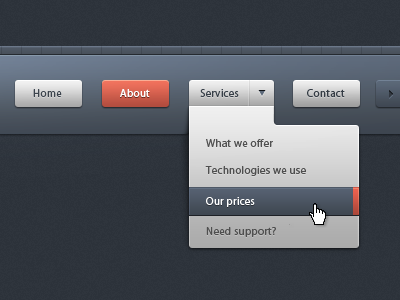
Interfaces built in html/css can be just as guilty of improperly nested corners. Think of form elements within a fieldset, or buttons within an alert box.
It’s not difficult to be dead accurate with it though; the difference in the border radius of your two objects should be equal to the gap between them. Simple!

And this can be flexible too, for example:
<div class="outer">
	<div class="inner">

	</div><!--/ inner-->
</div><!--/ outer-->
.inner {
    width: 5em;
    height: 5em;
    background: black;

    border-radius: 1em;
}

.outer {
	display: inline-block;
    background: lightblue;

    padding: 3em;
    border-radius: 3em;
}
Perfect bent pipe.
Exceptions
Like all matters in design, there are no concrete rules – you’ll always find exceptions. It’s a question of instinct.
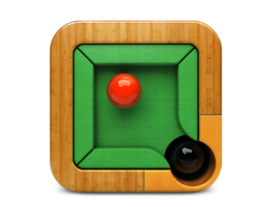
Take this interface for example; the gap between the contact button and the dropdown doesn’t look anything like a bent pipe. Saying that, all the corners in this interface have uniform radius, so nothing looks out of place:
Folks Who Get it Right
I think you’ve probably had enough of listening to me get wound up about something so trivial. Rather than draw attention to examples where I’ve seen it done awkwardly, let’s now take a look at some inspiring work by Dribbblers who do it right!