In web design, you don’t get a second chance to make a first impression. This is especially true if you have a global audience in mind. Translating your site involves more than just changing the language; it can mean re-thinking the entire design, from color choice and imagery, through to layout and navigation.
My first attempt at an online translation website featured a rather garish maroon and gold color scheme. Perhaps I didn’t need researchers to tell me that this combination is hard on the eyes and likely to irritate readers, wherever they’re from! As well as being overpowering, it’s an unpopular choice in China, where the color is often associated with indecision.
Since then, we’ve launched dozens of localized sites around the world, and developed an idea of what works and what doesn’t in different countries. That’s not to say you need to change every aspect to make your website blend in with the crowd. But taking the following tips into account can help make sure it stands out for the right reasons.
Observing Culture
Color preferences can be highly dependent on culture. While white symbolizes purity in the west, it’s the color of mourning in China and Japan. In North America, red is associated with danger or strong emotions such as anger, while it indicates happiness in China. And beware of colors with political connotations – for example, orange is best avoided in Ireland.
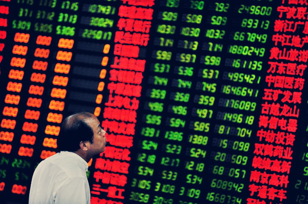
One surprising color reversal is that red indicates “up” in Chinese stock market updates and green “down” – precisely the opposite to Europe and America. Similarly, using green to mean “go” can cause cross-border confusion.
To an Asian viewer, Scandinavian design can appear austere or over-simplified. While some cultures have more minimal preferences, the most popular Chinese sites are packed with information, reference marks, tabs and banners. Japanese users also tend to prefer sites with bright colors and more images, describing simpler sites as “cold” and “unappealing”.
This could explain why eye-tracking studies have shown that Chinese and Korean users tend to take in more information when scanning a webpage in 25 seconds. Researchers at the Korea Advanced Institute of Science and Technology found they registered more “areas of interest” and were less likely to use a sequential reading pattern.
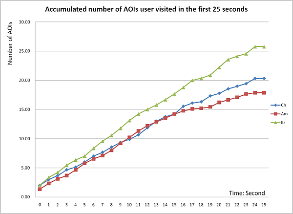
Findings from the analysis suggest that the Chinese, Korean, and American participants employed different viewing patterns when viewing a webpage. The Chinese and Korean subjects showed more similarities to holistic thought patterns, while the American subjects showed more similarities to analytic thought patterns. – KAIST
Right-to-Left
Of course, the way we scan web pages also depends on our language. Just as Arabic speakers read from right to left, they also tend to scan pages the same way. Localizing our website for the United Arab Emirates included moving buttons and navigational tools, to ensure they were easily found.
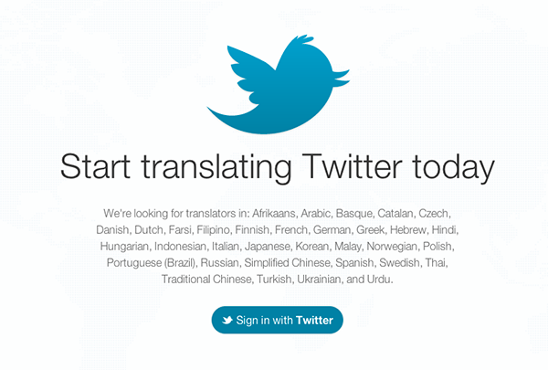
We’re not alone – Twitter recently had to rethink its design to support right-to-left languages. Making sure hashtags read correctly was just one of the challenges.
It’s also easy to switch the direction of the text to right-to-left, if needed, by altering the dir attribute in the <html> tag:
<html dir="rtl">
And remember people interpret pictures the same way they read text. “Before” and “after” images should be reversed for a right-to-left language such as Urdu or Hebrew.
Thinking Flexibly
German tends to take up to 30% more space than English
Language will also affect the layout. Translators know that German tends to take up to 30 per cent more space than English, creating potential headaches for web designers. And many Asian languages, such as Chinese and Korean, require much less space on a page than English.
Ideally, if you plan to translate your site, this should be taken into account at the design stage. It’s much easier to create a template that can be used for different languages, rather than adapting it later on. This is all part of basing a design upon the content, not the other way around.
Most design packages support Unicode, the standard numeric representation of characters, which can be used for more than 90 scripts. The best choice is UTF-8, a variable-length character encoding for Unicode, which most programmers are familiar with. Including the charset meta tag in the head of your document will inform the browser what kind of characters it’s likely to encounter.
<meta charset="utf-8">
Avoid injecting text with JavaScript/Flash where possible as this can create translation difficulties. Also, keep text and images separate for ease of translation and accessibility.
As a Webdesigntuts+ reader, the chances are you’re aware that CSS is your friend when creating adaptable design. Stylesheets keep the presentation separate from the structure, meaning even if you’re working with a static website you won’t have to start with a blank page for each translated page.
A Picture Says A Thousand Words
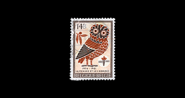
Images are one of the easiest ways to cause offense in another cultures. For example, a picture of a woman in a bikini would be frowned upon in a conservative Middle Eastern country. As with advertising campaigns, it helps to consider different cultural values. Does the target country tend to be more individualist or family-orientated, and does religion play a major part in daily life? Think about the symbolism of images – an owl is associated with wisdom in most Western countries, but pessimism in Arabic-speaking ones.
Additionally, consider the fact that photographs of well-known faces or landmarks might not be recognizable worldwide.
Technical Restraints
Remember that fast broadband connections aren’t the rule everywhere. While internet use is growing rapidly in Africa, India and South America, most users still have relatively slow connections. This means limiting large graphics and videos, to reduce the time it takes to load.
Wrapping Up
Of course your site doesn’t need to be completely changed for each new audience. We eventually settled on a fairly neutral blue, grey and green color scheme for our localized sites around the world. But most of them needed some tweaking for their target market, such as swapping images and moving navigational tools.
There’s no doubt that globalization and the internet have made the world a smaller place. But that doesn’t mean it’s more homogenous. Browsing the web can sometimes seem like stepping from a busy Hong Kong shopping street into a sleek Finnish design store.
You don’t need to sacrifice your site’s individual character when launching in a new market. But taking these factors into account will help ensure your message isn’t lost in translation. And it can result in big payoffs, in reaching a massive, global audience.