The pattern of using text on top of background images has been popular for years. Originating well before web design, text on an image can provide a more emotionally engaging and contextually rich experience. Before present day, images had to be much smaller to allow for significantly slower bandwidth. As connection speeds and screen densities rapidly increase, we are opened up to using much larger images in our designs.
Design decisions related to this technique are incredibly important to consider, and developing best practices to govern this practice is imperative to retaining high quality design. One cannot simply place text over any image and expect it to look right.
In this article, we will discuss five different aspects of placing text over images that will help you properly mix copy and imagery.
Note: throughout the article, the same principles apply when choosing video and text combinations.
1. Contrast Through Color and Brightness
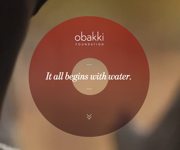
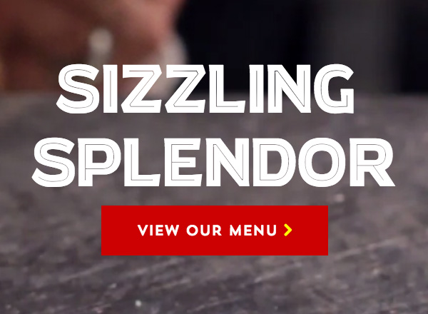
Using images that have significant contrast with the text is imperative. In particular, using darker images with lighter text, or darkening images with filters or an overlay element, can be an effective way to ensure you are utilizing enough contrast.
Some tips to achieve proper color and brightness contrast:
- If you can't immediately see the letterforms, your contrast is off.
- Contrast does not always mean dark versus light; complementary colors also provide natural contrast.
- If the image is complex and fully in focus, utilizing an overlay or editing the image will likely be the most effective option.
In this example, we use WebKit filters to manipulate the contrast and brightness of an image, which we place and manipulate using an extra <div>. The filter, unprefixed, looks like the following: filter: brightness(40%) contrast(70%);
Check out the demo.
More Examples

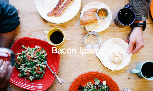
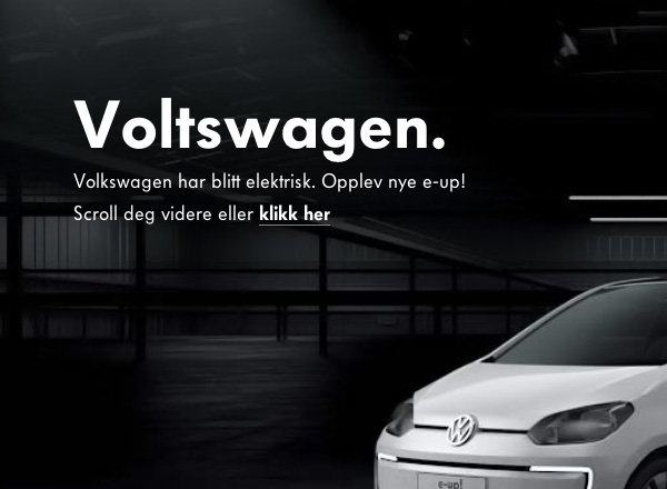
2. Contrast Through Sizing and Positioning
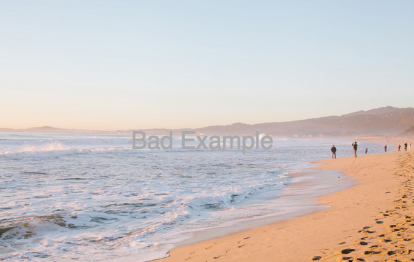
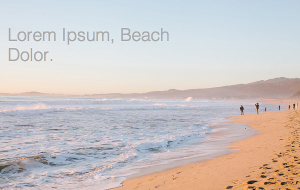
Color isn't the only way to improve the contrast of an image in relation to overlaid text. Choosing text size and position with relation to the focused elements of the image is essential, as this relates to the readability of the text itself.
In this example, we have chosen an image with a large, relatively homogenous sky area. This is a perfect area to place text. In contrast, a much less readable positioning of the text would be directly in the center of the image, where the skyline appears.
Check out the demo.
Further Examples
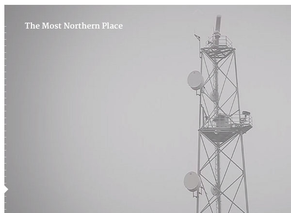

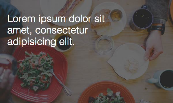
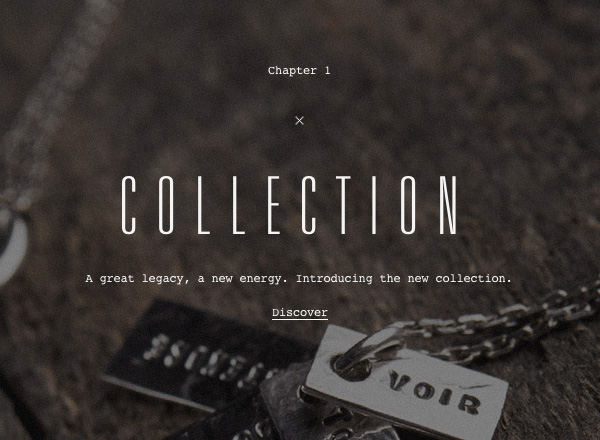
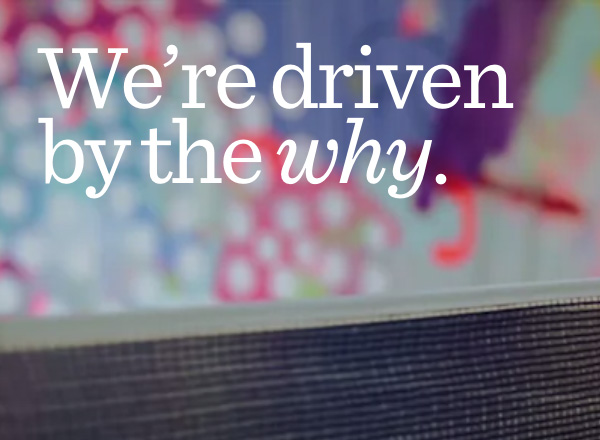
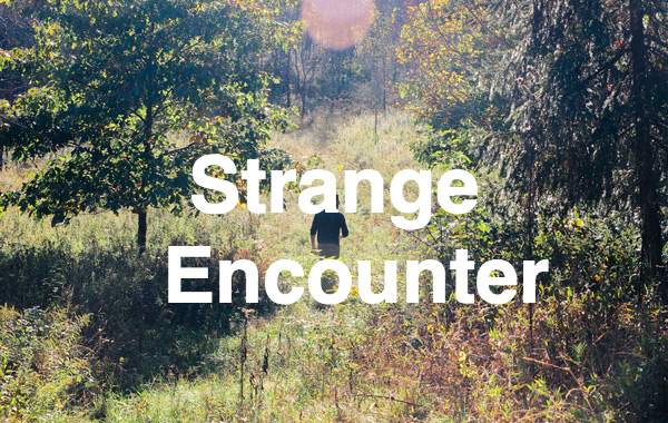
3. Readability Through Depth
Choose an image that utilizes depth of field. This will allow a smoother backdrop for text, which will increase readability. Place your text on the out-of-focus portion of the image, and be certain that the text color contrasts adequately with the primary color of the out-of-focus area.
We can do this easily by positioning text in areas of lower focus, as in this example.


Check out the demo.
Further Examples
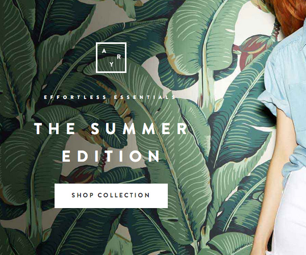
4. Image Subject Choice
Text over imagery is only as effective as the inferred meeting from the combination. For instance, don't choose generic imagery if more specific imagery will more adequately communicate. When choosing images, consider the emotional evocation and literal context of the image, especially as it relates to the tone of the message the copy is intended to convey.
Some tips:
- Choose images that show a full sentence; the user should clearly see the subject of the image, and understand the action being taken in the image, if any.
- Don't choose images that have a weak point of focus.
- Keep in mind the importance of clarity in the image. If the image is more or less for evoking feeling and less about the details, heavy overlays or filters may be applied without losing the effectiveness of the image.
Examples

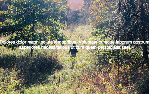
5. 3-Dimensional Awareness
Think about where the text appears in relation to the focus level of the various elements in the image. Does the text seem to sit back in the image, or does it come to the foreground? Does the text blend in, or does it hold its own unique position in z-space? How does the text relate to the focused elements of the image, most specifically?
A rule of thumb: the smaller the text, the further the text will seem to appear in z-space.
In this example, we utilize foreground text that appears to be much closer to us than the bushes in the background. Despite the high level of detail in the background, our eyes naturally identify the longer lines and larger shapes of the text, interpretting the text much more easily than the bad example. In the bad example the characters’ shapes seem to place the text at about the same z-position as the leaves in the background.
Check out the demo.
More Examples


Coming Soon
Well, that wraps up our discussion about aesthetics. In the next article, we will cover different ways of combining these techniques with hover interactions and animation.
